Paul Albert Laurens (1870-1934) was a French painter and illustrator; he was the eldest son of distinguished painter Jean-Paul Laurens (1838-1921), who taught at the Institut de France, the Academy in Toulouse and the Academie Julian in Paris. Paul Albert was born in Paris, although the family soon afterwards moved away from the city, seeking safety during the Franco-Prussian war. Laurens’ younger brother, Jean-Pierre, was born five years later and was also a painter. Paul-Albert went to school in Paris, where he became friendly with André Gide; he studied at the Ecole des Beaux Arts and then, in 1890, worked at the Académie Julian alongside his brother. The next year, the young Laurens won second prize in the prestigious Prix de Rome and began exhibiting his work at the Salon des Artistes Francais during the same year. Further awards and prizes followed and Laurens became a teacher at the École Polytechniquein 1898.
Laurens and André Gide remained friends into adulthood, and they went to live for a time in Algeria. On 18th October 1893 the pair sailed from Marseille bound for Tunis, and from there travelled on to Sousse in Tunisia. In January 1894 Laurens and Gide travelled to and settled in the Algerian city of Biskra, in the former home of the White Fathers (Missionaries of Africa). Various paintings of Algerian street scenes by Laurens obviously date to this period. Through Gide, it seems almost certain that there would have been some direct contact or familiarity between Laurens and Pierre Louys, who was also a friend of the young author. The two writers had met as teenagers in 1888 and remained close until 1895, when there was a falling out. Some resemblance of acquaintance was sustained for another year until the pair severed all communication in 1896. It’s probable that all three were, to some degree, sex tourists in Algeria; Louys got some of his inspiration for Bilitis there, although for Gide the journey led to the discovery of his homosexuality. Laurens was present when Gide’s first gay experience took place, an event that made the two men close, even though Laurens (like Louys) was straight and went on to marry in 1900.
Two Nymphs
Around 1912, with his father and one of his students, Laurens helped to decorate the walls and ceilings of the Capitole in Toulouse with allegorical scenes. During the First World War, he worked with several other artists on designing camouflage schemes for the armed forces and their work served as a model for the Allied armies (the British army, for example, used the painter Solomon J Solomon to work on tank camouflage). After the war, Laurens was promoted to Professor of Drawing at the École Polytechnique, where he continued to teach until his death in 1934. His professional standing was recognised when he was appointed member of the French Academy of Fine Arts in 1933.
A study for ‘Dido’
Laurens is known for his portraiture (for example, of Gide) and for his illustrative work. He also designed posters for theatres and, as a painter, his output appears extremely eclectic: he doesn’t seem to have had any really settled style or subject matter. Doubtless he painted what he was commissioned to produce or what would sell. Hence we have the neo-classical bathing scene, Les Baigneuses, which looks very like work by Alma Tadema, Lord Leighton and many others, a mythical Feast of Flora, and an imitation of the eighteenth century galant painting of Watteau in Le Jardin de l’amour (The Garden of Love).
Les Baigneuses
The Feast of Flora
Le Jardin de l’amour
Neo-classical nymphs and nudes are rather common, as might be anticipated if one is familiar with Laurens’ work on Pierre Louys retelling of Leda. These female figures draw on the artist’s skills as learned in the life drawing classes at the Academy, and are more or less conventional, reflecting the types developed by Bouguereau or Chabanel, but we can see as well that Laurens liked to depict pairs of nubile figures, leaving the viewer a little unsure as to whether he is seeing friends, sisters, mother and daughter or lovers.
Catching Waves
Nymphes de la mer
Amongst his other sources of income, Laurens illustrated books. He provided plates for editions of Daudet and Gautier, but also worked on editions of three books by Pierre Louys- in 1897 he produced six etchings depicting scenes from the recently published Aphrodite and, in the following year, he illustrated editions of the novel Bilitisand the short story Leda, as I have described previously.
Aphrodite, Book 3, c.4- the bacchanalia at Bacchis’ home
Aphrodite, Book 4, c.5: the burial of Chrysis by Rhodis & Myrtocleia
An illuminated capital from Leda
For me, Laurens’ work on the three books by Louys seems to rise above his other designs: there’s an energy and creativeness in them which I don’t find in some of his more generic pieces. Perhaps the subject matter was especially conducive to his imagination- as we might judge from his life study titled Adolescence (below), a figure who could as easily be a nereid, dryad or character from one of Louys’ Hellenic fantasies. Viewed from this perspective of this work, Laurens’ young nymphs may be understood as being clearly symbolic of the fertility of Nature, of perpetual renewal and regrowth. Nevertheless, aside from any mythological connotations, Lauren’s interest in this transitional state from youth to maturity was by no means unique to him: it was an aspect of life that fascinated very many artists of this period, from famous figures such as Edvard Munch (Puberty, 1894-95) and Oskar Kokoschka to relatively less well-known painters like Eleni Luksch-Makovsky (Adolescentia, 1903), Oskar Heller, Paul Hermann Wagner and Richard Muller. More particularly, a range of artists of the same period were drawn to create studies of the sleeping adolescent: examples include Marie Madeleine Rignot-Dubaux (1857-87), Oskar Heller (1870-1938), Hugh Ramsay (1877-1906), Gustave Brisgand (1867-1944) and, especially, Zinaida Serebriakova (1884-1967), a Russian artist who settled in France in 1924 and who, between 1923 and 1935, painted a number of portraits of her daughter, Katyusha, asleep in poses very similar to that chosen by Laurens.
Mike Cockrill has also pointed out something I had initially missed- the resemblance of Laurens’ model’s pose to that of numerous paintings by Balthus. The reclining female figure was one to which he returned throughout his career: it began with Therese Blanchard with one leg raised in Girl with Cat (1938) and evolved from there. Variations upon the theme of the slumbering girl include The Victim (1939-46), Reclining Nude (1945), The Week with Four Thursdays (1949), Nude with Cat (or Basin) (1948-50), The Room (1952-54), Large Composition with Raven and Nude with Guitar (both 1983-86) and Expectation (1995). All of these postdate Laurens’ death; although I have been unable so far to date Adolescence, Balthus may have been inspired by it- or will certainly have been responding to the general popularity of the subject within French painting of the era.
V jabloňovém sadu– In the Orchard (or Spring) 1904
Oskar Heller was a Jewish painter born in 1870 in what is now the Czech city of Olomouc- which was then part of the Austro-Hungarian empire and was known by the German form of the name, Olmutz. Heller was one of seven children, born to a prosperous grain merchant who could afford to send him to study fine art at the Berlin Academy. After his studies, Heller returned to his home town to work and remained there for the rest of his life, never marrying but playing a very active role in the social and cultural life of the city.
From January 1922, Heller presented his works at the German section of the Association Metznerbund, which developed from a former ‘Society of the Friends of Art.’ The Metznerbund was founded in March 1920 in Teplitz as a federation of German-speaking visual artists (painters, sculptors and architects) working within the newly-formed state of Czechoslovakia, in order to be able to better promote their artistic, social and socio-economic interests. It was named after the sculptor Franz Metzner (1870–1919). The concept of these regional associations was based on nationality and territorial affiliation, not on the orientation of their members, who represented a wide variety of artistic approaches and styles. Heller was active as the group’s president and vice-president, whilst the paintings he displayed at its exhibitions were always highly regarded by contemporaries.
Heller died of cancer and pneumonia in 1938. Sadly, it appears that other members of his family may have perished during the Holocaust.
The Shepherd (1909)
Heller’s favourite subjects were landscapes and still-life studies, but he also painted portraits, genre and mythical scenes and nudes. Josef Maliva, in the introduction to his Figural Paintings of the Artists of the Olomouc Region (Figurální tvorba umělců Olomouckého kraje, 2010), said of Heller’s earlier work that, “Out of the works of a wide community of German-speaking Olomouc artists who were engaged in painting, graphics or illustration work before the First World War, the work of Oskar Heller… received the widest popular response…. The colours of his early work were impressively fresh and some of his works transcended local realist conventions.” However, Maliva also recognised that Heller’s later work “fell into the conventional artistic plane,” when he was criticised for adhering to the academic style he had learned as a student. Hence, the entry on Heller in Prokop Toman’s New Dictionary of Czechoslovak Visual Artists (Novém slovníku československých výtvarných umělců) of 1936 contained this rather terse and dismissive summary of his work: “Landscape and still life painter. He paints views and still lifes.” A similar assessment was made much more recently by Alena Schulzová in Artistic Life in Olomouc in the Twenties of the Twentieth Century (Výtvarný život v Olomouci ve dvacátých letech dvacátého století, Ph D thesis, 1993) who wrote that: “Among the Olomouc painters, German critics positively evaluated Oskar Heller for his portraits and still lifes; [he was] a traditionalist of conservative inclination, whose work gained a strong local following.” Heller’s later work was marked by the pursuit of popularity, apparently for commercial reasons- and it’s fair to observe that the canvases he exhibited in the regular group exhibitions were often amongst the most expensive on display.
In the studio (c.1910)
The reason for featuring Heller is simply to contrast him to other contemporary painters whose work I’ve featured recently. Heller’s work is characterised, overall, by the simple necessity to earn a living. He seems to have given priority to remaining near his family, rather than living in a large city like Berlin, Munich, Vienna or Paris, where the artistic avant-garde were concentrated. Without a wealthy patron or progressive art market, Heller had to cater to the more conventional tastes of local purchasers. He therefore stuck to a variety of subjects which sold reliably; the staples were local scenes, portraits and paintings of vases of flowers, to which he added certain works reflective of his Academic background. V jabloňovém sadu at the head of the page is an example of this: it’s a vaguely pastoral, classical scene- it could be a shepherd and his girl, it could be Pan and a nymph. It’s cultured, but safe and familiar at the same time. The Shepherd (1909) is a little more daring; close examination reveals that the gambolling babies are actually pink and blue winged putti, definitely transporting the scene from an Arcadian pasture to somewhere mythical. I connect this picture with the Waldnymphe of Paul Hermann Wagner; they’re of broadly the same period, they mix mythical genres (fairy, nymph, cupid) and they appeal to an audience who want something for their home that suggests a familiarity with the classics, but which is also ‘cute’ and charming. There are also echoes of the work of Hans Makart, an artist who- as a leading figure of the Viennese artworld of the preceding generation- must surely have been familiar to Heller.
Girl with Dog, 1905
Lastly, Heller’s nude is, again, aware of wider stylistic developments, with its loosely impressionistic technique and its choice of subject matter (life studies such as this were extremely popular from the late nineteenth century onwards) but it’s not too challenging either. The Girl with Dog seen below is similar- these pictures may be compared with the works of Bouguereau, Emile Munier and Perrault that I’ve featured previously, giving a sense of a much wider, ‘pan-European’ popular taste.
Paul Hermann Wagner (1852–1937) was a German landscape and figure painter, who is also known for his decorative work in the applied arts. He was born in Rothenburg, west of Nuremberg, and, as a youth, learned glass painting, before moving to Munich in 1875. There he studied porcelain painting and also attended the art academy, from which he graduated in 1884. His teachers had included Ludwig von Lofftz (1845-1910), a painter of religious scenes and landscapes who also tutored the Symbolist Lovis Corinth, and Wilhelm von Lindenschmit the younger (1829-95), who was also known for his religious as well as historical pictures- although his Two Girls Playing by a Forest Beck is exactly the sort of subject that Wagner came to make his own.
Wagner is admired for the superb technique and brushwork in his studies of childhood scenes, his figures of nymphs and fairies and also in his landscape paintings. Many of his works were painted in Kochel am See, south of Munich near the Austrian border, which he initially visited only the summer months, but in 1897 he established his home and studio there. Later in life, Wagner also began to produce woodcuts.
Child Surrounded by Blossom
The particular interest of Wagner for me is the use he made of conventional aesthetic themes and imagery drawn from European culture. He is, by no means, a major painter, which arguably means that in his output we may glimpse what was popular and acceptable, rather than what was avant garde and challenging. Wagner’s repeated depictions of nymphs, faeries and other minor divinities tell us a good deal about what the buying public wanted and expected to see.
As stated, many of his works depict children with their families, playing, exploring the countryside or undertaking small chores around the home or farm (several pictures of girls herding geese are good examples of this). Unsurprisingly, we can also detect in these scenes echoes of the work of Munier and Perrault in France, as with New Playthings (head of page), in which two girls and a boy play with a basket full of kittens, or Junge Magd seen below, with her winsome expression slightly at odds with her scythe. This kind of depiction of rural life- simple, healthy, contented, neat and comfortably prosperous- was extremely popular in many European countries, where cities were expanding rapidly. They were reassuring nostalgia for the urban middle classes.
Junge Magd
However, in Wagner’s work it can sometimes be hard to distinguish human infants from faeries and dryads: Chasing Dragonflies below is a good example of this. The girl is plainly of human size, and could well be playing, or she might be a nymph at one with her environment, very much like similar pictures produced around the same time by William Stephen Coleman in Britain. Images like this also served a sort of nostalgia, for innocent childhood, greater contact with nature, carefree play and a lost world of infant stories and fantasies.
Chasing Dragonflies
Liebesglück durch Amors Pfeil
Then there are Wagner’s clearly mythical figures, such as Liebesglück durch Amors Pfeil (Happiness in love thanks to Cupid’s arrow) and his very well known study of a Waldnymphe (Wood Nymph). Like the exploits of Cupid, the theme of this second picture was far from novel- see, for instance, Victor Müller’s Waldnymphe of 1863. Müller (1829-71) was also based in Munich, so that Wagner may have been aware of this canvas, but its figure (a mature woman) and style (a voyeuristic glimpse in a murky, shady wood) contrast strongly with Wagner’s own canvas.
Victor Müller, Waldnymphe
Part of the popularity of Wagner’s nymph must be the style he used for the painting- it is noticeably brighter and sharper than many of his works. The wood nymph, despite her very clear dragonfly wings, is still an ambiguous figure. For one thing, she’s both fairy and classical nymph. She rests on a striped, fringed cloth, a shawl perhaps, which appears only too human-made. What she symbolises is also obscure: Eros/ Cupid (above) radiates innocent delight, the sash knotted around his waist preserving his modesty. The ‘nymph’ has the same flimsy wisp of material, but her expression, engaged with the viewer, is rather more self aware. It might be added that she’s the size of a mortal child- as we may judge from her surroundings- thereby making her more nymph than fairy. Her near-nakedness, however, is in marked contrast to quite a few other waldnymphen of the same period: Robert Pötzelberger (1856-1930), from Salzburg, in 1886 painted a nymph as a young woman reclining on a rock, watched by a goat, but she simply looks like a Greek goatherd having a rest; the German artist Max Röder (1866–1947) created another such nymph in a long white chiton, seen at the foot of a flight of stone steps leading (perhaps) to a shrine. In fact, Röder favoured pictures in which a classical figure was a small part of a much larger Mediterranean landscape: Iphigenie, Park Landscape with Pool and Sprite and Bacchantes near Rome all minimise the mythical presence in the scene. Lastly, another German, Ferdinand Leeke (1859-1959), in 1905 imagined a Waldnymph und Hirte as another young woman in a blue robe, listening to a piper in a grove. A later version by Leeke, from 1921, which is called Listening Nymph, reverses the image and makes the young woman’s dress rather more see-through, in the spirit of many British neo-classicists such as John Godward.
Pötzelberger, A Wood Nymph, Russell-Cotes Art Gallery & Museum, Bournemouth
Leeke, Nymph & Shepherd, 1905
Wagner’s second woodland nymph below reminds me of Pan and Flora by Hans Makart. She is depicted with a shepherd boy in a rough sheepskin; only his human feet prevent him being a young satyr, while her white dress and garland seem less practical for their wild setting and transport her more into the realm of the mythical. We are left a little uncertain as to whether they are two children who’ve sneaked away to the woods to experience the first stirrings of love, whether they are both supernaturals, or whether, in fact, this touching pair are actually more sinister than first glance indicates: the hapless mortal boy is falling for the immortal nymph, a doomed infatuation. Such a reading might cause us to revise our interpretation of the previous Waldnymphe: perhaps her sunny, welcoming smile is not to be trusted… nature can be hostile as well as lovely. Then again, given the overall saccharine cheerfulness of so much of Wagner’s output, maybe I’m reading in too much?
Woodland Nymph
What we can be more certain about, I think, is what Wagner’s work tells us about trends across Europe in the perception of supernatural beings. The nymphs portrayed by Pötzelberger and Leeke are young women of child-bearing age- and rightly so. The Greeks understood dryads, naiads, and all the other nymphs of groves, meadows, springs and other natural features, as symbols of fertility. They stood for the fecundity of the earth and, through their propitiation, people hoped to have secure water supplies and abundant crops. The Greeks would, therefore, have rightly identified Pötzelberger and Leeke’s figures as nymphs. Wagner, though, was painting in sympathy with new artistic trends: his Nymphen are little girls, not nubile young women. The original purpose and meaning of the nymphs has been displaced in these pictures, for they are now transmitting new messages. As with Wagner’s homely, adorable children, playing with their kittens or pretending to be grown-ups, these beings are there to offer something different to audiences. Rather than reassuring them about a stable and fruitful environment, they embody benign and (again) nostalgic memories of the rural world. They represent comfort and an invocation of a safe, pastoral, unchallenging country scene- somewhere to go for a peasant walk, not somewhere to toil to win a subsistence living.
As I mentioned earlier, in Britain William Stephen Coleman was doing exactly the same with his naiads and water nymphs, and numerous other artists (especially but not exclusively) in Britain, also did the same with faeries. A race which had been dangerous, malicious and threatening was drastically downgraded- they sprouted wings, put on tutus, waved wands decorated with stars and- most of all- turned from predatory adult lovers (Morgan le Fay and the other fae women of Arthurian myth; the leanan sith and lhiannan shee of Highland and Manx folklore) into pretty little girls. They became decorative, they became nice. It’s for this reason that I think we can safely assume that the wood nymph in her white dress can probably be viewed with charmed condescension: they are a pair of youngsters playing endearingly at love- how sweet! How evocative of one’s own first, tentative, romantic moments. The natural environment is (tacitly) confirmed as being unthreatening- a forum for carefree delight. Returning to the reclining Waldnymphe, observe how the stream by which she is relaxing winds behind her into the background where, beyond a little waterfall, there is a sunlit clearing of ancient oaks. Everything is mossy, green and floral: we are deliberately drawn into a calming sylvan scene. This is what Wagner is offering his viewers: a reversion to childhood and the wonder-filled exploration of a mysterious wood.
For more information on Victorian art, see details of my bookCherry Ripe on my publications page.
Clara Tice, King Pausole, Princess Aline & Giglio at the Fountain of the Nymphs (Book 4, Epilogue)
I recently made a sort of pilgrimage to the British Library to look at some of their illustrated editions of the books of Pierre Louys; a confession- I’ve written a lot about these but I’ve substantially relied on images found online- other than for the 1932 Collected Works published by the Pierre Louys Society of America. I wanted to experience some of these books in my hands because, as regular readers will know, I have put considerable stress on the significance of the bibiology of Louys- the astonishing number of illustrated editions of his works that people have felt it worthwhile producing. The experience of the book as a physical, tactile object can be every bit bit as valuable as reading the text, in addition to which I wanted to see the various colour plates as they had been designed to be seen- on the page and at the size that the artist had intended. This was the visit I looked at the very rare poem Maddalou as well.
I’ll start with the most outrageous- the 1933 edition of L’Histoire du Roi Gonzalve s et les douze princesses. It was tiny- just 10 by 7.5 cms; perhaps this was to enable something potentially illicit to be smuggled more easily; certainly, the book pretends to have been published in Madrid, which was probably intended to throw the authorities off the scent. This edition (which only totalled 205 copies) is illustrated with a dozen pen and ink drawings by Auguste Brouet. The unfinished story concerns King Gonzalve’s incest with his twelve daughters and Brouet faithfully reproduced these incidents in explicit detail. That said, the pictures were very small indeed, which must rather have detracted from their impact.
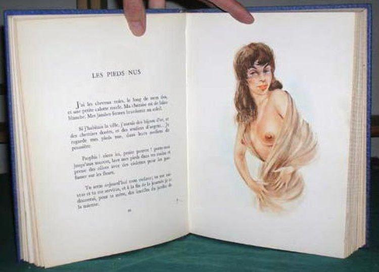
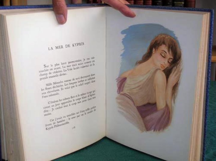
Next, a couple of real treasures. I looked first at the 1898 edition of Louys’ version of Leda, generally found now as part of the collection Crepuscule des nymphes (Twilight of the Nymphs in the 1926 Collected Works). As I’ve described before, this original version is illustrated with plates by Paul-Albert Laurens. It is a truly beautiful book, to hold and to look at. It’s printed on thick verge d’Arches paper and the illuminated initial letters and tailpiece illustrations are handpainted in watercolour. In places, I could see where the paint had strayed over the printed outlines and, in one case, over the frame of one of the decorative capital letters. Only 600 copies were printed, of which this was number 183- it was gorgeous, a little jewel.
Clara Tice, King Pausole, Mirabelle & Aline at the inn (Book 2, c.8)
Nearly as lovely was the 1926 edition (for the Pierre Louys Society) of The Adventures of King Pausole, illustrated by Clara Tice. This was copy 586 of 990. The book itself, like my copy of the 1932 Collected Works, was decent but not top quality; the text was the same translation in each. The pages are moderately heavy paper, typical of middle of the range books of the time, but what lifts this edition is the plates- ten of them- by Tice. These are little jewels, printed in bright pinks and greens but, in some cases, with radiant backgrounds of silver or gold. The figures are, predominantly, Tice’s sweet female nudes; her drawing is dynamic and the designs are elegant. It was a joy to turn the pages. There’s a delightful humour in Tice’s work- from the odd phallic sceptre carried by the king to her young females, who always look slightly startled, their mouths in a cute moue.
Clara Tice, King Pausole, Queen Philis arrives in the capital (Book 4, c.5)
Collot, courtesans of the temple of Aphrodite
Next I looked at the 1946 edition of Aphrodite, illustrated by Andre Collot and published by Henri Kaeser in Lausanne. The plates were printed on heavier paper than the text; a total of one thousand copies were printed and this seemed to be reflected in the fact that it felt less special and expensive than the books I’d already inspected. From 1930, I also inspected a copy of Douze douzains de dialogues illustrated by Collot. Although it lacked any bibliographical information from the publisher, the pages were thick, heavy paper, untrimmed (and unnumbered) and there were attractive floral pattern endpapers. The text was reproduced as if it was handwriting and the plates were minimalist pen and ink sketches, but it was notable how well the artist had captured the various facial expressions of the protagonists.
All the same, the next volume, Les Chansons de Bilitis, illustrated by Mariette Lydis in 1934, was number 1550 copies out of a total print-run of 5000- yet it felt more precious than the 1946 Aphrodite. Perhaps this was because it was printed on velin chiffon paper rather than plain old velin blanc– although the marbled endpapers may have helped? Maybe it was just because I esteem Ms Lydis more highly as an artist. She was generous- thirty four images, mainly included as tailpieces to the individual songs. In the copy I saw, these were printed just in black and white, but I have seen online coloured versions which have some differences in the drawing too. As ever with Mariette Lydis, these were delicate and tender evocations of female beauty and women in love.
Lydis, Bilitis, song 76, ‘Evening by the fire’
Also illustrated by Lydis in the same Union Latine d’Editions series was a copy of Les Aventures du Roi Pausole. It was in the same format as Bilitis, with attractive marbled end papers and quality, heavier paper for the illustrations. There was a title page image of a young woman’s head, and eleven ‘tipped in’ plates on separate sheets bound into the text. These were in Lydis’ typical soft pencil drawing style; interestingly, one plate- showing Aline at theatre, catching sight of Mirabelle for the first time- was coloured; the only one on the book. As ever, Lydis produced beautifully modelled female nudes and delicate, expressive pictures of girls in love.
Mariette Lydis, Aline at the theatre, 1934
The rest of the books I examined were from the later 1940s. In 1947 Edition du Grand-Chenes produced an edition of Bilitis illustrated with nine lithographs by Andre Dignimont. One thousand were printed, on velin blanc; the paper was very white and smooth, not as rich feeling as some, but enhanced by red section headings at the top of each page and red page numbers at the foot, plus the drop capital letter at the start of each chapter was printed in red. The book included an introduction on the life and work of Louys written by his friend, Claude Farrère, and the plates reproduced delicate soft pencil drawings with colour shading, all pleasingly simple and attractive.
Dignimont, Bilitis, Book 2, song 76- ‘Soir pres du feu’ (contrast to the Lydis’ plate above)
From the previous year was a curiosity, a version of Pybracwith plates by an unknown artist. It was clearly a reasonably expensive printing, as there were three different qualities of edition: one on papier d’arches that also included a ‘suite’ of the illustrations, provided in a separate folder on unbound sheets and printed on Holland van Gelder Zonen paper (this Dutch firm handmade paper from 1685 to 1982), plus two extra original designs that the editors had decided not to include in the final volume; eight copies of the book were supplied with a single extra original design and a ‘suite’ printed on velin de Renages paper (Renages is a town near Grenoble); lastly, there was the ‘basic’ printing which ran to 42 copies. The eight illustrations were the mystery- again, they spoke of quality, in that they each had a tissue paper cover. The plates were painted, perhaps in gouache, in bright colours, the scenes depicted being very explicit but (technically) rather crude. Some of these scenes also did not reflect any of the quatrains in the collection that I can can identify. The hairstyles and clothes were certainly right for the mid-’40s, but I wonder if at least some of these images were recycled from elsewhere, as if the artist, whoever he was, just decided to paint something rude that was vaguely inspired by the text- which would be odd (then again, there are those two rejected plates). An alternative explanation may be that this selection of 140 quatrains does not draw solely upon the ‘canonical’ collection of three hundred four-line verses. Louys wrote many more than those that are typically included in the available volumes (for example, the translations by Wakefield Press or Black Scat). However, it would have been difficulty to establish this with certainty from the British Library copy as a number of pages were missing. Finally, this edition appears to be so rare I can find no examples of it online- hardly surprising given that there were only ever 51 copies.
The cover of the Serres edition, 1948
From 1948, I inspected a copy of the edition of the Manuel de civilite illustrated by Raoul Serres and ostensibly published in London. Once again, this was a ‘fine art’ edition with several levels of quality. There was just one single copy printed on luxury Vieux Japon paper with six original watercolours, six original designs by the artist and a ‘suite.’ Six were printed on handmade Auvergne paper with the watercolours and the suite; another six were on Auvergne and also included an original design as well as the suite; fifteen were on Auvergne with only the suite added and all the rest were on the velin rives paper (with a very clear watermark) but without any extras. All copies except the top quality version were initialled by the artist. Serres’ twelve watercolours are rude but very funny. The young females have little dot eyes (rather like figures by Clara Tice) and regularly sport a coloured ribbon or bow in their straw yellow hair. The older men they encounter are made to seem more ghastly and unappealing by giving them pale blue skin.
I’ve kept the (second) best for last: Suzanne Ballivet‘s 1948 edition of Roi Pausole, printed in Monte Carlo by Editions du Livre. Three levels of quality were offered: eight copies on Old Japan; forty on pur fil Johannot, a heavy paper made from 100% linen, and the remaining 925 on Grand Velin Renage (which was clearly watermarked Renage). It was a big, heavy book (29 x 23 cms) and, even though the British Library version (as always) was from the least expensive of the sets, it still felt sumptuous. It came in a hard case with card covers and a heavy paper dustjacket. There was a separate ‘suite’ of twelve of the illustrations. The book itself was illustrated by 37 lithographs incorporated into the text plus another twenty ‘tipped-in’ full page plates. Ballivet’s fine pencil illustrations were gorgeous- especially the detail of the woods and meadows in which she placed her figures, with flowers and blades of grass individually delineated. The quantity of illustrations meant there was an image every seven to ten pages, making the book feel very special indeed.
Ballivet, Mirabelle dressing
To conclude, the feel of a book- its size, the quality of the paper, the number and nature of the illustrations- all contribute to the reader’s sense that they are looking at something precious and significant. As for the plates themselves, there was unquestionably something special about seeing the luminosity of Clara Tice’s pastel colours, and the sheen of her silver and gold background, or Laurens’ jewel-like watercolours in Leda.
I wrote recently about the legacy and importance of the work of Pierre Louys: that surely can be appreciated when you handle lavish and expensive books like these and realise how much money, effort and respect publishers, artists and purchasers have been prepared to continue to put into his writings since his death a century ago. These books were unquestionably created as investments: their limited print runs and range of ‘extras’ all confirm that they were planned as highly collectible from the outset, a tribute to the high regard in which their author was held.
For more on the work of Pierre Louys, see my bibliography page. For more on my own writing on the author, see my books page with its links to my Academia page where a range of essays on Louys and his illustrators are posted.
The poems and novels of Pierre Louys were always destined for publication in illustrated editions. The writer himself was a decent draughtsman and photographer, whose images of his lovers were clear complements to his verse. His authorial imagination was such that he conceived of his works as a succession of ‘scenes,’ whether those might be imagined as theatrical or pictorial. What’s more, from the outset, his published work was quickly reissued in illustrated volumes, as commercial publishers appreciated how ideally suited they were to such editions. The text offered episodes readily translatable to visual form whilst the erotic content had an instant appeal to buyers. As I’ve argued before, the illustrated editions of Pierre Louys’ various books constitute a major literary corpus that also has considerable art historical significance: sixteen different works were illustrated by in excess of one hundred and thirty different artists and were issued in a total of over one hundred different editions.
The foregoing figures are impressive, but in concentrating upon them the danger is that the wider context within which such remarkable productivity was possible is taken for granted. We risk making the mistake of simply accepting that the publishers, artists- and market- were all available, but in reality a major contributing factor to the sheer wealth of artistic creativity that enhanced the writer’s own literary originality lies in the special circumstances of the book trade and visual arts in Paris during the late nineteenth and early twentieth century.
Publishing & censorship
Perhaps the foremost facilitating factor was the relatively relaxed attitude of the French authorities towards the erotic book trade. Explicit depictions of sexual activity tended to be risky- which is not to say that out and out porn was not produced (but it was frequently undertaken covertly), nor that depictions of sexual contact were avoided where they could be defended as being ‘artistically justified.’ Editions of several of the more explicit works by literary authors included explicit plates- such as Guillaume Apollinaire’s Onze Milles Vierges (1942) and an edition of Paul Verlaine’s pansexual Oeuvres libres published by Jean Fort in Paris but which claimed to originate “À Eleuthéropolis” (near Hebron in Palestine). This attribution was a blatant attempt to pretend that the book was nothing to do with a French publishing house- one which was plainly still hedging its bets.
Many of the most explicitly erotic works of Pierre Louys were published following his death in 1925, and were accompanied by suitably graphic illustrations. Once again, these texts commonly alleged that they had been published outside France. For example, the 1929 edition of Bilitis apparently came from the Greek island Mytilene, where the heroine of the story lived, and the 1940 edition of Douze douzains de dialogues originated “A Cythère” (at Cythera, one of Aphrodite’s islands). The 1935 edition of the verse collection, Poésies Érotiques, claimed it came from Chihuahua, Mexico; the 1934 edition of Trois filles de leur mère alleged that it came from Martinique. These foreign publishers all sound highly improbable, and it’s surely likely that the authorities had a pretty good idea that they had really been produced in Paris. These stratagems aside, the book trade thrived for the first five decades of the twentieth century and, in its turn, encouraged a rich aesthetic community to complement it.
Paris- city of culture
Paris had been a centre of artistic excellence for several hundred years. In the recent past, of course, Impressionism, Post-Impressionism, Fauvism, Surrealism and other movements had been particularly linked with the city and, as a result, it had become a magnet for artists nationally and internationally, drawn by its schools, ateliers, salons, dealers and galleries.
A good example of the city’s draw for, and impact upon, painters may be the Bulgarian-born Jules Pascin (1885-1930). After studying and working in Vienna and Munich, he moved to Paris in 1905 and became immediately involved with the bohemian artistic and literary circles of Montparnasse, where he got to know painters and writers including Hemingway and Picasso. He enrolled at the academy run by Matisse and, on that painter’s recommendation, regularly visited the Louvre, where he copied the works of such eighteenth-century masters Greuze, Boucher, Van Loo, Watteau and Fragonard. Pascin’s own taste for erotica and nudes was doubtless reinforced by seeing these earlier painters’ canvases. Whilst Pascin was never commissioned to work on a book by Louys, he did produce a painting based upon Roi Pausole and, in the tight knit artistic community of the French capital, he knew illustrators such as Andre Dignimont and Marcel Vertès.
The artistic community of Paris was close-knit and somewhat incestuous and doubtless artists passed around news of possible commissions to illustrate books when they were drinking in Montmartre bars. The artistic capital of the world fostered talent in other ways, too: Auguste Brouet, who illustrated Louys’ Roi Gonzalve in 1933, earned money early in his career by producing cheap reproductions of paintings by other, much better-known artists- another good way of honing one’s skills and the instinct for what makes a good composition.
Magazines
A great deal of explicit material (written and visual) was tolerated by the French authorities and plainly contributed to a European perception that Paris was a uniquely ‘naughty’ place. Such an impression of ‘sauciness’ was doubtless further bolstered by the large number of magazines, such as La Vie Parisienne and Fantasio, in which suggestive images of glamorous nudes habitually appeared. The artist Chéri Hérouard is very typical of this genre. A good example of his output is a cartoon of a mermaid that appeared in Fantasio in 1921. The mermaid is seated, naked of course, on the sea floor, looking up at the bottom half of a woman in a bathing costume swimming above her. The image surely has a double entendre: the sea creature marvels amusingly at the strange behaviour of terrestrial beings, but at the same time we may enjoy the frisson of wondering if she is tempted by the shapely thighs and lower torso passing within touching distance. Topless or thinly veiled mermaids and nymphs regularly graced Herouard’s work, as did young beauties bound, or being either spanked or whipped, which were also popular with the artist. See too my post on the work of Georges Redon.
The importance of these magazines is not just what they tell us about the generally permissive mood in Paris, but also what they demonstrate about the artistic community working there. There was very evidently a pool of graphic artists with considerable skills in draughtsmanship and effective composition, upon whom the journal publishers could draw for cartoons, satirical sketches and other illustrations. Artists who worked on comic books or drew cartoons for newspapers and magazines included Jacques Touchet and Georges Beuville (both of whom worked on editions of Louys’ Roi Pausole), whilst Maurice Julhès, Pierre Lissac, André-Edouard Marty, Lucien Metivet and Maurice Leroy all illustrated Bilitis as well as drawing humorous sketches.
Georges Pichard, cartoon, 1950s
Graphic Novels
More recently, as I have described before, graphic novelists have been commissioned to work on Louys’ texts: Georges Pichard used his stark monochrome style to bring out the bleak depravity of Trois Filles in 1980 and Kris de Roover leavened the incest of Roi Gonzalve by means of bright colour blocks in 1990. Both these artists worked in established traditions, with Pichard drawing upon the inspiration of Robert Crumb and de Roover designing in the Belgian graphic style of ligne claire, initiated by Tintin’s creator Hergé. A close friend of Hergé was another Belgian, Marcel Stobbaerts, whose primary coloured and cartoonish illustrations of Pibrac from 1933- in which sexual explicitness and ribald humour combine- would seem to be another source of inspiration for de Roover.
Even more recently, the British artist, Robin Ray (born 1924), who uses the pseudonym Erich von Götha, illustrated an edition of a play by Louys, La Sentiment de la famille. Ray is known for the erotic and sadomasochist content of his illustrations and comic books. His most famous work is the series The Troubles of Janice, set in the time of the Marquis de Sade. The emergence of adult ‘comix’ (with an emphasis on the ‘x’) has provided a new medium for the presentation of Louys’ works to a modern audience.
The design of pin-up images is also something for which quite a few of the illustrators of Louys have been known. Early in his career, Georges Pichard honed his characteristic female character in such images (see above). The same is true of René Ranson (Trois Filles, 1936) and Raymond Brenot (an edition of Sanguines, 1961)- their partially nude figures were often incorporated into adverts and calendars for products such as motor oil (see commercial art later).
Children’s Books
A form of illustration related to comics and cartoons is that of children’s books, and the list of artists who provided plates for these- but who also worked on texts by Louys- includes Pierre Lissac, both Pierre and Maurice Leroy, Rojan, Maurice Julhès, Pierre Rousseau and Renée Ringel. Although there was an obvious gulf between the books’ contents, those artists working in the junior, as well as adult, markets had very valuable skills and were plainly in demand. Publishers appreciated that they could instantly capture the essence of a scene in a concise and attractive image- one that could not just complement but enhance and propel forward the narrative beside which it was printed.
René Ranson, ‘Hello sailor’
Commercial Art
Another branch of commercial art that also provided employment for talented draughtsmen was found in the continual demand for posters and advertisements and many significant painters and illustrators also made (or supplemented) a living by such work. Amongst the artists who undertook commercial design work (as well as illustrating works by Louys) were Nathan Iasevich Altman and Jean Berque (Bilitis, 1932 and 1935 respectively), Pierre Bonnard (Crepuscule des nymphes, 1946), André Dignimont (Bilitis, 1947) and Maurice Leroy (Bilitis, 1948) in addition to which there were those artists who were illustrators of multiple works by Louys- such as André Collot and André-Edouard Marty. Amongst the many multitalented and adaptable artists whose commissions included illustrations for magazines as well as Louys’ books were Georges Barbier, Luc Lafnet, Rojan and Louis Icart.
Finally, theatrical design was another source of income for jobbing artists, and illustrators who earned additional money creating sets and costumes included René Ranson and Georges Barbier. Barbier also designed jewellery whilst the painter and illustrator Pierre Bonnard made furniture.
Raymond Brenot
French Literature
Furthermore, Pierre Louys did not write in an artistic vacuum, neither literary or pictorial. His period saw not just an outpouring of cheap porn paperbacks alongside frank, sexually themed poetry and novels from authors like Collette, Rimbaud, Verlaine and Apollinaire; there were also regular reissues of earlier texts- for instance, new editions of eighteenth-century work by Casanova, Laclos (Les Liaisons dangereux) and, of course, the rediscovered and newly popularised Marquis de Sade. Very many of these volumes were illustrated- very frequently by the same artists who worked on titles by Louys.
Independent of literary erotica, and the illustrations that accompanied those works, it’s important to notice that artists were also producing their own freestanding portfolios of adult imagery. The Austrian Franz von Bayros (1866-1924) is particularly significant in this genre, but French/ Belgian artists André Collot and Martin van Maele, and Russian émigré Rojan, deserve mention because all three also provided plates for books by Louys. Van Maele and von Bayros shared a distinctly gothic or grotesque taste; all of them explored the complex but controversial interplay between sex, sexuality, perversion and various degrees of force and violence (see too Jules Pascin’s pen drawings and his 1933 portfolio Erotikon or the Sade-inspired portfolios of Fameni Leporini).
What these conjunctions emphasise is the fact that the illustrators just mentioned didn’t only respond to the content of the texts by Louys upon which they were commissioned to work. Their independent collections demonstrate that those books were merely reflective of wider interests and obsessions in European society at that time. However, the purely visual representation of these themes in the portfolios brings these themes more starkly and unavoidably to our attention. Decadence and Bohemianism were not just meaningless labels- in the books and etchings we are often witnessing the first stirrings of sexual liberation and a permissive society. Louys- along with many others- was a harbinger of these shifts in social attitudes, although he may have felt that his promotion of Greek social values and an openness to greater diversity and freedom of personal expression fell on deaf ears in his time.
Summary
In conclusion, the illustrated editions of the many novels and poetry collections of Pierre Louys stand as a remarkable body of collaborative creativity, a literary and artistic legacy deserving of much wider critical study and popular appreciation. These joint productions underline the degree to which individual artists depend upon the work of others. Pierre Louys’ achievements arose upon the foundations of previous writers, painters and illustrators, who had created an aesthetic and intellectual environment within which he could develop his own particular vision. As for the craftsmen and women whose images enhanced his words, this brief review repeatedly demonstrates how multi-talented they were, able to produce memorable designs in a wide range of media.
A longer, fully annotated version of this essay can be downloaded from my Academiapage.
Georges Barbier, advert in Vogue, December 1st 1920
There are two versions of the poem Maddalou by Pierre Louys. The first is included amongst a collection of ‘Fourteen Images’ in the second volume of the poet’s Complete Works. It follows the lyrics of Bilitis, indicating that it dates to same period, around 1894.
“Her hair is black; her skin is brown. Around her chest she wears a white rag, which was once a camisole, and which reveals her half-naked.
A red rag serves as her skirt, a rag with more holes than a battle flag. And that’s all.- she doesn’t have a shirt; her feet are bare as hands.
But what embroidered silk would be more beautiful than this colourful costume of human skin and rags? What jewel purer than the point of her breast?
She moves in the light, without shame and almost without clothing, while I follow the play of shadow and sunlight around her form.”
The second Maddalou, as I have noted before, is a longer poem, published separately after Louys’ death in 1925. I have been able to see a copy of the 1927 edition, held by the British Library, and- because it’s such a rare little book- I’ve reproduced a translation of the French prose poem here.
The physical book itself underlines some of what I’ve said several times previously about the qualities of limited edition fine art printings and how they can interact with the experience of reading the text. As was common practice at the time, the book was issued in a limited run of 400 copies, printed on three grades of paper. The BL copy is number 36 and is on the ‘cheapest’ paper, Velin d’Arches. This is a strong cotton paper, with a fine grain and ‘deckle’ (untrimmed) edges. It has weight and a pleasing grained texture. The book itself comes in a card case that opens to reveal the forty loose pages; these are quite small- called in-huit in French, they’re only about 19 cms tall. It was a delight to see and handle and Edouard Degaine’s illustrations were gorgeous- soft-focus and evocative.
“At the end of the long path which winds between the bushes, I discovered a hovel in the middle of a small garden. It was a poor shack that no one knew, far from hamlets, far from the roads. Never has a tourist, a hunter or a passer-by walked there. It had only one window and just one door. Through the window I saw an old woman seated and, before the door, a young girl was standing. But this young girl was very strange, with rags like a savage and a body so beautiful that I felt myself go pale.
Throughout the day I thought about her and, in the evening, I went back. She came towards me, little by little, curious, but also slightly on her guard, like a tame doe.
‘Who do you want here? My grandmother isn’t at home. Grandma’s left for the town, for the Saturday market. I’m alone- who are you looking for?
I’ll be on my own for another three days. If you want a basket, grandma has taken to them all to sell at the market. You’ll quickly catch up with her on the road running beside the sea.
Why don’t you reply? Why are you just looking at me without saying a word? I haven’t got anything… Only a bowl of milk… and some figs… and water from the spring.
How did they come to live here? She didn’t know anymore: she was little; it was ten or more years ago. Back then, there, one of the men who’d loved her mother had killed her.
Back there, on the other side of the mountains. That was the day when Maddalou was taken away by her grandmother, passing through so many villages. She doesn’t know anything more than that, neither can she read, nor count, nor say where she comes from.
The hovel didn’t belong to them. They are allowed to stay there as an act of charity. By whom? A lady whom they never see, whose name she’s forgotten- but who owns all the land round here.
She responds to me with her head lowered and, when she stops speaking, I no longer even hear the silent footsteps of her bare feet in the dust.
Maddalou, with such black hair, barely covers herself with a red rag which, pierced, torn, slashed, wraps over her chest, and hangs down to her slender heels. She puts this on like a shirt, passing her arms through the tears, then ties it in the middle of her body. It gapes on the side and opens on the thigh- and her feet are bare.
But what silk would dress her better than this motley costume of brown skin and rags? What could be more beautiful than this exposed hip? What jewel could be purer than the tip of her bare breast?
She moves in the light, without shame and almost without clothing, and each of her gestures reveals all her contours to the play of shadow and sun.
‘Oh yes! Yes, stay here with me. I’m alone, I’m miserable. No-one ever comes here, except the seabirds and the birds from the woods. Stay! I’m all alone and I’m bored. I hate to go to work in the fields with my little coat all in rags. The gleaners have all got shoes and they mock my bare feet.
Instead, I go to the deserted willow grove, to harvest the stems. I come back and I weave baskets; I milk the black goats; I sing to myself- and yet, I’m not happy. You’re the first man I’ve seen- the first since… since I’ve been grown up and since I’ve been crying at night without knowing why.
I love life in my rags. I wash them like lace; when I see spots there, I just cut them out and make more holes for the wind to blow through. The holes dress me with my skin; the material covers what it can. If someone were to lie in wait for me in the woods… but no one spies on me in the woods and doesn’t follow me along the path.
On more than one evening, do you want to know how I make my way back from the fountain? With my rags over my arms, completely naked so I can run faster!
Now I’ve told you all my secrets- I’m tired of telling them to myself. I never like the flower I put in my hair, because it was me that gave it to myself.’
The hovel is just a large room covered with a broken roof. Just as Maddalou’s rags tear and show her body, so the roof has holes in and lets you look up at the sky. It lets in the wind and the rain, butterflies and dead leaves, the bats and the birds and, in their turn, the sunshine and the moonlight.
There’s neither a table nor chairs. You sit yourself on empty baskets and you eat off your lap. The bucket, the spindle whorl and the pan hang on the mossy, decaying wall. The goats sleep in one corner, the old woman by the chimney, the mice in the wall, the blue parrot on the rack and the girl under the stairs.
Under an old broken staircase that serves as a perch for the hens and from which she hangs a cloth as a curtain, there Maddalou has her bed. On a mattress of seaweed and tow sleeps the loveliest girl in the world. It’s just a sack laid on the earth, made from lots of saffron bags sewn together with string and somewhat gnawed by rats. A roll of rags serves as her pillow. She only has one sheet: the thin red canvas that she wears as a dress during the day. At night, when she lies down, she’s uncovered down to her feet, her head resting on her hand.
But those who did not see her on this regal bed, half-opening her mouth and stretching out her arms, will die without having known what human splendour can be.”
Maddalou is a very different poem to almost everything else produced by Pierre Louys (and hence nearly every book I’ve described on this blog). It describes a tender, romantic love, which despite the evident impact that the young woman’s partial and unconscious nakedness has on the male narrator, is taken no further. It’s not even clear whether the narrator expresses his admiration for the titular heroine, or just worships her silently. Degaine’s full page illustrations do tend to focus on the naked Maddalou, but the headpieces at the beginning of each section of the prose poem are small landscape scenes, evoking the peaceful, deserted natural world in which the hovel is set.
There are some hints of adult sexuality- and of the potential dangers of the outside world- but Maddalou and her grandmother inhabit a kind of Edenic utopia cut off from the harsh outside world. Their contact with it seems to be limited to selling the baskets at market- something the grandmother undertakes in order (it seems) to protect the girl from the corruption and temptation of the rest of society. There are indications that the maturing young woman is beginning to sense a lack in her life (her loneliness and her tears), and wants more, but she doesn’t yet know what that is.
The encounter between narrator and female household echoes the mise en scene of Trois Filles de leur mere, but the story is otherwise located in a completely different universe. Whether we are even in contemporary France is unclear (although the amphora in Degaine’s frontispiece might suggest not). All in all, the closest parallel in the rest of Louys’ work to this poem is the Dialogue at Sunset, found in Sanguines, which is set in ancient Greece and in which a goatherd and a girl meet, talk and fall in love. That said, Maddalou’s name implies very strongly that the setting is French: as we know from Bilitisand Aphroditeamongst other books, Louys was perfectly capable of coming up with authentic Greek names from the sources he knew so well. Wherever the story takes place, though, Maddalou’s world is innocent, pure and placid and, as the final sentence reveals, it’s held up to us as a model to envy and to imitate.
A longer, fully annotated version of this essay can be downloaded from my Academiapage.
The illustrated novels of Pierre Louys are instructive in many ways. Primarily, of course, they reveal evolving artistic responses to the author’s prose and verse, thereby not just illustrating his personal vision but demonstrating- indirectly- what book purchasers were understood to want, and what publishers and their commissioned artists believed they could offer them, within the parameters of law and public decency. In other words, the nature of illustrations can be a record of changes in society- in attitudes to sexuality, gender and the status and rights of women.
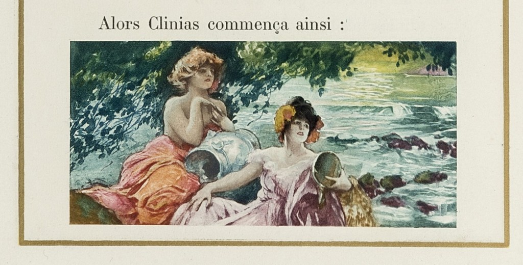
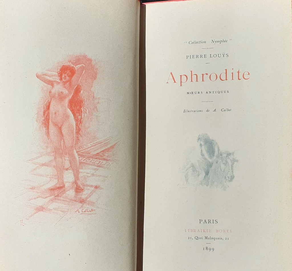
Louys’ first books appeared in the last decade of the nineteenth century, notably Les Chansons de Bilitisin 1894 and Aphrodite in 1896. The earliest illustrated editions are distinctly reflective of their era, tacitly articulating contemporary attitudes towards the female gender and the position of women in society. Librairie Borel‘s 1899 edition of Aphrodite, illustrated by Antoine Calbet, is a case in point: his depictions of Chrysis reflect the Academic tradition of life studies, derived from the classical artistic tradition since the Renaissance, and the young Galilean courtesan is depicted very much in the style of Greek statues of Aphrodite and paintings of Venus by Botticelli, Tiziano Vecelli and others thereafter.
The title pages of the Calbet edition
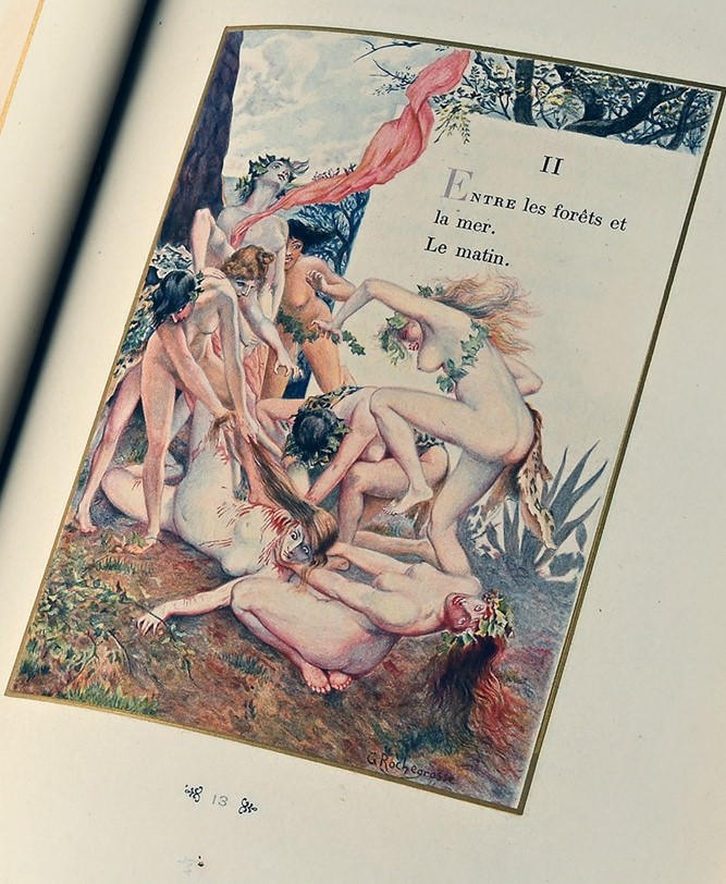
Likewise, when Georges Rochegrosse provided plates for an edition of Ariadne in 1904, what he supplied was a very revealing reflection of the period’s conceptions of bacchantes- frenzied women. In the plate illustrated below, they are seen wreathed in ivy and flowers and leopard skin, about to tear apart the helpless Ariadne. Elsewhere in the same volume, Greek ladies were presented as sedate, respectable, elegant, graceful and beautiful- as in the illustration that accompanied the preamble to The House on the Nile by Paul Gervais, which is seen at the head of this post.
As I have described in other posts, numerous further illustrated editions of the various books written by Louys were to follow, both before and after his decease in 1925. A constant feature of these was women in greater or lesser states of undress, plates that faithfully responded to the text but also very consciously appealed to the primarily male collectors of fine art limited editions of books. Amongst these many examples, the most interesting are probably those designed by women. Those volumes worked on by Suzanne Ballivet, Mariette Lydis and Clara Tice are notable for the quality of their work and for the fact that the latter two were lesbian and brought their own sense of eroticism to their reactions to the texts. So, for example, in her plates for the 1934 edition of Les Chansons de Bilitis, Lydis’ vision of female lovers was far more intimate and subtly sensual than most of the works produced by male contemporaries- such as J A Bresval (see below). Other women who worked on the various titles by Louys included Renee Ringel (Aphrodite, 1944), Yna Majeska (Psyche, 1928), Guily Joffrin (Psyche, 1972) and editions of Bilitis illustrated by Jeanne Mammen, Genia Minache (1950), Carola Andries (1962) and Monique Rouver (1967). The frequency with which female illustrators were employed as the century passed is noticeable, although I hesitate to identify a distinctly feminine style.
Maritte Lydis, plate for Bilitis, 1934
Post-war, new editions of Louys introduced us to new conceptions of his female characters. J. A. Bresval illustrated an edition of Bilitis in 1957, his figures being very much inspired by contemporary film stars like Gina Lollobrigida and Brigitte Bardot. The women have a dark-haired fulsomeness typical of the period; the eroticism is rather cliched, such as the frontispiece to the book, which shows Bilitis with a lover: the latter kneels before her partner, embracing her waist and kissing her stomach; the standing woman cups her breasts in her hands and throws back her head in a highly stereotypical soft-porn rendering of female ecstasy.
However, by 1961 and Raymond Brenot’s watercolours for a new edition of Sanguines, we see a new aesthetic of the female body beginning to emerge: the bosoms may be just as fantastical, but there is a slenderness and, in some of the clothes, a sense of a more liberated and relaxed mood. Pierre-Laurent (Raymond) Brenot (1913-98) was a painter who was also very much in demand to design record sleeves, advertisements and fashion plates (for such couturiers as Dior, Balenciaga, Ricci and Lanvin). More tellingly, he is known as the ‘father of the French pin-up’- consider, for example, his advert for lingerie manufacturer Jessos- “Comme maman, je porte un Jessos” declares a young teen with pigtails, seated with her blouse unbuttoned to reveal her bra (“just like my mum’s”); I have discussed this style of marketing in another post. Brenot’s poster designs, for consumer goods, holiday destinations and films and theatres, regularly featured glamorous young women and, when this work declined during the later 1960s, he returned to painting, producing many young female nudes.
Brenot, Parrhasius in ‘The Wearer of Purple’ from Sanguines
What has to be observed, though, is that most of the nudity portrayed by Brenot was not justified by the actual stories in Sanguines. There are some naked slaves in The Wearer of Purple (see below), and Callisto in A New Sensation does share a bed with the narrator, but most of the rest of the stories are really quite respectable and sex-free (by the standards of Louys), being more concerned with psychology than sexuality. What we see, therefore, is evidence for the tendency to treat the works of Louys as a platform for erotic illustration. Frequently, this was a distinct element in the author’s stories, but it seems that he had acquired a reputation for sexiness which was then applied more liberally, presumably in the knowledge that the name would sell. The same criticism can, in truth, be made of Georges Rochegrosse’s depiction of the bacchae in the 1904 edition of Ariadne (see earlier): what he depicted might perhaps be implied in the text, but what Louys wrote doesn’t wholly warrant the nudity that we see:
“They wore fox skins tied over their left shoulders. Their hands waved tree branches and shook garlands of ivy. Their hair was so heavy with flowers that their necks bent backwards; the folds of their breasts streamed with sweat, the reflections on their thighs were setting suns, and their howls were speckled with drool.”
Ariadne, c.2
Brenot, Callisto in ‘A New Sensation’ from Sanguines
The men who feature in Brenot’s illustrations often seem hesitant, ill at ease or, even, embarrassed at being discovered with the women in their company- his take on the ‘satyrs’ with nymph in a scene from ‘The Wearer of Purple’ is a case in point. In Louys’ story, this is an incident involving a slave girl being assaulted by two other servants so as to create a titillating composition for the the artist Parrhasius to paint. As we can see in the reproduction below, the satyrs appear afraid of the young woman, having lost all their accustomed priapism, whilst she strikes me as indifferent to their presence and in fully control of the situation. Given Brenot’s later output, it’s almost certainly overstating things to say that these plates reflect shifts in social attitudes.
Brenot, two satyrs & a nymph in ‘The Wearer of Purple’ in Sanguines
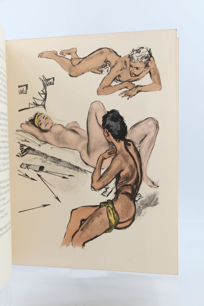
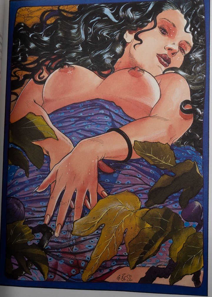
Coming right up to date, the 1999 edition of Aphrodite demonstrates how visions of women may have developed and advanced (or not). The book was issued in three volumes, the first two being illustrated by two male comic book artists, Milo Manara and Georges Bess respectively. Both have distinctly erotic styles and the results strike me as being, in essence, highly accomplished and artistic reproductions of glamour photography and lesbian porn; for example, George Bess’ picture of the reclining woman, which faces the start of Book 2, chapter 1 of the story, seems to me to be drawn in a style very much influenced by Mucha or Georges du Feure: the streaming hair and the encroaching, twisting foliage all have the hallmarks of Art Nouveau (which is of course highly appropriate given the publication date of the original book). In the modern version, Chrysis is regularly depicted in intimate scenes alone, with her maid Djala or with the two girls Rhodis and Myrtocleia. With their tousled hair, pouting lips and pneumatic breasts, these women are very much the late twentieth century ideal. Most of the time, they are presented as being more interested in each other than in any of the male characters in the story, but my response is that there are really rather high-quality examples of fairly standard pornographic obsessions. When we look at them, it’s worth recalling Pierre Louys’ own description of his heroine, when he wrote to the painter Albert Besnard asking to paint her:
“Chrysis, as womanly as possible- tall, not skinny, a very ‘beautiful girl.’ Nothing vague or elusive in the forms. All parts of her body have their own expression, apart from their participation in the beauty of the whole. Hair golden brown, almost Venetian; very lively and eventful, not at all like a river. Of primary importance in the type of Chrysis, the mouth having all the appetites, thick and moist- but interesting […] Painted lips, nipples and nails. Depilated armpits. Twenty years old; but twenty years in Africa.”
Aphrodite, chapter 1, Milo Manara, 1999
Bess, plate for Aphrodite, 1999, Book 2, c.1, ‘The Garden of the Goddess’
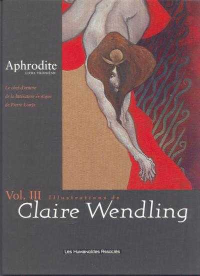
A fascinating contrast to the the first two volumes of the 1999 edition is to be found in the third, illustrated by Claire Wendling (born 1967). She is a French author of comic books and her response to the text is interesting because it is so much darker and less obviously ‘sexy’ than that of her male collaborators. The plates are, literally, dark in tone and, although they tend to focus on solo female nudes, rather than lascivious eroticism is there is a mood of mental and physical suffering entirely appropriate to the final section of the book, in which Chrysis is arrested, sentenced to death, executed and buried. Her cover image evokes- for me- thoughts of Gustav Klimt in its decoration, but the twisted, crouched posture of the woman doesn’t look seductive- rather she’s supplicatory or, possibly, predatory.
At the start of this post I proposed that the book illustrations published with successive editions of the works of Pierre Louys can be a record of changes in society- in attitudes to sexuality, gender and the status and rights of women. I think that this is true, but that the evidence does not necessarily reveal huge steps forward in those areas. Far more women are involved now in commercial art, and the works of Louys provide vehicles for the expression of lesbian desire on their own terms: albeit in the service of illustrating books written by a man in which his sympathetic views of same-sex attraction compete with heterosexual masculine eroticism. Art styles have evolved, but the attitudes expressed by what’s depicted have not necessarily developed at the same pace.
During the last decade and a half of his career, Pierre Louys completed three major works- the Handbook of Manners for Young Ladies, which was a parody of deportment manuals; the novel Trois Filles de leur mere, and the poetry collection Pybrac. It is arguable, in fact, Pybrac was never actually completed, in the sense that Louys added continually to the quatrains that comprise it and the published versions of the book only include a fraction of the total known number of verses. There were, in addition, several unfinished works: the novels Toinon and L’Histoire du Roi Gonzalveand the mock-travelogue/ novel L’Ile aux dames. These texts all have a number of themes in common: Louys’ encyclopaedic literary knowledge coupled with a tendency to mock those books; his filthy sense of humour; the utopian strand to his writing, and his liking for erotica.
Here, I focus on Trois Filles de leur mere (Three Daughters of Their Mother), arguably one of the most difficult books by Louys. This considerable difficulty for readers arises from the tension between the surface content of the text- some of his obscenest erotica- and the deeper purposes of his writing.
Louys had a number of aims and targets in writing Trois Filles. He felt a deep antipathy for the stifling morals and conventions of the Catholic church within which he’d been raised (hence his regular recreations of the pagan faith of classical Greek and Roman seen in several of his works) and it’s clear that the book is, in part, an assault upon many of the sacraments and concepts of the faith: the story features sex in a church, a vicious parody of communion, and a perverse immaculate conception, for example. One of the three daughters, Charlotte, is something of a martyr-figure, and it’s even arguable, I think, that the mother, Teresa, stands as a satanic temptress figure for her trinity of girls. Amongst the other targets for Louys’ derision, alongside casual piety, were French wine snobbery and the general bourgeois mood of propriety.
In addition, the book is deeply literary. There are repeated references to classical and Renaissance and later French authors, such as Clement Marot (1496-1544) or La Fontaine, which readers are expected, implicitly, to know. Some of these sources are quoted, some are parodied and mocked. An obscene passage is attributed to the Humanist scholar Erasmus, which I’m sure he never wrote (although I’ll confess I’ve not checked all 86 volumes of his collected works). One contemporary French writer is condemned as merely deadly dull (just as was the case with the moralist Guy du Faur in Pybrac): after a rather overstimulating session with the mother, Teresa, the student narrator concludes “I took from my library a ‘heady’ novel by Henri Bourdeaux that I had purchased especially for the purpose of calming myself down when I was in a worked-up state.” Bourdeaux (1870-1963) was a lawyer and author known for his traditional Catholic morality and his very correct French style.
Besides citing classical authors, Louys borrowed themes from them just as he modelled parts of his plot on the Bible. Hence, we find traces of Leda, Pasiphae and Europa in some of the incidents described.
René Ranson’s title page
The book is also ‘metatextual’ before that term was invented. It is repeatedly aware that it is a story, pretending to be a memoire. For example, the student narrator addresses us, as readers, explaining “I would have taken much more pleasure in inventing a story where I could give myself (so easily) a more sympathetic role” or “That’s the trouble with memoires: they get monotonous. In a novel, this kind of repetition can never be excused, but in life it has to be accepted.” When a play is acted out in the final chapters of the book, the artificiality of that make-believe within the wider pretence of the story-telling is continually highlighted, the use of dramatic jargon constantly reminding us that it is all invented and staged: for example “Teresa probably did not know that she had introduced a prosopopoeia into her speech, but there is no need to know the figures of rhetoric to put them… at the service of persuasion. Was it the apostrophe, the hypothesis, the exhortation or the prosopopoeia that won? I do not know…” Very evidently, this sort of passage is not part of standard work of pornography.
The text can be understood at several levels simultaneously, I would argue. The basic plot concerns a student who moves into a new flat next door to Teresa and her three daughters and discovers that all four are sex workers. A few weeks of uninhibited sensual indulgence with the entire family follows, before they suddenly disappear. The novel may be interpreted as a condemnation of the sex trade and its malign impact upon the women trapped within it. At the same time, though, there are elements of the narrative which celebrate female sexual autonomy and women’s right to control over their bodies and their pleasures. Teresa is proud of her physical prowess; she comes over as a powerful and determined woman- except that the downside of her assertiveness is the fact that she dominates her family and is involved in damaging incestuous relationships with all of them. Then again- as he often did- Louys seems to suggest that self-sufficient lesbian households may represent some sort of social utopia– an ideal of independence and happiness. Yet he also interrogates lesbian or bisexual identity, perhaps ultimately tending towards a position that sexual fluidity is a more accurate way of understanding individuals.
On its face, Trois Filles may appear outrageously, shockingly pornographic, but I think it’s plain that any text that casually mentions Jesuit preacher Louis Bourdaloue, Roman poet Tibullus, the Greek playwright Aeschylus, Alexander the Great, Melisandre, and the painter Ingres, has depths and intentions that are not instantly obvious. The complex and multi-faceted nature of Trois Filles means that we are constantly left unbalanced by it, not quite sure of Louys’ meaning, uncertain whether he is playing a game and always returning to the text to uncover new layers of significance.
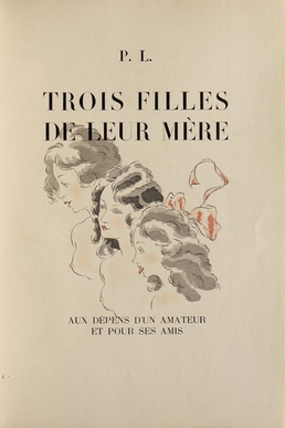
As ever, I find the novel’s bibliology as fascinating as the book itself. Illustrated editions proved extremely popular with publishers and several artists whom we’ve already encountered before, because of their work on texts by Louys, were commissioned to provide imagery. The first edition of Trois Filles was released by Pascal Pia in 1926, with twenty plates by Louis Berthomme Saint-Andre. Further illustrated editions followed in due course: in 1930, with plates by Andre Collot; in 1935, illustrated with sixteen etchings by Marcel Vertes and in 1936, with 34 watercolours by René Ranson (1891-1977). Ranson was one of the most important designers at work during the interwar heyday of the Parisian music hall, working for the Folies Bergère between 1924 and 1932. Renowned for his draughtsmanship, he was a painter, illustrator and costume designer as well. Ranson also supplied designs to the Paris Opera, and for several film studios, including Fox, Pathé and Paramount. Over and above his theatrical work, Ranson painted glamour or pin-up nudes and provided plates for works such as Baudelaire’s Fleur du mal. In past posts I’ve remarked on the frequency with which cartoonists and caricaturists found work as illustrators- and, for that matter, how often the skills acquired in illustrating children’s books might be transferred to the distinctly adult content of the works of Pierre Louys. René Ranson demonstrates how theatrical and costume designers might find additional work in book illustration; other examples I’ve noted previously include George Barbier, Louis Touchagues and Andre Dignimont. All of them surely deserve our respect for their multi-talented ability to turn their hands to almost any artistic commission offered to them.
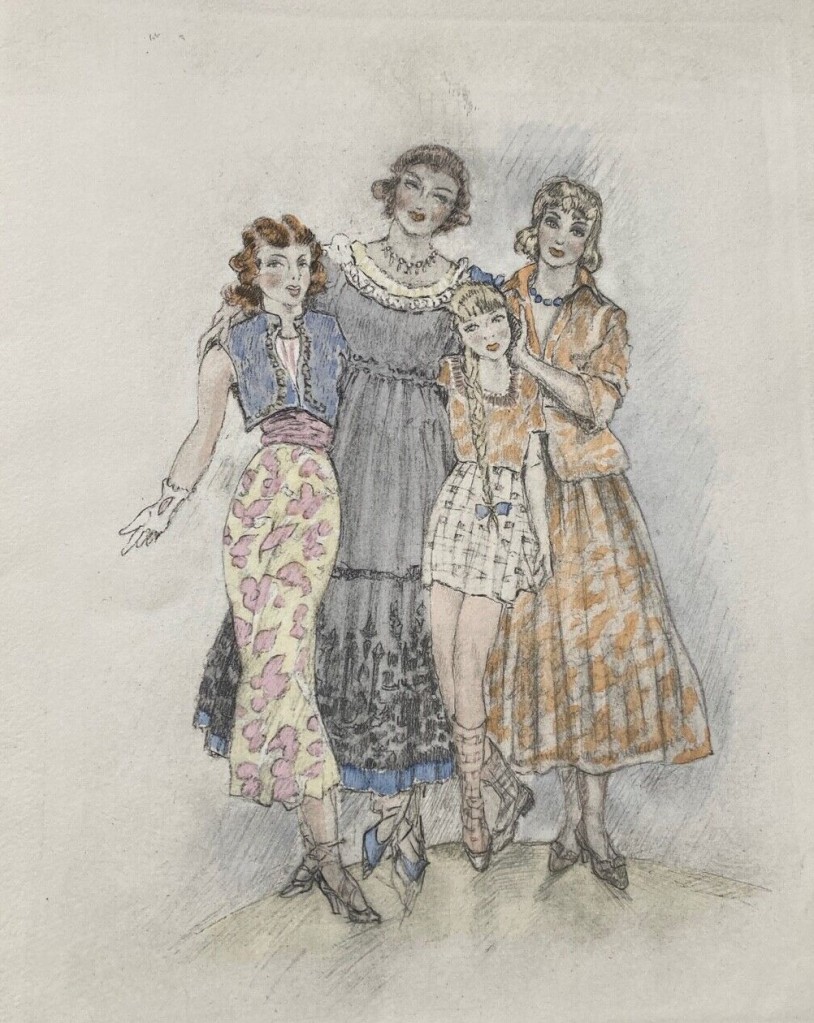
After the end of the Second World War, further editions of Trois Filles followed: Jean Berque provided sixteen plates for an issue in 1955 and, late that same year, Edouard Chimot also illustrated an edition with a dozen plates (see head of page for the family in their best ‘New Look’ dresses). Then, in 1960, an edition illustrated by Rojan was published. Finally, as I have mentioned several times, a version illustrated by graphic novel artist Georges Pichard appeared in 1980. In all these cases, the illustrators were faithful after their own style to the text they were commissioned to work upon, meaning that in most cases the plates are not really suitable for publication on WordPress. This explicitness can- as I’ve suggested- have its own implications for the text that the images accompany. Pichard, used to multiple frames in cartoon strips, designed an impressive fifty-three plates to go with Louys’ book. The sheer number of these, coupled with his graphic style of strongly drawn images, has the effect of underlining the more bleak and depraved aspects of the book. His monochrome plates emphasise the elements of tragedy and desperation in the narrative- something that Chimot’s and Ranson’s very pretty coloured illustrations definitely do not do.
This post is a simplified version of a longer, fully annotated essay on the novel that can be downloaded from my Academiapage. I have also written there in detail on Louys’ attitudes towards religion. For readers who are interested, several translations of the book are readily available, the most recent being Her Three Daughters, available from Black Scat books (published December 2022). See as well my Louys bibliography and details of my other writing on the author.
Published in 1926, soon after the author’s death, Pierre Louys’ Handbook for Young Ladies (Manuel de civilite pour les petites filles a l’usage des maisons d’education) is very typical of much of his later output: it is also very accessible for readers- short and ridiculously, scandalously funny.
In his broadly contemporary verse collection Pybrac, Louys savaged the moralising verse of the Guy du Faur, seigneur de Pibrac (1529-84). He had written a series of pious but pompous quatrains, giving worthy advice to his readers. These texts became required reading for generations of French schoolchildren and, as such, were a clear target for loathing and mockery.
The Handbook was, in this context, merely a modernised version of the same project, attacking manuals of deportment and good manners written for the daughters of bourgeois families. There were plenty of these to satirise- a small selection of examples includes a snappily titled work by Stéphanie Félicité Genlis, Dictionnaire critique et raisonné des étiquettes de la cour, des usages du monde, des amusemens, des modes, des moeurs, etc: ou, L’esprit des etiquettes et des usuages anciens, compares aux modernes (1818), as well as the Manuel complet de la bonne compagnie, ou, Guide de la politesse, et de la bienséance, dédié à la société française et à la jeunesse des deux sexes, by Elisabeth Celnart (1834), Manuel de l’homme et de la femme comme il faut, by Eugène Chapus (1855), Cham’s Nouvelles lecons de civilité, puérile et honnête (1859), La civilité puérile et honnête by Eugène Plon and Louis Maurice Boutet de Monvel (first published 1887) and Paul Burani’s Guide-manuel de la civilité française; ou, Nouveau code de la politesse et du savoirvivre (1890). Burani, for instance, advises that:
“The carriage of the head is especially a study to be done in the young girl ‘s early years. A leaning, languorous expression, an impudent and disdainful expression are also unsuitable and later become unfortunate habits.”
“Spouses must avoid overly familiar caresses in front of their children, in front of servants and in front of strangers. The mysteries of marriage, to retain all their attraction, must not be revealed.”
Guide-manuel de la civilité française
In the Handbook, over just sixty pages, Louys purported to give advice on the correct behaviour for young ladies in a range of social situations: when dining in company, at a ball, at school, at church, when visiting a museum, at the theatre, when travelling, when being introduced to the president of the republic- and many other circumstances. Almost none of this advice ought to be followed: “Get this truth into your head: every person around you, regardless of their age or sex, has a secret desire for you- but most of them will never dare to say so;” “If you pass an attractive man in the street, do not proposition him yourself; have your maid do this for you,” or “If your mother accompanies you to your lover’s home, let her go to bed with him first. That is the proper way to do things.”
Many recommendations are probably still valid, even so: at the dining table, for example, do not arrange a banana above a pair of tangerines on the tablecloth; do not slide asparagus in and out of your mouth whilst regarding the young man you find attractive; if you are doing an arithmetic lesson at school and the solution to your calculation is 69, do not roll around laughing like an idiot, or, if you are in a compromising situation with the elderly gentleman and he drops dead, rearrange his clothes and make him decent before calling for help…
As regular readers will know, I am as interested in the publishing history of Louys’ many works as in the texts themselves; most of the artists commissioned to illustrate successive editions of the Handbook will be familiar to readers who have read my earlier posts. The first edition was published in 1926 in Paris by Simon Kra, but within just a few months the publisher released an illustrated edition containing six etchings by Louys-regular Rojan. Strangely, the next year Simon Kra reissued the same text, but this time featuring twelve coloured etchings by Leon Courbouleix. He was an artist and occasional author who illustrated cheap erotic books for the Parisian book publishing trade, along with providing plates for more literary erotica, such as Restif de la Bretonne.
Illustration by Schem 1948
A further edition of the Handbook followed in 1930 (although- as was common- the title page claimed it had been published in Brussels in 1919). Twelve plates by Martin van Maele were provided, but these were not original works, being taken from La Grande danse macabre des vifs which he had illustrated in 1909. Nevertheless, those images were readily transferrable and highly suitable for the new text. Van Maele (a pseudonym of artist Maurice Martin, 1863-1926) had been widely employed in illustrating literary erotica (Laclos, Gautier, Verlaine) as well as in providing images for the thriving trade in spanking novels.
After World War II two more editions of the Handbook followed. 1948 saw an edition with twelve ‘pouchoir’ plates, designed by the illustrator and printmaker Schem (Raoul Serres, 1881-1971). In 1950 a further version, with eighteen line drawings, some hand-coloured, by Nicolas Sternberg was published. Most of these are not really suitable for publication here- as the CD cover reproduced below says: “Interdit aux moins de dix-huit ans.”
The cover of the Sternberg edition
The Handbook is ribald and irreverent; it’s no guide at all to correct comportment, although it might well function as a catalogue of all the things one should never do in polite company. It is, in microcosm, an epitome of Pierre Louys’ parallel reality- a vision of contemporary Parisian society that existed only in his imagination.
A longer, fully annotated essay on Pybrac can be downloaded from my Academiapage. A couple of recent English translations of the Handbook have been published: one, The Young Girl’s Handbook of Good Manners for Use in Educational Establishments by Wakefield Press (2010) and the second, A Handbook of Manners for the Good Girls of France by Black Scat Books (2022).
Alfred Leopold Isidor Kubin (1877-1959) was an Austrian printmaker, illustrator and occasional writer. In 1898, after a failed apprenticeship with a photographer, a suicide attempt (on his mother’s grave with a rusty, faulty gun) and a nervous breakdown (for which he was hospitalised for a time), Kubin began training as an artist at a private academy. He didn’t complete this course, seemingly impatient to progress his career, for he enrolled at the Munich Academy the next year.
After the Battle, 1902
In Munich, Kubin began to visit art galleries and first encountered the work of Odilon Redon , Edvard Munch, James Ensor, Félicien Rops, Aubrey Beardsley and Max Klinger. The latter’s series of prints, Paraphrase on the Finding of a Glove, which I have described before, had a particular impact on the young and impressionable artist. Of this “cascade of visions,” he declared “Here an absolutely new art was thrown open to me, which offered free play for the imaginative expression of every conceivable world of feeling… I swore that I would dedicate my life to the creation of similar works”.
Haushamerlind, 1907
Inspired by Klinger and Goya- and by a visit to Redon in Paris in 1905- Kubin began to produce fantastical, macabre drawings in pen and ink, with some watercolour washes. Although initially associated with the Blaue Reiter group of expressionists, from 1906 he gradually became ever more withdrawn and isolated and lost contact with the artistic avant-garde. Despite (or perhaps because) of his solitary life, Kubin was prodigiously productive and inventive, especially during the first decade of the new century. In total he produced between six and seven thousand drawings- of which just a few are selected here. Kubin’s art, stylistically, looked back to Symbolism with its morbid and supernatural elements. Like Goya, he often created thematic series of drawings, regularly dealing with issues such as sexual violence, human suffering and magical, malevolent female power. After Germany absorbed Austria in 1938, Kubin’s output was condemned as ‘degenerate’- perhaps this isn’t surprising given that he had termed himself “the artistic gravedigger of the Austrian empire.”
Epidemic (1901)
Kubin also worked as an illustrator, designing plates for editions of works by Edgar Allan Poe, E. T. A. Hoffmann and Dostoevsky, amongst others. He was also an author in his own right, albeit of just one book, Die andere Seite (‘The Other Side’) in 1908, a fantasy novel set in an imaginary land. In the story’s epilogue, Kubin revealingly declared “I loved Death, loved her ecstatically, as if she were a woman; I was transported with rapture… I surrendered completely to her… I was the lover of that glamorous mistress, that glorious princess of the world who is indescribably beautiful in the eyes of those she touches.”
Ins unbekannte (Into the unknown), 1901
It seems pretty clear that Kubin’s unhappy youth and his troubled mental state contributed directly to the art he created. He may have officially have been cured of his mental illness, but his work suggests an imagination still disturbed- and it can’t have helped that, from the age of nineteen, he was steeped in the rather pessimistic philosophy of Schopenhauer, who saw “misfortune as the general rule.” Kubin recorded how important dreams were for him as a source of artistic inspiration and that when he sat down to create art he was seized by “unspeakable psychic tremors.” From the artists he admired and closely studied, he seems to have retained only the most morbid elements. In his images, women and sex represent danger and power and death is ever present.