“Wonderful things”- Some rare illustrated books in the British Library

Clara Tice, King Pausole, Princess Aline & Giglio at the Fountain of the Nymphs (Book 4, Epilogue)

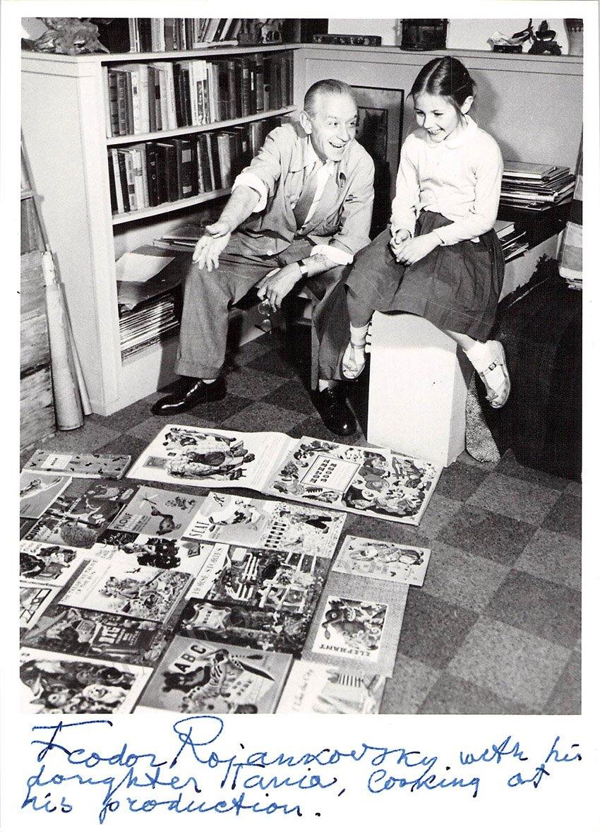
I recently made a sort of pilgrimage to the British Library to look at some of their illustrated editions of the books of Pierre Louys; a confession- I’ve written a lot about these but I’ve substantially relied on images found online- other than for the 1932 Collected Works published by the Pierre Louys Society of America. I wanted to experience some of these books in my hands because, as regular readers will know, I have put considerable stress on the significance of the bibiology of Louys- the astonishing number of illustrated editions of his works that people have felt it worthwhile producing. The experience of the book as a physical, tactile object can be every bit bit as valuable as reading the text, in addition to which I wanted to see the various colour plates as they had been designed to be seen- on the page and at the size that the artist had intended. This was the visit I looked at the very rare poem Maddalou as well.

I’ll start with the most outrageous- the 1933 edition of L’Histoire du Roi Gonzalve s et les douze princesses. It was tiny- just 10 by 7.5 cms; perhaps this was to enable something potentially illicit to be smuggled more easily; certainly, the book pretends to have been published in Madrid, which was probably intended to throw the authorities off the scent. This edition (which only totalled 205 copies) is illustrated with a dozen pen and ink drawings by Auguste Brouet. The unfinished story concerns King Gonzalve’s incest with his twelve daughters and Brouet faithfully reproduced these incidents in explicit detail. That said, the pictures were very small indeed, which must rather have detracted from their impact.

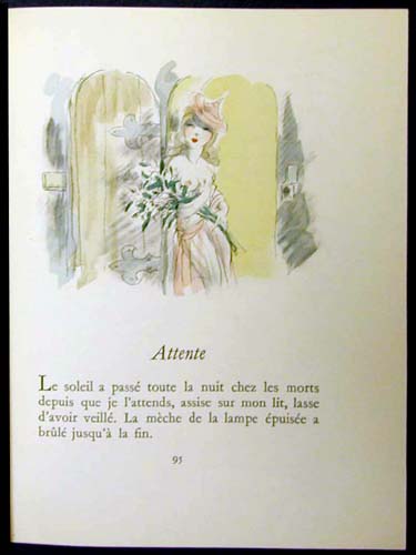
Next, a couple of real treasures. I looked first at the 1898 edition of Louys’ version of Leda, generally found now as part of the collection Crepuscule des nymphes (Twilight of the Nymphs in the 1926 Collected Works). As I’ve described before, this original version is illustrated with plates by Paul-Albert Laurens. It is a truly beautiful book, to hold and to look at. It’s printed on thick verge d’Arches paper and the illuminated initial letters and tailpiece illustrations are handpainted in watercolour. In places, I could see where the paint had strayed over the printed outlines and, in one case, over the frame of one of the decorative capital letters. Only 600 copies were printed, of which this was number 183- it was gorgeous, a little jewel.

Clara Tice, King Pausole, Mirabelle & Aline at the inn (Book 2, c.8)

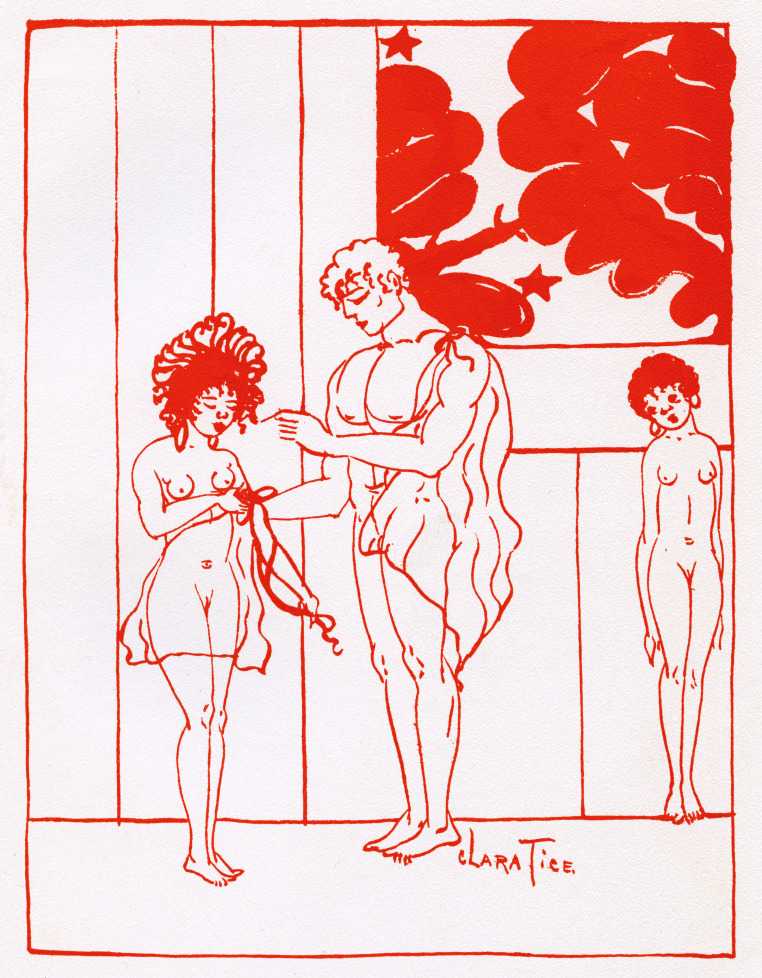
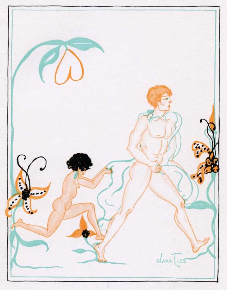
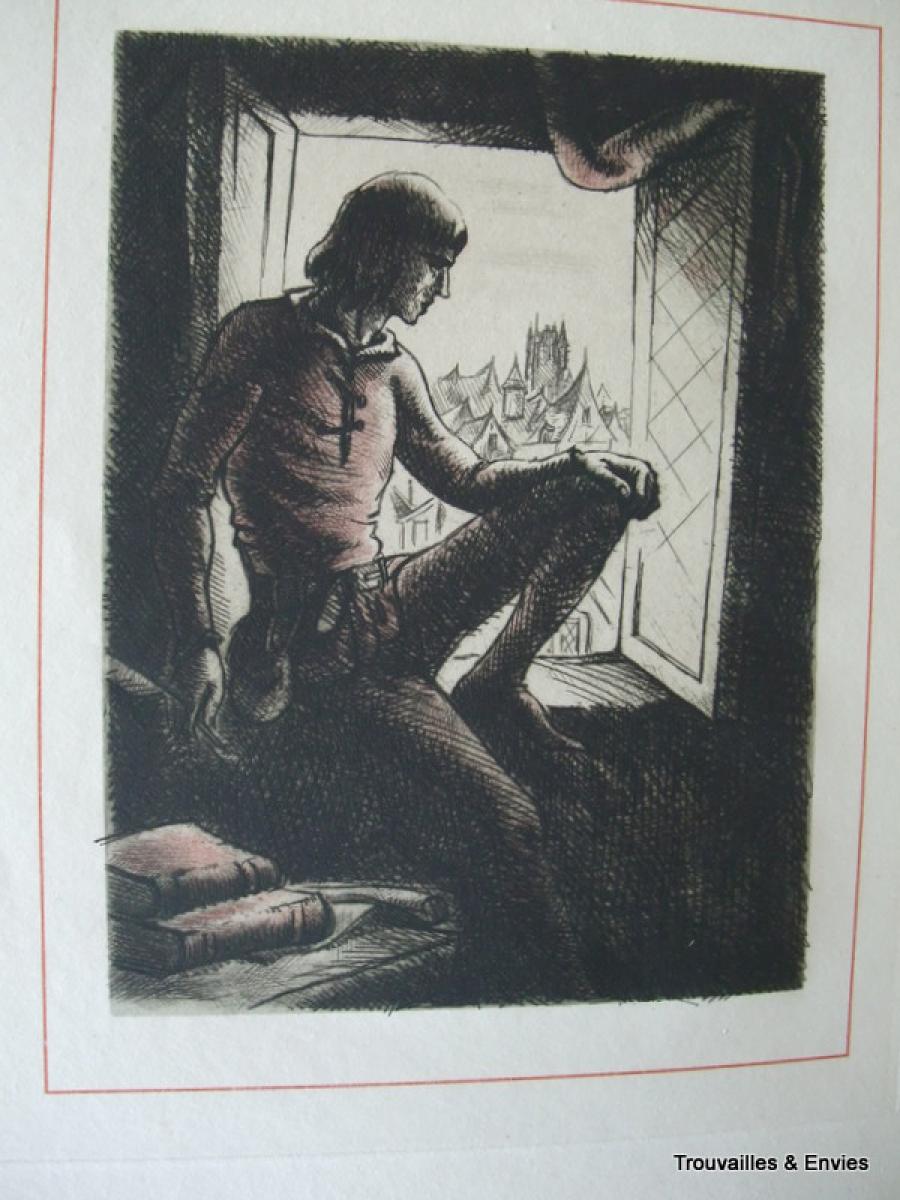
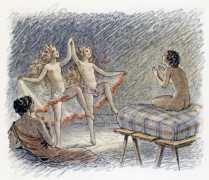
Nearly as lovely was the 1926 edition (for the Pierre Louys Society) of The Adventures of King Pausole, illustrated by Clara Tice. This was copy 586 of 990. The book itself, like my copy of the 1932 Collected Works, was decent but not top quality; the text was the same translation in each. The pages are moderately heavy paper, typical of middle of the range books of the time, but what lifts this edition is the plates- ten of them- by Tice. These are little jewels, printed in bright pinks and greens but, in some cases, with radiant backgrounds of silver or gold. The figures are, predominantly, Tice’s sweet female nudes; her drawing is dynamic and the designs are elegant. It was a joy to turn the pages. There’s a delightful humour in Tice’s work- from the odd phallic sceptre carried by the king to her young females, who always look slightly startled, their mouths in a cute moue.

Clara Tice, King Pausole, Queen Philis arrives in the capital (Book 4, c.5)
Collot, courtesans of the temple of Aphrodite

Next I looked at the 1946 edition of Aphrodite, illustrated by Andre Collot and published by Henri Kaeser in Lausanne. The plates were printed on heavier paper than the text; a total of one thousand copies were printed and this seemed to be reflected in the fact that it felt less special and expensive than the books I’d already inspected. From 1930, I also inspected a copy of Douze douzains de dialogues illustrated by Collot. Although it lacked any bibliographical information from the publisher, the pages were thick, heavy paper, untrimmed (and unnumbered) and there were attractive floral pattern endpapers. The text was reproduced as if it was handwriting and the plates were minimalist pen and ink sketches, but it was notable how well the artist had captured the various facial expressions of the protagonists.

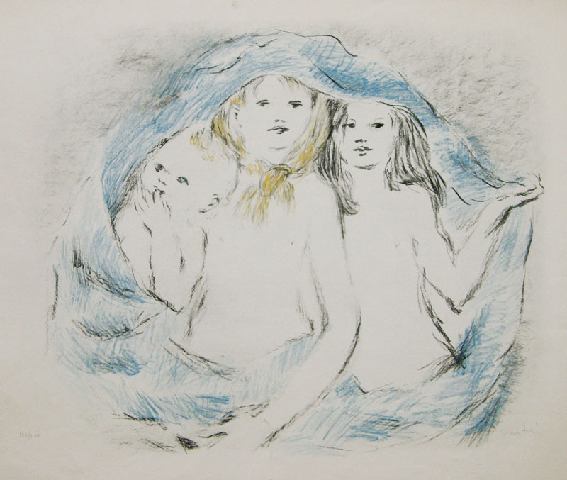
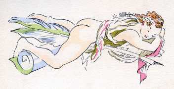
All the same, the next volume, Les Chansons de Bilitis, illustrated by Mariette Lydis in 1934, was number 1550 copies out of a total print-run of 5000- yet it felt more precious than the 1946 Aphrodite. Perhaps this was because it was printed on velin chiffon paper rather than plain old velin blanc– although the marbled endpapers may have helped? Maybe it was just because I esteem Ms Lydis more highly as an artist. She was generous- thirty four images, mainly included as tailpieces to the individual songs. In the copy I saw, these were printed just in black and white, but I have seen online coloured versions which have some differences in the drawing too. As ever with Mariette Lydis, these were delicate and tender evocations of female beauty and women in love.

Lydis, Bilitis, song 76, ‘Evening by the fire’

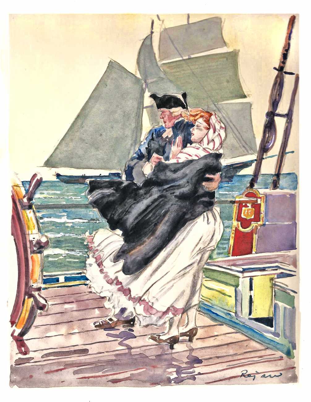
Also illustrated by Lydis in the same Union Latine d’Editions series was a copy of Les Aventures du Roi Pausole. It was in the same format as Bilitis, with attractive marbled end papers and quality, heavier paper for the illustrations. There was a title page image of a young woman’s head, and eleven ‘tipped in’ plates on separate sheets bound into the text. These were in Lydis’ typical soft pencil drawing style; interestingly, one plate- showing Aline at theatre, catching sight of Mirabelle for the first time- was coloured; the only one on the book. As ever, Lydis produced beautifully modelled female nudes and delicate, expressive pictures of girls in love.

Mariette Lydis, Aline at the theatre, 1934

The rest of the books I examined were from the later 1940s. In 1947 Edition du Grand-Chenes produced an edition of Bilitis illustrated with nine lithographs by Andre Dignimont. One thousand were printed, on velin blanc; the paper was very white and smooth, not as rich feeling as some, but enhanced by red section headings at the top of each page and red page numbers at the foot, plus the drop capital letter at the start of each chapter was printed in red. The book included an introduction on the life and work of Louys written by his friend, Claude Farrère, and the plates reproduced delicate soft pencil drawings with colour shading, all pleasingly simple and attractive.

Dignimont, Bilitis, Book 2, song 76- ‘Soir pres du feu’ (contrast to the Lydis’ plate above)

From the previous year was a curiosity, a version of Pybrac with plates by an unknown artist. It was clearly a reasonably expensive printing, as there were three different qualities of edition: one on papier d’arches that also included a ‘suite’ of the illustrations, provided in a separate folder on unbound sheets and printed on Holland van Gelder Zonen paper (this Dutch firm handmade paper from 1685 to 1982), plus two extra original designs that the editors had decided not to include in the final volume; eight copies of the book were supplied with a single extra original design and a ‘suite’ printed on velin de Renages paper (Renages is a town near Grenoble); lastly, there was the ‘basic’ printing which ran to 42 copies. The eight illustrations were the mystery- again, they spoke of quality, in that they each had a tissue paper cover. The plates were painted, perhaps in gouache, in bright colours, the scenes depicted being very explicit but (technically) rather crude. Some of these scenes also did not reflect any of the quatrains in the collection that I can can identify. The hairstyles and clothes were certainly right for the mid-’40s, but I wonder if at least some of these images were recycled from elsewhere, as if the artist, whoever he was, just decided to paint something rude that was vaguely inspired by the text- which would be odd (then again, there are those two rejected plates). An alternative explanation may be that this selection of 140 quatrains does not draw solely upon the ‘canonical’ collection of three hundred four-line verses. Louys wrote many more than those that are typically included in the available volumes (for example, the translations by Wakefield Press or Black Scat). However, it would have been difficulty to establish this with certainty from the British Library copy as a number of pages were missing. Finally, this edition appears to be so rare I can find no examples of it online- hardly surprising given that there were only ever 51 copies.

The cover of the Serres edition, 1948

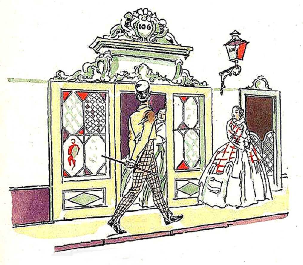
From 1948, I inspected a copy of the edition of the Manuel de civilite illustrated by Raoul Serres and ostensibly published in London. Once again, this was a ‘fine art’ edition with several levels of quality. There was just one single copy printed on luxury Vieux Japon paper with six original watercolours, six original designs by the artist and a ‘suite.’ Six were printed on handmade Auvergne paper with the watercolours and the suite; another six were on Auvergne and also included an original design as well as the suite; fifteen were on Auvergne with only the suite added and all the rest were on the velin rives paper (with a very clear watermark) but without any extras. All copies except the top quality version were initialled by the artist. Serres’ twelve watercolours are rude but very funny. The young females have little dot eyes (rather like figures by Clara Tice) and regularly sport a coloured ribbon or bow in their straw yellow hair. The older men they encounter are made to seem more ghastly and unappealing by giving them pale blue skin.

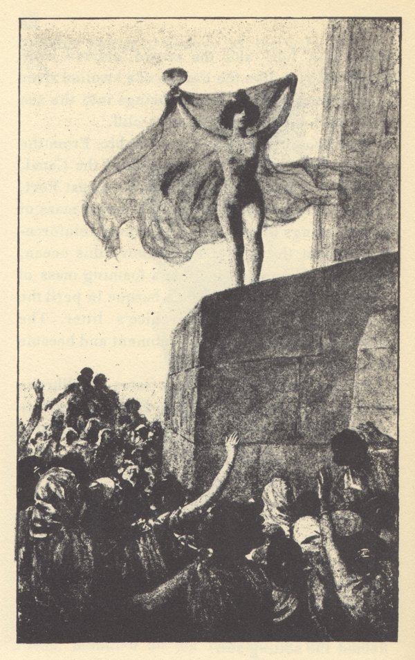
I’ve kept the (second) best for last: Suzanne Ballivet‘s 1948 edition of Roi Pausole, printed in Monte Carlo by Editions du Livre. Three levels of quality were offered: eight copies on Old Japan; forty on pur fil Johannot, a heavy paper made from 100% linen, and the remaining 925 on Grand Velin Renage (which was clearly watermarked Renage). It was a big, heavy book (29 x 23 cms) and, even though the British Library version (as always) was from the least expensive of the sets, it still felt sumptuous. It came in a hard case with card covers and a heavy paper dustjacket. There was a separate ‘suite’ of twelve of the illustrations. The book itself was illustrated by 37 lithographs incorporated into the text plus another twenty ‘tipped-in’ full page plates. Ballivet’s fine pencil illustrations were gorgeous- especially the detail of the woods and meadows in which she placed her figures, with flowers and blades of grass individually delineated. The quantity of illustrations meant there was an image every seven to ten pages, making the book feel very special indeed.

Ballivet, Mirabelle dressing

To conclude, the feel of a book- its size, the quality of the paper, the number and nature of the illustrations- all contribute to the reader’s sense that they are looking at something precious and significant. As for the plates themselves, there was unquestionably something special about seeing the luminosity of Clara Tice’s pastel colours, and the sheen of her silver and gold background, or Laurens’ jewel-like watercolours in Leda.

I wrote recently about the legacy and importance of the work of Pierre Louys: that surely can be appreciated when you handle lavish and expensive books like these and realise how much money, effort and respect publishers, artists and purchasers have been prepared to continue to put into his writings since his death a century ago. These books were unquestionably created as investments: their limited print runs and range of ‘extras’ all confirm that they were planned as highly collectible from the outset, a tribute to the high regard in which their author was held.

For more on the work of Pierre Louys, see my bibliography page. For more on my own writing on the author, see my books page with its links to my Academia page where a range of essays on Louys and his illustrators are posted.

‘Three daughters and their mother’- scandal and complexity from Pierre Louys

Teresa & family by Edouard Chimot

During the last decade and a half of his career, Pierre Louys completed three major works- the Handbook of Manners for Young Ladies, which was a parody of deportment manuals; the novel Trois Filles de leur mere, and the poetry collection Pybrac. It is arguable, in fact, Pybrac was never actually completed, in the sense that Louys added continually to the quatrains that comprise it and the published versions of the book only include a fraction of the total known number of verses. There were, in addition, several unfinished works: the novels Toinon and L’Histoire du Roi Gonzalve and the mock-travelogue/ novel L’Ile aux dames. These texts all have a number of themes in common: Louys’ encyclopaedic literary knowledge coupled with a tendency to mock those books; his filthy sense of humour; the utopian strand to his writing, and his liking for erotica.

Here, I focus on Trois Filles de leur mere (Three Daughters of Their Mother), arguably one of the most difficult books by Louys. This considerable difficulty for readers arises from the tension between the surface content of the text- some of his obscenest erotica- and the deeper purposes of his writing.

Louys had a number of aims and targets in writing Trois Filles. He felt a deep antipathy for the stifling morals and conventions of the Catholic church within which he’d been raised (hence his regular recreations of the pagan faith of classical Greek and Roman seen in several of his works) and it’s clear that the book is, in part, an assault upon many of the sacraments and concepts of the faith: the story features sex in a church, a vicious parody of communion, and a perverse immaculate conception, for example. One of the three daughters, Charlotte, is something of a martyr-figure, and it’s even arguable, I think, that the mother, Teresa, stands as a satanic temptress figure for her trinity of girls. Amongst the other targets for Louys’ derision, alongside casual piety, were French wine snobbery and the general bourgeois mood of propriety.

In addition, the book is deeply literary. There are repeated references to classical and Renaissance and later French authors, such as Clement Marot (1496-1544) or La Fontaine, which readers are expected, implicitly, to know. Some of these sources are quoted, some are parodied and mocked. An obscene passage is attributed to the Humanist scholar Erasmus, which I’m sure he never wrote (although I’ll confess I’ve not checked all 86 volumes of his collected works). One contemporary French writer is condemned as merely deadly dull (just as was the case with the moralist Guy du Faur in Pybrac): after a rather overstimulating session with the mother, Teresa, the student narrator concludes “I took from my library a ‘heady’ novel by Henri Bourdeaux that I had purchased especially for the purpose of calming myself down when I was in a worked-up state.” Bourdeaux (1870-1963) was a lawyer and author known for his traditional Catholic morality and his very correct French style.

Besides citing classical authors, Louys borrowed themes from them just as he modelled parts of his plot on the Bible. Hence, we find traces of Leda, Pasiphae and Europa in some of the incidents described.

René Ranson’s title page

The book is also ‘metatextual’ before that term was invented. It is repeatedly aware that it is a story, pretending to be a memoire. For example, the student narrator addresses us, as readers, explaining “I would have taken much more pleasure in inventing a story where I could give myself (so easily) a more sympathetic role” or “That’s the trouble with memoires: they get monotonous. In a novel, this kind of repetition can never be excused, but in life it has to be accepted.” When a play is acted out in the final chapters of the book, the artificiality of that make-believe within the wider pretence of the story-telling is continually highlighted, the use of dramatic jargon constantly reminding us that it is all invented and staged: for example “Teresa probably did not know that she had introduced a prosopopoeia into her speech, but there is no need to know the figures of rhetoric to put them… at the service of persuasion. Was it the apostrophe, the hypothesis, the exhortation or the prosopopoeia that won? I do not know…” Very evidently, this sort of passage is not part of standard work of pornography.

The text can be understood at several levels simultaneously, I would argue. The basic plot concerns a student who moves into a new flat next door to Teresa and her three daughters and discovers that all four are sex workers. A few weeks of uninhibited sensual indulgence with the entire family follows, before they suddenly disappear. The novel may be interpreted as a condemnation of the sex trade and its malign impact upon the women trapped within it. At the same time, though, there are elements of the narrative which celebrate female sexual autonomy and women’s right to control over their bodies and their pleasures. Teresa is proud of her physical prowess; she comes over as a powerful and determined woman- except that the downside of her assertiveness is the fact that she dominates her family and is involved in damaging incestuous relationships with all of them. Then again- as he often did- Louys seems to suggest that self-sufficient lesbian households may represent some sort of social utopia– an ideal of independence and happiness. Yet he also interrogates lesbian or bisexual identity, perhaps ultimately tending towards a position that sexual fluidity is a more accurate way of understanding individuals.

On its face, Trois Filles may appear outrageously, shockingly pornographic, but I think it’s plain that any text that casually mentions Jesuit preacher Louis Bourdaloue, Roman poet Tibullus, the Greek playwright Aeschylus, Alexander the Great, Melisandre, and the painter Ingres, has depths and intentions that are not instantly obvious. The complex and multi-faceted nature of Trois Filles means that we are constantly left unbalanced by it, not quite sure of Louys’ meaning, uncertain whether he is playing a game and always returning to the text to uncover new layers of significance.

As ever, I find the novel’s bibliology as fascinating as the book itself. Illustrated editions proved extremely popular with publishers and several artists whom we’ve already encountered before, because of their work on texts by Louys, were commissioned to provide imagery. The first edition of Trois Filles was released by Pascal Pia in 1926, with twenty plates by Louis Berthomme Saint-Andre. Further illustrated editions followed in due course: in 1930, with plates by Andre Collot; in 1935, illustrated with sixteen etchings by Marcel Vertes and in 1936, with 34 watercolours by René Ranson (1891-1977). Ranson was one of the most important designers at work during the interwar heyday of the Parisian music hall, working for the Folies Bergère between 1924 and 1932. Renowned for his draughtsmanship, he was a painter, illustrator and costume designer as well. Ranson also supplied designs to the Paris Opera, and for several film studios, including Fox, Pathé and Paramount. Over and above his theatrical work, Ranson painted glamour or pin-up nudes and provided plates for works such as Baudelaire’s Fleur du mal. In past posts I’ve remarked on the frequency with which cartoonists and caricaturists found work as illustrators- and, for that matter, how often the skills acquired in illustrating children’s books might be transferred to the distinctly adult content of the works of Pierre Louys. René Ranson demonstrates how theatrical and costume designers might find additional work in book illustration; other examples I’ve noted previously include George Barbier, Louis Touchagues and Andre Dignimont. All of them surely deserve our respect for their multi-talented ability to turn their hands to almost any artistic commission offered to them.

After the end of the Second World War, further editions of Trois Filles followed: Jean Berque provided sixteen plates for an issue in 1955 and, late that same year, Edouard Chimot also illustrated an edition with a dozen plates (see head of page for the family in their best ‘New Look’ dresses). Then, in 1960, an edition illustrated by Rojan was published. Finally, as I have mentioned several times, a version illustrated by graphic novel artist Georges Pichard appeared in 1980. In all these cases, the illustrators were faithful after their own style to the text they were commissioned to work upon, meaning that in most cases the plates are not really suitable for publication on WordPress. This explicitness can- as I’ve suggested- have its own implications for the text that the images accompany. Pichard, used to multiple frames in cartoon strips, designed an impressive fifty-three plates to go with Louys’ book. The sheer number of these, coupled with his graphic style of strongly drawn images, has the effect of underlining the more bleak and depraved aspects of the book. His monochrome plates emphasise the elements of tragedy and desperation in the narrative- something that Chimot’s and Ranson’s very pretty coloured illustrations definitely do not do.

This post is a simplified version of a longer, fully annotated essay on the novel that can be downloaded from my Academia page. I have also written there in detail on Louys’ attitudes towards religion. For readers who are interested, several translations of the book are readily available, the most recent being Her Three Daughters, available from Black Scat books (published December 2022). See as well my Louys bibliography and details of my other writing on the author.

The cover of Pichard’s edition

How Not to Behave: ‘The Handbook for Young Ladies’ by Pierre Louys

Rojan, 1926

Published in 1926, soon after the author’s death, Pierre Louys’ Handbook for Young Ladies (Manuel de civilite pour les petites filles a l’usage des maisons d’education) is very typical of much of his later output: it is also very accessible for readers- short and ridiculously, scandalously funny.

In his broadly contemporary verse collection Pybrac, Louys savaged the moralising verse of the Guy du Faur, seigneur de Pibrac (1529-84). He had written a series of pious but pompous quatrains, giving worthy advice to his readers. These texts became required reading for generations of French schoolchildren and, as such, were a clear target for loathing and mockery.

The Handbook was, in this context, merely a modernised version of the same project, attacking manuals of deportment and good manners written for the daughters of bourgeois families. There were plenty of these to satirise- a small selection of examples includes a snappily titled work by Stéphanie Félicité Genlis, Dictionnaire critique et raisonné des étiquettes de la cour, des usages du monde, des amusemens, des modes, des moeurs, etc: ou, L’esprit des etiquettes et des usuages anciens, compares aux modernes (1818), as well as the Manuel complet de la bonne compagnie, ou, Guide de la politesse, et de la bienséance, dédié à la société française et à la jeunesse des deux sexes, by Elisabeth Celnart (1834), Manuel de l’homme et de la femme comme il faut, by Eugène Chapus (1855), Cham’s Nouvelles lecons de civilité, puérile et honnête (1859), La civilité puérile et honnête by Eugène Plon and Louis Maurice Boutet de Monvel (first published 1887) and Paul Burani’s Guide-manuel de la civilité française; ou, Nouveau code de la politesse et du savoirvivre (1890). Burani, for instance, advises that:

“The carriage of the head is especially a study to be done in the young girl ‘s early years. A leaning, languorous expression, an impudent and disdainful expression are also unsuitable and later become unfortunate habits.”

“Spouses must avoid overly familiar caresses in front of their children, in front of servants and in front of strangers. The mysteries of marriage, to retain all their attraction, must not be revealed.”

Guide-manuel de la civilité française

In the Handbook, over just sixty pages, Louys purported to give advice on the correct behaviour for young ladies in a range of social situations: when dining in company, at a ball, at school, at church, when visiting a museum, at the theatre, when travelling, when being introduced to the president of the republic- and many other circumstances. Almost none of this advice ought to be followed: “Get this truth into your head: every person around you, regardless of their age or sex, has a secret desire for you- but most of them will never dare to say so;” “If you pass an attractive man in the street, do not proposition him yourself; have your maid do this for you,” or “If your mother accompanies you to your lover’s home, let her go to bed with him first. That is the proper way to do things.”

Many recommendations are probably still valid, even so: at the dining table, for example, do not arrange a banana above a pair of tangerines on the tablecloth; do not slide asparagus in and out of your mouth whilst regarding the young man you find attractive; if you are doing an arithmetic lesson at school and the solution to your calculation is 69, do not roll around laughing like an idiot, or, if you are in a compromising situation with the elderly gentleman and he drops dead, rearrange his clothes and make him decent before calling for help…

As regular readers will know, I am as interested in the publishing history of Louys’ many works as in the texts themselves; most of the artists commissioned to illustrate successive editions of the Handbook will be familiar to readers who have read my earlier posts. The first edition was published in 1926 in Paris by Simon Kra, but within just a few months the publisher released an illustrated edition containing six etchings by Louys-regular Rojan. Strangely, the next year Simon Kra reissued the same text, but this time featuring twelve coloured etchings by Leon Courbouleix. He was an artist and occasional author who illustrated cheap erotic books for the Parisian book publishing trade, along with providing plates for more literary erotica, such as Restif de la Bretonne.

Illustration by Schem 1948

A further edition of the Handbook followed in 1930 (although- as was common- the title page claimed it had been published in Brussels in 1919). Twelve plates by Martin van Maele were provided, but these were not original works, being taken from La Grande danse macabre des vifs which he had illustrated in 1909. Nevertheless, those images were readily transferrable and highly suitable for the new text. Van Maele (a pseudonym of artist Maurice Martin, 1863-1926) had been widely employed in illustrating literary erotica (Laclos, Gautier, Verlaine) as well as in providing images for the thriving trade in spanking novels.

After World War II two more editions of the Handbook followed. 1948 saw an edition with twelve ‘pouchoir’ plates, designed by the illustrator and printmaker Schem (Raoul Serres, 1881-1971). In 1950 a further version, with eighteen line drawings, some hand-coloured, by Nicolas Sternberg was published. Most of these are not really suitable for publication here- as the CD cover reproduced below says: “Interdit aux moins de dix-huit ans.”

The cover of the Sternberg edition

The Handbook is ribald and irreverent; it’s no guide at all to correct comportment, although it might well function as a catalogue of all the things one should never do in polite company. It is, in microcosm, an epitome of Pierre Louys’ parallel reality- a vision of contemporary Parisian society that existed only in his imagination.

A longer, fully annotated essay on Pybrac can be downloaded from my Academia page. A couple of recent English translations of the Handbook have been published: one, The Young Girl’s Handbook of Good Manners for Use in Educational Establishments by Wakefield Press (2010) and the second, A Handbook of Manners for the Good Girls of France by Black Scat Books (2022).

The cover of a CD of the Handbook

Custom, right & hospitality in the work of Pierre Louys

Louis Icart, Les Chansons de Bilitis, 1949

It seems clear from some of the writings of Pierre Louys that he was aware of ancient practices of hospitality that involved offering a guest a female of the household as a companion for the night. This mark of respect is not the droit de seigneur or jus primae noctis of feudal lordship or certain Middle Eastern societies, but it comes from similar deep roots and is founded in identical systems in which honour, sacrifice and a degree of subservience were fundamental to interpersonal relations. We might borrow the phraseology and term it the jus uni noctis, the right of one night, or- perhaps even better, jus hospitis noctis– the right of a guest for a night.

The clearest manifestation of this is in Louys story The House Upon the Nile, which forms part of the Twilight of the Nymphs (Crepuscule des nymphes) collection of short stories. The House is the odd one out as it is non-mythical, not being concerned with retelling various classical stories of gods and minor divinities like Leda, Byblis or Ariadne. Rather, The House Upon the Nile might be seen as related to the same interests from which the novel Aphrodite– which is set in Ptolemaic Egypt in Alexandria, near the mouth of the Nile- derived. They seem to be of the same time period.

In The House Upon the Nile, a traveller on foot, Bion, comes upon mud hut late one day. There are two girls outside; one is naked because she is still a child, the other is a little older and therefore wears dress. Their father asks the weary Bion to stay overnight and, after they have eaten, he says, “I know the duties of hospitality.  Here are my two daughters.  The youngest has not yet known a man, but she is of an age to come to you.  Go, and take your pleasure in her.”

Bion respects this custom and venerates it “as a tradition of singular virtue.  The gods often visited the earth, dressed as travellers, soldiers or shepherds, and who could distinguish a mortal from an Olympian who did not wish to reveal himself?  Bion was, perhaps, Hermes.  He knew that a refusal on his part would be taken as an insult; thus, he was neither surprised nor troubled when the elder girl bent toward him and uncovered her young breasts so that he might kiss them.”

The younger daughter is upset by her sister’s intervention and runs off into the night, dismaying her father by carrying “away forever the honour of his house.”  Bion spends the night with the older sister and leaves early in the morning.  Sometime later, he encounters the younger girl, who has been waiting along his route to waylay him.  She wants to go with the traveller, thinking herself in love.  He tells her to go home to her father, but cannot get her to see sense, nor can he shake her off.  The man therefore gets her to carry his burden for the day and, that evening, cynically sells her like a slave.

The story ends tragically, but the duties of ancient hospitality are laid out very clearly.  An examination of other works by Louys indicate that he felt that very similar responsibilities still fell upon those offering accommodation or receiving guests, even in the modern world. 

Woodcut for the House on the Nile for a 1926 edition, by Jean Saint-Paul

This duty appears most clearly in commercial situations.  So, for example, in one verse in Pybrac the poet appears to complain about those occasions when, on being unable to supply overnight ‘company’ for a guest, a hotel manageress will present herself at his room door and offer herself instead. Similar solicitude on the part of hotel staff for guest welfare may be detected in the Handbook for Young Girls, which advises the young lady traveller not to ask the hotel manager if the maid offers other entertainment to single female guests, but to approach directly herself.  So too in the Poésies Érotiques, in which one poem depicts a man enquiring from the inn keeper’s daughter the prices for a night’s stay (plus additional services). She seemingly expects this request and promptly offers a scale of charges.

We might even construe the sexual activity in Trois filles de leur mère as an extreme form of hospitality towards a new neighbour.  In the story, a young student moves into his new flat and, within the space of barely twelve hours, has been to bed with the mother and all three of her daughters- a gesture of welcome which is then hospitably continued over the ensuing days.

Illustration by Clara Tice, 1927

Arguably, in Les Aventures du Roi Pausole (1900), we see the king himself performing a similarly generous act in reverse when he is the guest of Monsieur Lebirbe.  When his eldest daughter Galatea absconds overnight, whilst the monarch is sleeping in the house, Pausole resolves to try to comfort his host and hostess by making their younger daughter, Philis, his new queen. As is so often the case with Pierre Louys, the ideas he wished to convey were couched in terms of sex and sexuality, but his idea of a hospitable welcome seems nonetheless clear.

Now, a reasonable criticism of Louys might well be that his concept of hospitality was a highly patriarchal one: the father in the House on the Nile disposes of his daughters like chattels. Of course, the author is portraying the customs of a patriarchal ancient society, albeit one he has imagined and was under no obligation to resurrect. The traveller, Bion, also behaves as if the younger daughter is a piece of property he no longer requires when he wearies of her presence. Yet, the daughters both seem to be willing to comply, presumably because they understand that it is a religious as well as a social duty: I think that Louys liked the idea that the ancient deities were constantly present in the world, and perfectly likely to turn up at your door at any moment. As for the other cases I’ve noted, hospitality is offered primarily because it is friendly, pleasing and, in addition, commercially beneficial.

The House on the Nile is a short story in one of the lesser works of the author and poet Pierre Louys. It might well not be appropriate to construct any great theory about the writer’s thinking or philosophy upon it. Nevertheless, I think it gives us some further indications as to his musings about alternative social structures and customs, a microcosm of the utopias that form such a major element in his fiction. Whether located in the distant past or on some distant island, Louys continually speculated about different forms of community and different rules for conduct. In his writing, he intertwined all kinds of ideas and influences, testing theories and playing with citations and styles from other authors. This wasn’t necessarily worked up into any sort of manifesto; instead, it was an evolving game.

If nothing else, Twilight of the Nymphs and The House Upon the Nile have provided a platform for publishers and artists to create beautiful editions of one of Louys’ most charming books. I’ve discussed the interaction of word and imagery elsewhere, but with at least ten different books by Louys being the subject of multiple editions over the last century and a quarter, readers may appreciate how they have come to constitute a major body of illustrative art, showcases for the work of many dozens of artists. The printed works of Pierre Louys therefore represent a substantial resource for art historians and a little explored gallery of genres and individual styles- as I’ve indicated in my posts on Bilitis and Aphrodite.

For more details of the writings of Pierre Louys, see my bibliography, and for more of my essays on his work, see my separate books page. A full, annotated version of this essay can be downloaded from my Academia page.

Illustration by Clara Tice, 1927

Sound and Vision (and Taste) in the Works of Pierre Louys

Chrysis & Djala, in Aphrodite, by J A Cante, 1949

I have posted previously about the close connection between the writing of Pierre Louys and the art associated with that. I am pleased to discover that I’m not alone in making that connection. The scholar of French literature, Maja Vukušić Zorica, from the University of Zagreb, has observed how, “from antiquity, the ‘graphy’ of ‘pornography’ has always oscillated between writing and painting.” She said this in the context of Louys’ book La Femme, an autograph collection of his earliest erotic verse which was designed principally as a celebration of the female body (his lovers’ bodies) and was illustrated with his own sketches of his partners naked. It is highly intimate and erotic and it underlines for Louys how word and pencil line existed symbiotically, supporting and reinforcing each other and extending our understanding of the author’s literary vision. As the remark by Vukušić Zorica makes clear, the line of text does not displace the pen stroke that delineates form; one is not superior to the other, necessarily. Their relative significance may change from period to period: both within the life of a single artist, such as Louys, and between eras. Perhaps photography and the internet make the present a more visual than aural or textual age.

Book illustration is more than just expanding upon an idea through an image. The message conveyed by the picture is embodied as well in the form of the image itself.  What’s more, this is a complex subject to discuss, because part of the communication that’s involved in subliminal.

My particular interest here is the image that accompanies a text.  Almost always, that text was not written by the artist, who therefore comes to it as a third party, just like any other reader.  Some artists are able to liaise and collaborate with authors, but for most of the texts I have discussed in my postings, that was not possible because the authors were dead (Pierre Louys died in 1925, and it was only after this that many of his books were published, having hitherto been unknown manuscripts).  This fact means that the transmission of the writers’ ideas through imagery becomes a complex process.  Artists must read a text and find their own interpretation of it. They must choose suitable scenes to depict, decisions which hinge upon their own interpretations of what’s relevant to a story or verse.  They must then design an illustration.  What this conveys- and how it complements the text- in large measure depends upon the image itself, but this is not all: the illustration also speaks though its design, colouring, line and overall style.  What’s included and excluded, the manner in which its presented, the realism or abstraction of the draughtsmanship all contribute to the plate’s meaning, and thence to our reactions to the text and how we remember characters and incidents.  The message is the medium as much as it is the subject of the image itself.

Aphrodite 1929

In the matter of illustrating the works of Pierre Louys, the illustrator was confronted with very different tasks, depending upon the commission. Much of Louys’ poetry, such as Pybrac, is very concise and condensed, presenting the reader with a single visual image over just a few lines of verse. Illustrating the author’s poems was rather straightforward as a result; the same applies to his Manual of Good Manners for Young Ladies, which comprises a series of terse aphorisms that are readily translated into single illustrations.

Chrysis & Djala by Firmin Maglin, 1930

The task of illustrating Louys’ novels was, necessarily, more complex, for the reasons already described and, as well, due to the fact that- with some- determining the correct tone or approach for the artist could be fraught. An example of this, I think, is the novella Trois filles de leur mere (Three daughters of their mother), which appeared posthumously. This book is, in my opinion, one of the most iconographically complex of Louys’ prose works, as determining the author’s intent is very difficult indeed. Was it meant to be pure erotica (I doubt this profoundly); was it meant to be a declaration of sexual independence and personal freedom (possibly- in some respects), or was it meant to be a portrayal and condemnation of abuse and captivity (also, possibly, yes)? This uncertainty is reflected by different illustrators’ responses. Louis Berthomme Saint-Andre provided plates that, whilst not avoiding some of the more controversial aspects of the text, still tended in their delicate draughtsmanship and style to reduce some scenes to genteel suburban sex parties. In contrast, Georges Pichard‘s interpretation was to see the story as bleak narrative of violent exploitation (in which he decided to follow the student narrator of the account- although the voice of the narrator is not necessarily that of the author himself). Pichard’s illustrations are, as a result, more explicit but much less erotic, as the text is translated as a succession of unpleasant and desperate scenes. That Pichard also produced fifty-three plates for this 1980 edition compounds the tenor of his work; he was able to portray almost every scene and to bring home in graphic detail many of the more dismally depraved aspects of the text.

Mariette Lydis, Chrysis, 1934

By way of contrast, we might consider the treatment of individual characters in stories, as in Pierre Louys’ second novel, Aphrodite. The depictions of the main character, the courtesan Chrysis, vary widely from one illustrator to another. J. A. Cante showed her with her handmaiden Djala, both clothed and looking like respectable Greek women; the contact between their hands is the only suggestion that there may be more to their relationship (see head of page). Firmin Maglin rendered Chrysis and her servant naked together, but they still look quite staid and sober, rather like middle class matrons pretending to be Greeks. Mariette Lydis‘ response was to present the heroine as a reflective solo nude, a figure who could just as well be one of Lydis’ own lovers as an illustration for a story, although perhaps her pose and her contemplative air is suggestive of the pride that will destroy Chrysis. Pierre Rousseau’s bold design brings out more clearly the courtesan’s awareness of her own physical beauty and her willingness to display this and to manipulate others through it; the bright colours and bold design reflect something of Chrysis’ character, we might say. It is only really in the frontispieces by Clara Tice and Paul-Emile Becat that Chrysis’ full, dangerous vanity is expressed; both artists show her with the stolen mirror, necklace and comb that lead to her execution. In passing, we may note too the illustrations provided by Louis Icart for a 1940 edition of Aphrodite that was retitled Chrysis. The name Chrysis derives from her golden hair, which is a key element in her attractiveness and is much mentioned in the story. Icart, perversely, gave her black hair, as may, perhaps, better suit a woman of Jewish origin who was brought up as Susannah, but it makes a nonsense of the story.

Chrysis, by Louis Icart

In fact, I think the way that two lesser characters in the story of Chrysis were portrayed by artists is far more interesting and informative than their treatment of the heroine of Aphrodite. Present throughout the novel are two Greek flute players, a couple of girls called Rhodis and Myrtocleia from Ephesus. They are old enough to have left their home to seek work in Alexandria; they are also old enough to be lovers and to occasionally share a bed with Chrysis. They are referred to in the text a couple of times as the “little flute players,” yet they are plainly not so little. Clara Tice and Mariette Lydis follow the words of Louys, with Lydis even showing one older and more mature than her partner. Maglin, however, decided to take the adjective ‘little’ literally and has apparently halved the pairs’ ages. They are reduced to children of eight or nine, seen struggling to carry the corpse of Chrysis after her execution and appealing to the courtesan’s friend Timon for help. Their need for assistance is emphasised, but the fact that the couple are in a relationship and plan to marry is quite lost. That this is the case is especially noticeable if we contrast Maglin’s plate with illustrations for the book by Serge Czerefkov (1928) and by Georges Villa (1938): both these artists chose to be explicit about the pair as lesbian lovers, showing them making love together and (very gymnastically in Villa’s case) with Chrysis. 

The essential point is this: that illustrations can shape perceptions, unconsciously affecting our responses to, and interpretations of, a text. Where an artist departs significantly from the author’s conception, this can influence the reader’s impressions. An illustrated book should be conceived as a whole, with one medium supplementing the other; author and illustrator may rank equally in their impact upon the reader experience- hence my series of postings on the many illustrators of the books of Pierre Louys.

Flute player and dancing girl by Clara Tice
Rhodis & Myrtocleia, by Mariette Lydis
Antoine Calbet, 1910
The Death of Chrysis, by Firmin Maglin

Sound and vision are very important in the form of Louys’ work, then, but I’d argue that the sense of taste was also extremely significant to him. Taste (along with smell) is, of course, part of our experience of sex anyway and the entire oral and sensuous aspect triggers associations with eating and food. From my readings of Louys, it appears to me that food took on its own sensual nature for him, so that the boundaries between cuisine and sex became blurred.

For example, two female medical students feature in the Douze Douzain de Dialogues discussing how an ointment including Vaseline, mustard flour and cayenne pepper can (literally) spice up personal pleasure. Mustard is also applied in Trois filles de leur mere and Pybrac to heighten sensitivity- both deliberately and accidentally. Elsewhere, Louys’ febrile imagination found unexpected uses for salad oil, butter, bananas and aubergines and conceived of diners being put off their meals in a restaurant by one couple’s use of their table. The most notable intersection between the physical pleasures of the gourmet and the hedonist is found on Louys’ Utopian Ile aux Dames, in which he imagined a restaurant that provides entertainment for diners beneath the table as well as on top (as it were). This union of bodily sensations represents what may very possibly have been the writer’s conception of the pinnacle of experience.

For more detail, see my Pierre Louys bibliography, most especially my longer note on ‘Pierre Louys and Food.’

Two Less Well Known Illustrators of Pierre Louys

Vertès, Blond Girl

Marcel Vertès (1895-1961) was a costume designer and illustrator of Hungarian-Jewish origins. He was born in Budapest and his first commercially successful works of art were sketches of corpses, criminals and prostitutes he made for a sensationalist magazine in Budapest (he subsequently published a portfolio of this work as Prostitution in 1925). Vertès later provided illustrations for many of the clandestinely printed publications opposed the continuation of the Hapsburg monarchy and the Austro-Hungarian Empire in the aftermath of the First World War.

After the Great War, Vertès moved first to Vienna and thence, in 1925, to Paris, where he became a student of fine art at the prestigious Academie Julian. He quickly established himself on the Paris art scene, concentrating on illustration, painting and printmaking, especially lithography. He became a close friend and disciple of fellow émigré Jules Pascin, with whom he shared many tastes and interests.

Amongst the work Vertès undertook were forgeries of Toulouse-Lautrec’s works, which helped him earn his art tuition fees. His illustration commissions included working on various erotic books, which included several works by Pierre Louys. Amongst the titles Vertès illustrated were La Semaine Secrete de Venus, 1926, which was written by Pierre Mac Orlan, a leading author of erotic and spanking fiction during the interwar period in Paris (and another friend of Pascin’s); also Collette’s Cheri in 1929 and the collection of Guillaume Apollinaire’s poems, Ombre de mon Amour, in 1956. These may all have led to his commissions to work on several books by Louys, but it may also have helped that Vertès (like Toulouse Lautrec and Jules Pascin before him) seemed to have a good knowledge of the world of Parisian brothels, as demonstrated by his album of colour lithographs, Dancings (Dancing Halls) which he produced soon after his arrival in Paris in 1925.

Harper’s Bazaar, October 1940

The artist first tackled Pierre Louys’ novel Trois Filles de leur mere in 1927. His seventeen dry-point prints were graphically faithful to the text; Vertès depicted all the perversities of the family at the heart of the novella. Next, Vertès illustrated Pybrac in 1928, unflinchingly recording the highly varied sex and sexuality that features in the hundreds of short poems that make up the collection. The artist also contributed plates to an edition of Les Aventures du Roi Pausole in 1932, which faithfully detailed the incidents of the story in thirty-eight pen and ink drawings. Six years later, he tackled Pierre Louys’ Poésies érotiques. Much like Rojan’s version of the previous year, Vertès provided thirty-two pencil and watercolour plates that fully portrayed all the lesbian and other incidents narrated in the verses.

Vertès, Three Girls

In 1935 Vertès made his first trip to New York in search of business contacts. Two years later he staged his first one-man exhibition in New York. That same year, in Paris, he provided the fashion designer, Elsa Schiaparelli, with advertisements for her new perfume called Shocking, work that was considered rather suggestive and a little shocking by some in the industry, with their hints of dryads and discrete nakedness. Schiaparelli herself obviously liked the artist’s work, for the campaign ran for seven years.

Harper’s Bazaar, October 1944

At the start of Second World War, Vertès returned to New York with his wife, escaping the Nazi invasion of France by just two days. Ten years later, he returned to live in Paris but still maintained his lucrative professional contacts in the USA. These led his work on the 1952 film Moulin Rouge about the life and times of artist Henri De Toulouse-Lautrec, for which Vertès won two Academy Awards; in addition, he painted the murals in the Café Carlyle in the Carlyle Hotel and in the Peacock Alley at the Waldorf Astoria Hotel in New York.  Furthermore, he designed the sets for Ringling Brothers’ Barnum and Bailey Circus in 1956, contributed illustrations to Vogue and Harper’s Bazaar and was a jury member at the 1961 Cannes Film Festival. In France, his work was recognised when he was made an officer of the Legion d’Honneur in 1955, after designing sets for ballets at the Paris Opera. Vertès also published a number of books himself, including The Stronger Sex, Art & Fashion in collaboration with Bryan Holme, It’s All Mental, a satire on psychoanalysis, and Amandes Vert, an illustrated biography.

As his enormously eclectic output will indicate, Vertès was able to work in a variety of styles and media, turning his hand to almost any commission he received.  In this, he resembled many of the illustrators I have described in my postings: whilst they may have regard themselves as painters or engravers, earning an income demanded that they were constantly flexible over subject matter and materials.

Reynard the Fox

Kris de Roover (born 1946) was an artist from Antwerp, Belgium. He studied architecture before becoming an illustrator and, during his career, worked on illustrating a wide range of subjects, including erotica, with his designs being published across Europe and in the USA. De Roover employs revived the ligne claire style of comic art, which was pioneered in Belgium by Herge and other artists at Tintin magazine.

De Roover illustrated a comic strip version of Marcel Russen’s retelling of the medieval tale of Rynaert de Vos (Reynard the Fox, 1999), Die verhalen uit het kasteel der lusten- het verboden boek (1984- which was translated later as ‘The Chateau of Delights,’ 1990) and Pierre Louys’ L’Histoire du Roi Gonzalve et des douze princesses (1990). He also created the children’s comic De Tocht der Petieterkees (The Tour of the Petieterkees, 1989).

My interest here is de Roover’s work on Roi Gonzalve. His previous work on Het kasteel der lusten, had indicated a talent for erotica, but the uncompleted novel by Louys represented a challenge to his representational skills. The origins of the story itself are unclear; the king seems to be an invention of Louys, taking his name from the eleventh century king Gonsalvo of the counties of Sobrabe and Ribagorza in the Pyrenees (and, as such, being a neighbouring realm to the imaginary kingdom of Trypheme in Louys’ Les Aventures du Roi Pausole). The twelve princesses of the full title, and their unnatural relationship with their father, may be an echo of the twelve children that the god Uranus had with his sister Gaia in the Greek myth of the Titans. Moreover, one of these offspring, Cronus, had six children with his sister Rhea and two of these, Zeus and Hera, became husband and wife, although Zeus previously was married to his aunt, Themis, sister of Cronus and Rhea. Rather like cartoonist Georges Pichard in his earlier work illustrating Louys’ Trois filles de leur mere, it seems that the Spanish publisher of Roi Gonzalve considered that a graphic novel style would be the best way of tackling the adult content of the story, thereby creating some distance and unreality. De Roover accordingly seems to have depicted the king as a louche, Lothario-like figure in a dinner jacket with a large seventies moustache, a slightly dodgy looking monarch whose character was well suited to the plot of the unfinished text, such as it is. 

De Roover’s choice of style for the book involved emphasising elements in his previous work: his plates feature strong outlines and very brightly coloured designs, using blocks of colour for each figure or item and depicted in a very simple manner (a style that might be very suitable for a children’s book- although primary tones are distinctly stronger than those he used for Reynaert de Vos in 1999). De Roover surrounded these with a pen and ink border design of female nudes which closely resemble his delicate work in the Kasteel der lusten. These elements further help to reduce the challenging nature of the content and to lighten the mood, by making the novella seem more like an action comic. It’s notable too that de Roover, like Paul-Emile Becat before him, chose to depart from the text of the book and overall raised the ages of the princesses he drew, lessening some of the potentially controversial impact of Louys’ narrative, although his plates are still explicit and are clearly tied to the text with quotations of the passages depicted.

We may well wish to reflect upon the fact that the two most recent illustrators to work upon the posthumously published works of Pierre Louys felt that such a style was more suitable or acceptable. For more discussion of these issues, see my book In the Garden of Aphrodite and also refer to my Pierre Louys bibliography.

On Leda, Pasiphaë and Little Red Riding Hood- modern uses of ancient myth

Valentin Serov, The Rape of Europa, 1910

In a recent posting I examined the late nineteenth century fascination with Gustave Flaubert’s story of Salammbô– and the wider contemporary interest in representations of sinful women involved with serpents. These images were just one facet of a larger theme in western art. 

In truth, depictions of cross-species relationships are nothing new in the history of human imagination. They have an ancient and classical pedigree. We need only think of the myths of Leda and the Swan, or of Europa and the Bull, in both of which Zeus took animal form in order to get close to women. Most memorable is the case of Pasiphaë, the queen of Crete, who had a wooden cow constructed for her by Daedalus so that she could couple with a bull, a union which gave rise to the hybrid Minotaur. Classical literature was just as outrageous, as, for example, in Apuleius’ Golden Ass (Book 10, c.22). Ancient art too unashamedly depicted such scenes, as in the famous Greek sculpture of Pan and a She Goat. In more recent British folklore, sexual relationships between humans and selkies (seal-folk), leading to part-seal/ part-human offspring, are quite common. This is a theme which has plainly engaged our imaginations for millennia.

Masson, Pasiphae, 1942

These myths have long contributed subjects and themes to fine art. Pasiphaë and the bull have been painted by Symbolist Gustave Moreau, John Buckland-Wright and, most notably, by the French Surrealist Andre Masson who, from 1932 onwards, produced a series of studies of the myth and, in turn, inspired Jackson Pollock to do so. We should also note Matisse’s lino-cuts of the Pasiphaë story that he designed to accompany an edition of de Montherlant’s play of the same name in 1944. Felix Labisse’s Strange Leda of 1950 is a late Surrealist exploration of the myth of nymph and swan, but in this case, Leda herself partly metamorphoses into the animal that molests her.

Jackson Pollock, Pasiphaë, 1943
Labisse, Strange Leda, 1950

Other artists have appropriated the classical story lines but relocated them to more familiar stories and settings. For example, in 1930 the Paris-based Russian artist Rojan (Feodor Stepanovich Rojankovsky-1891-1970) produced a series of illustrations of an adult re-imagining of Le Petit chaperone rouge (Little Red Riding Hood) in which the interaction between the girl and the wolf becomes more a matter of Greek myth than familiar fairy-tale. Subsequently, in 1935, the artist revert to classical precedent when he produced a portfolio based on Apuleius’ L’ane d’or (The Golden Ass) that depicted the episode in the book involving a taboo relationship with a man metamorphosed into the titular quadruped (see too Rojan’s Zoo (1937)). Most surprisingly perhaps, Rojan then moved to the United States and established himself as a leading illustrators of children’s books, leaving far behind this rather troubling period in his early career.

Rojan

Rojan was far from being alone in producing such material at the time. Whilst these themes have clear classical precedents, we might trace them most directly in French literature from the famed and scandalous Gamiani of 1833, a book generally ascribed to Alfred de Musset. The novel concerns the Comtesse Gamiani and her unbridled sexuality; the text features a lot of straight and lesbian sex, but also, disturbingly, scenes that reference and develop Apuleius. Gamiani‘s particular shock value seems to have lain in the way that it used the classical myths and classical storylines. Ancient models help to justify or make familiar and respectable what otherwise would seem wholly unacceptable. It appears that de Musset’s book helped to have establish something of a malign precedent in French literature; it was soon followed by Théophile Gautier’s Le petit chien de la marquise (The Marchioness’ Lap-Dog, 1836). These themes didn’t go away, but persisted into the next century. This was, I suspect, a reflection of new attitudes to human nature that emerged from the middle of the Victorian era onwards: Darwin’s work started to demolish the idea that humans were created distinct from other animals and that we were somehow superior to them; rather, our common descent meant that we shared many characteristics with ‘wild beasts.’ Secondly, Freud’s investigations into the human psyche revealed how much we are driven by subconscious and instinctual desires. This less separate- and less noble- view of human nature appears to have fed back from science into art; perhaps this is part of the message of Labisse’s Leda: that she is not at some levels so different from the bird.

In the writing of Pierre Louys- notably in his novel Trois filles de leur mere, which was written- but not published- in about 1914, the author indulged in a few scandalous scenes, albeit- as I’ve indicated previously– in such an exaggerated manner that I think they should be understood as hyperbolic parodies of Gamiani and the classical myths that Louys knew so well- and of Pasiphaë in particular. The purpose of the scenes was also to highlight the abuse and exploitation- even ‘martyrdom’- of the one of the book’s characters. Similar incidents are also to be found in some of Louys’ poetry collections, such as Pybrac and, in his Twilight of the Nymphs, Louys presented his own reworkings of various classical myths- including that of Leda. These scenes were, in turn, illustrated by the artists who worked on editions of his books- for instance, Paul-Albert Laurens, Leda & the Swan, 1898, Louis Berthomme-Saint Andre, Jean Berque, Marcel Vertes and Georges Pichard for Trois filles, by Rojan for an edition of Louys’ Poésies érotiques in 1937, and by Vertes for Pybrac in 1928.

Paul-Albert Laurens, Leda & the Swan, from Pierre Louys, The Twilight of the Nymphs, 1898

Hard to understand as it is, this sort of material would seem to have had a market- both texts and, more problematically still, images. Various other artists included scenes which were reminiscent of the myths of Leda and Pasiphaë, but which did not illustrate or draw upon them- in collections they published: examples include several of the portfolios by von Bayros, André Collot’s Jeunesse from 1933, a plate in Rojan’s illustrations for Renée Dunan’s novel Dévergondages (‘Wantonness’ or ‘Immoral Behaviours’) of 1948 or Jean Dulac’s 1952 plates for Trente et quelques attitudes. I personally struggle to understand the demand for such material that led to such a flow of books and art work from the presses (although the editions were very likely to have been quite limited), but they must be seen as depressing evidence of a high degree of very unpleasant misogyny. This probably tells us a lot about extremely regrettable male attitudes towards women during the nineteenth and early twentieth centuries. These books and illustrations may seem more outrageous to us because they do not seek to depict the mythology or to imitate classical settings, but this should probably not distract us from the very deep-rooted misogyny and gynophobia for which the Greek myths may also be evidence. 

The ancient myths remain powerful and fascinating. They are valuable vehicles that enable us to discuss many difficult aspects of human nature and, as such, they continue to provide inspiration even into the twenty-first century. Contemporary South African artist Diane Victor frequently references Greek mythology in her work, including Leda and the White-Backed Vulture, Endangered Liaisons- The Lady and the Rhino (2004) and Pasiphae (2001/2, reworked 2003). I am also a great admirer of the work American graphic artist and painter Stu Mead, who has long confronted issues of masculinity in his work. He clearly has a broad knowledge of themes and precedents in art history and borrows subtly but cleverly from the Greek and Roman canon, from classically inspired works of the Renaissance, and from more contemporary images such as film and musical. Accordingly, Mead has adopted the narrative traditions and the iconographical lineage of ancient mythology, but has relocated these ancient themes within a modern context- as we see in his allusion to Leda below.

For more information, see my recommended reading page.

Stu Mead: a modern version of the myth of Leda?

Andre Collot- from de Sade to Louys

André Collot (1897-1976) was a French painter, engraver and illustrator, who was active from the 1930s. His early work was in a colourful art deco style, depicting topographic views, the natural world and allegorical or mythical scenes and he exhibited at the Salon d’Automne and Salon des Artistes Independents during 1942 and 1943. Before and after the Second World War, he produced a large number of illustrations, sometimes for undated works, some of which were published clandestinely. He also illustrated fine art editions of Rudyard Kipling’s Jungle Book, Francois Villon, Don Quixote, Henri Barbusse’s war novel, Marco Polo, Rabelais, Moliere, Aristophanes, Goethe, Aesop, Jules Verne, Ovid and Anatole France. In 1943 he illustrated Rene Maran’s Animals of the Bush and he also found work designing posters.

from the Works of Francois Villon, 1942

Collot was especially known for his erotic drawings and book illustrations, particularly those for Pascal Pia’s notorious La Semaine secrète de SaphoLa Chronique des Dames Contemporaines in 1929- a work which established his reputation in this field- and subsequently Les Voyeurs (whose title speaks for itself) in 1930, one hundred and twenty engravings of Casanova’s Memoirs (1932), as well as plates for Gamiani and Jeunesse (both 1933), a collection titled Seduction-Young Lovers (1939) and, in 1945, his Thirty One Mottos for Big Boys. His eight colour plates for Pia are explicit and erotic- as were those that followed, all with a strong lesbian emphasis. Collot’s designs don’t always set out to be entirely realistic, but they benefit from bold, simple lines and strong design style that he developed from the ’30s onwards. As will also be seen, he was able to work in a variety of markedly distinct graphic styles and media, this flexibility helping to respond more sensitively to different texts.

Illustration from edition of Balzac, Les Contes drolatiques, 1934

His work on the preceding texts stood Collot in very good stead for approaching his subsequent commissions, working on the works of Pierre Louys. Successively, Collot illustrated the poet’s erotic Biblical parody Aux temps de juges (1933), Pybrac/ Pibrac in 1933 (alongside Berthomme Saint-Andre), an edition of Aphrodite in 1948 and the graphic sexual poems of Douze Douzains de Dialogues in an edition of 1950. Such is the explicit nature of so much of Collot’s work that it’s not really feasible to reproduce here- but it’s readily found on art auction websites.

Chapter head from Louys, Aux Temps des juges

As part of the publishing sector that thrived in interwar Paris, Collot also found work on the flood of spanking and flagellation texts that were produced, for instance in his illustrations to the Marquis de Sade’s Les 120 Journees de Sodome (1931), a text which was unknown until the Surrealists recovered it in the late 1920s, at the same time as restoring de Sade’s reputation as a serious writer and philosopher. Collot’s preparedness to deal with some of the more niche aspects of sexuality, apparent from his faithful reproduction of scenes from de Sade, is further proved by some of his own portfolios- Viol (Rape) of 1927, Leurs rêves (1929) and the aptly named Le monde brutal (1934). As the first indicates, the dreams (rêves) that are given visual form here fully represent the brutal world of the final collection. His images are violent, non-consensual, sexist, ageist and racist. Collot’s Symphonies amoureuses (1960) is likewise full of challenging imagery, albeit not so extreme.

Collot is most interesting for what his output shows us about French literary publishing and erotic illustration in the decades after 1930. He was presented frequently with quite explicit texts and responded to them as frankly and honestly as they demanded. Within a fine art context, this was perfectly acceptable. His own output, in fact, was even more daring. For further discussion of his book illustrations, see my essay ‘In the Garden of Aphrodite.’ See too my Pierre Louys bibliography.

Image & Imagination in the Work of Pierre Louys

Leda or ‘La Louange des Bienheureuses Tenebres‘ engraving by Paul-Albert Laurens (1898)

In 1862 Gustave Flaubert published his historical epic, Salammbo. His publishers suggested having the book illustrated, given that it featured spectacular scenes of warfare and exotic religion in ancient Carthage, but the author rejected the idea, objecting that it would destroy the imaginative impact of his work. I think we can understand and sympathise with Flaubert as a writer; additionally, much of Salammbo is taken up with almost cinematic descriptions of vast armies fighting- something illustrations could hardly have represented adequately.

Nevertheless, I was fascinated to discover this detail about the book and to contrast it to the attitude of the later author, Pierre Louys, whose Aphrodite was, I would say, strongly influenced by Salammbo. Both books are set in an alien, pagan world, distant in time and space. Both feature thefts from temples, crucifixion of offenders, sacred harlots and an enigmatic central female figure. Despite these broad thematic similarities, Louys’ novel pursued a very different course and, significantly for our purposes here, illustrated editions appeared very soon after its first publication.

Considering this contrast, it struck me that Pierre Louys was, in fact, a very visual writer. He was himself a photographer and an amateur artist and in recent years his erotic photos and drawings of naked women and girls have been published, as Le cul de femme and La femme respectively. His books contain scenes that seem almost intended to form the basis of plates designed by artists: Princess Aline admiring herself before her mirror in Roi Pausole, or, in Aphrodite, the heroine Chrysis carried off as a girl by horsemen or displaying herself to the population of Alexandria in the jewellery she has had stolen for her. For this crime, she is executed with poison, and the artist Demetrios, who became obsessed with her, then sculpts her deceased body as a way of preserving an image of her notable beauty. In the novella Trois filles de leur mere (Three daughters and their mother), the eldest daughter Charlotte is imagined dressed up as a schoolgirl with plaits; in the Twilight of the Nymphs, Louys pictures how the nymph Leda’s body and hair are all different shades of blue. As for most of Louys’ later poetry, it is comprised of short verses (for example the compact four line ‘quatrains’ of Pybrac that each describe a single vignette) which are ideally suited to the artist and have been copiously illustrated as a result.

Carlier, Le Miroir de Chrysis

These verbal images soon became printed ones. Twilight of the Nymphs was published with illustrations by Paul-Albert Laurens in 1898. In that same year, Laurens also illustrated the second edition of Bilitis. Others editions of that book followed in 1895, with watercolours by Robaglia and in 1906, illustrated by Raphael Collin. The first illustrated edition of Aphrodite, with plates by Antoine Calbet, appeared in 1896; another, illustrated by Edward Zier, appeared in 1900 (this is the edition to be found on Gutenburg). In that same year, the sculptor Joseph Carlier exhibited Le Miroir, which represents Chrysis admiring herself in a mirror, at the Exposition Universelle in Paris. Plainly, Louys must have welcomed the physical depiction of his imagined scenes. Another edition appeared in 1896, reprinted in 1898 and 1910, with plates by Edmond Malassis. As I shall describe elsewhere, Malassis’ plates and headpieces partook very much of the graphic style of their period, but they also exude a charming and saucy energy, taking full advantage of the opportunities offered by the text to make the most of the set-pieces, such as the bacchanalian orgy at the home of the courtesan Bacchis (Book 3, chapters 1-4).

The dancers at Bacchis’ orgy
‘Party got out of bounds….’

We can go further still, I think. Louys often included scenes in his books in which performances are staged for characters- and thereby for the reader. He imagines this play or dance and then enacts it for us as if we are the audience too. These performances involve the characters, but in addition they are something for us to witness as a spectacle and to become deeply engaged by. In Les aventures du Roi Pausole, Princess Aline falls in love with the dancer Mirabelle when she sees her performing on stage. In Bilitis the two young girls, Glottis and Kyse, dance for Bilitis, partly displaying their skill but also as a way of trying to tempt her to choose one as a partner- a moment depicted in a plate by Paul-Emile Becat. In the novella Trois filles de leur mere, the story concludes with the three daughters staging a ‘play’ (with costumes) for the young student they have all seduced. This is very clearly a ‘home theatrical,’ but there are other elements in the story in which the girls and their mother perform for others. The oldest daughter, Charlotte, passed various milestones in her journey to sexual maturity in front of invited audiences, whilst the entire family, as sex workers, in a sense ‘perform’ for their clients in order to give them an illusion of passion and love.

Bilitis illustrated by Becat

Staged scenes therefore seem to have been a key part of the way in which Louys liked to envisage his works. That this is the case is demonstrated, as I described before, by the fact that he collaborated or agreed to several works being turned into various musical dramas, operas and plays. Fascinatingly, a very early (and brief) erotic film, Le Rêveil de Chrysis (1899), seems to have been based upon the opening chapter of Aphrodite. Much more recently, La femme et la pantin became a film, firstly in 1935 as The Devil Is a Woman, directed and photographed by Josef von Sternberg, starring Marlene Dietrich, and then in 1977 as That Obscure Object of Desire directed by Luis Buñuel. Aphrodite in 1982 was filmed by Robert Fuest and, very much more loosely, David Hamilton adapted Les Chansons de Bilitis into the 1977 film Bilitis.

Because Louys’ books were so frequently illustrated, especially in the quarter century period from his death until about 1950, it is now hard to hard to conceive them separately from those images- rather as is the case with John Tenniel’s illustrations of the Alice stories. Those book pates can stand apart as separate artworks (and, as I have described, there is a thriving market for them as such) but they also bring vitality and vividness to the texts themselves. Often, they shed new perspectives on the books. For example, whilst Louis Berthomme Saint-Andre‘s watercolours for Trois filles de leur mere are quite delicate and make the sex scenes appear almost loke genteel parties in suburban living rooms, Georges Pichard‘s cartoon style artwork, with its strong contrasts between black and white and bold delineation, brings out far more starkly and memorably the bleaker, more depraved aspects of the book. This is a key aspect of illustration: encapsulating literary ideas in visual form, can mean that they are far less mediated or disguised. As such, they may reveal the psyche of an age more directly, crystallising or laying bare attitudes and appetites which were generally hidden.

The best book plates not only complement but enhance and amplify the text that they accompany. The result is a Gesamtkunstwerk, a single, unified work of art, and I would argue that many of the illustrated Louys volumes should be regarded as such (as, once again, the auction prices paid for them by collectors might well attest). It’s arguable, as well, that the publication record of the works of Pierre Louys stand testimony to the fact that word and image can work so well together: there have been at least forty illustrated editions of the poet and author’s works over the last 130 years.

For more detail on the illustrators of Louys, see my books page.

Chrysis displays herself to the citizens of Alexandria in Zier’s illustration to Aphrodite

Rojan- from nudes to baby bunnies

Rojan, Scaf the Seal, 1936

Feodor Stepanovich Rojankovsky (1891-1970), also known as Rojan, was a Russian émigré illustrator. He is best known both for his children’s book illustration but also for his erotic art from the 1930s. Rojan was born in Mitava, in the Kurland Governorate of the Russian Empire (now Latvia) in 1891. After his father’s death in 1897, the family moved to St. Petersburg to be closer to an older married sister. The artist later recalled how he once was taken to the zoo and that then, his imagination excited, he was given a set of coloured crayons with which he immediately began to draw the animals he’d seen. As a result, the boy’s interest in natural history picture books and illustrated classics developed whilst he honed his artistic skills by copying his elder brothers’ school drawings and paintings. These interests led to him to enrol for two years at the Moscow School of Painting, Sculpture and Architecture. However, these studies were interrupted by military service during the First World War, but his first works (patriotic battle scenes) were published in a magazine in May 1915.

After the war, Rojan joined siblings in Ukraine where he worked as an artist for the local council, illustrating school books. Further military service followed during the Russian Civil War and he became a prisoner of war in Poland. After the war, the artist stayed in Poland designing book covers and illustrations for the bookseller and publisher Rudolf Wegner. Unable to return to USSR after his service with the anti-communist White Army, Rojan moved to France in 1925, where he found work again as an illustrator of children’s books.

from Frog Went a Courting, 1956

In Paris, Rojan supplemented his income by designing plates for a considerable amount of erotica. Allen and Polly Irving’s biography of the artist describes these “naughty books [as] a minor but noteworthy aspect of the illustrator’s long and varied career [which] round out the picture of a man in and of his time and place. The drawings are best viewed in the cultural setting of Paris in the 1930s and, in the much harsher world of today, appreciated for their gentle period style and what they reveal of our social and cultural history…. This small and generally amusing body of work has long been known, valued, and collected; Rojankovsky lavished his best draughtsmanship and colour work on these illustrations and they are among his most accomplished work” (from Feodor Rojankovsky: The Children’s Books and Other Illustration Art, 2013). Rojan was an incredibly productive designer and his illustrations are “distinctive, brightly-coloured, spirited and stylish,” generally painted in watercolours.

Rojan is noted for the portfolio Idylle Printaniere of 1936 which consists of 30 lithographs wordlessly telling the story of the chance meeting of a man and a woman on a train and thence to a hotel room. His work on titles by Pierre Lous included 105 plates for the Manuel de civilité pour les petites filles (The Young Girl’s Handbook of Good Manners, 1926), Pybrac (1927), 75 illustrations for the Poèsies erotiques (1937) and, lastly, Trois filles de leur mère (1940). He also worked on titles including Jeux d’Enfants (1930), Memoires of Casanova (1931), Théophile Gautier’s Poésies libertines (1935), Raymond Radiguet’s Vers libre (1937), Vicomtesse de Saint Luc’s Liqueurs féminines, parfums sexuels (1940) and Jean Spaddy, Dévergondages (Wantonness, 1948). Rojan also designed illustrations for Le petit chaperon rouge (Little Red Riding Hood) and for Guillaume Apollinaire’s Cortège priapique, which were unpublished. His attractive and light-hearted style was plainly well-suited to children’s books, so it can be quite strange to see it applied to very explicit adult scenes, which frequently involve a wide diversity of couples engaged in a range of practices.

from Casanova

In 1941, Rojan moved to the US to work there with his former French publisher. He was able to continue his career illustrating large number of children’s’ books featuring either history or animals and the natural world. He wrote and illustrated seventeen books of his own and provided plates for four dozen books by authors including Rudyard Kipling, Rose Fyleman and Algernon Blackwood.

from Radiguet’s Vers Libres

After leaving Paris, Rojan produced no more erotic work- perhaps understandably given that his name was now associated by the public with titles such as Our Puppy, by Elsa Ruth Nast (1948), Baby Wild Animals, John Wallace Purcell (1958) and The White Bunny and His Magic Nose, Lily Duplaix (1957). For more information on Pierre Louys see my bibliography for the author and for details of interwar book illustrations, see my books page.

From Le théâtre érotique de la Rue de la Santé, 1932