‘Three daughters and their mother’- scandal and complexity from Pierre Louys

Teresa & family by Edouard Chimot

During the last decade and a half of his career, Pierre Louys completed three major works- the Handbook of Manners for Young Ladies, which was a parody of deportment manuals; the novel Trois Filles de leur mere, and the poetry collection Pybrac. It is arguable, in fact, Pybrac was never actually completed, in the sense that Louys added continually to the quatrains that comprise it and the published versions of the book only include a fraction of the total known number of verses. There were, in addition, several unfinished works: the novels Toinon and L’Histoire du Roi Gonzalve and the mock-travelogue/ novel L’Ile aux dames. These texts all have a number of themes in common: Louys’ encyclopaedic literary knowledge coupled with a tendency to mock those books; his filthy sense of humour; the utopian strand to his writing, and his liking for erotica.

Here, I focus on Trois Filles de leur mere (Three Daughters of Their Mother), arguably one of the most difficult books by Louys. This considerable difficulty for readers arises from the tension between the surface content of the text- some of his obscenest erotica- and the deeper purposes of his writing.

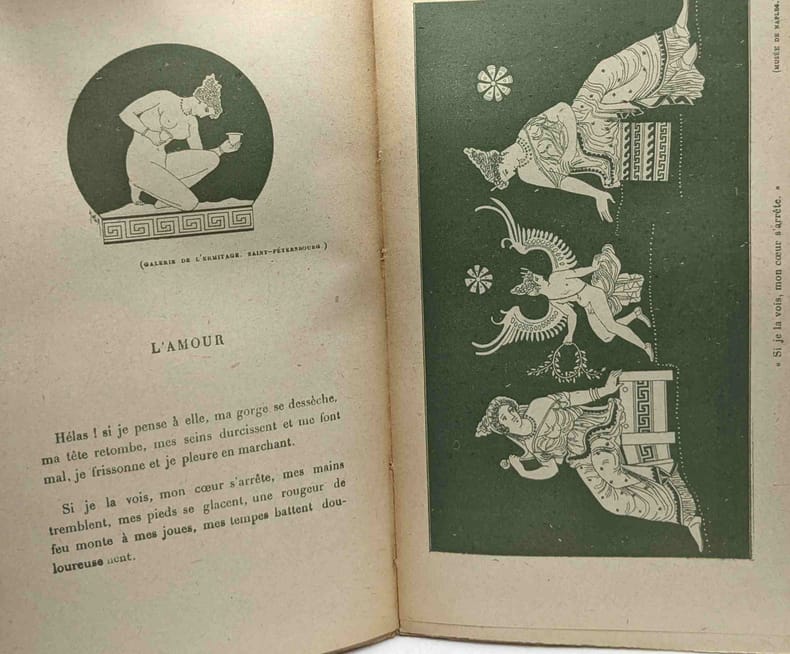
Louys had a number of aims and targets in writing Trois Filles. He felt a deep antipathy for the stifling morals and conventions of the Catholic church within which he’d been raised (hence his regular recreations of the pagan faith of classical Greek and Roman seen in several of his works) and it’s clear that the book is, in part, an assault upon many of the sacraments and concepts of the faith: the story features sex in a church, a vicious parody of communion, and a perverse immaculate conception, for example. One of the three daughters, Charlotte, is something of a martyr-figure, and it’s even arguable, I think, that the mother, Teresa, stands as a satanic temptress figure for her trinity of girls. Amongst the other targets for Louys’ derision, alongside casual piety, were French wine snobbery and the general bourgeois mood of propriety.

In addition, the book is deeply literary. There are repeated references to classical and Renaissance and later French authors, such as Clement Marot (1496-1544) or La Fontaine, which readers are expected, implicitly, to know. Some of these sources are quoted, some are parodied and mocked. An obscene passage is attributed to the Humanist scholar Erasmus, which I’m sure he never wrote (although I’ll confess I’ve not checked all 86 volumes of his collected works). One contemporary French writer is condemned as merely deadly dull (just as was the case with the moralist Guy du Faur in Pybrac): after a rather overstimulating session with the mother, Teresa, the student narrator concludes “I took from my library a ‘heady’ novel by Henri Bourdeaux that I had purchased especially for the purpose of calming myself down when I was in a worked-up state.” Bourdeaux (1870-1963) was a lawyer and author known for his traditional Catholic morality and his very correct French style.

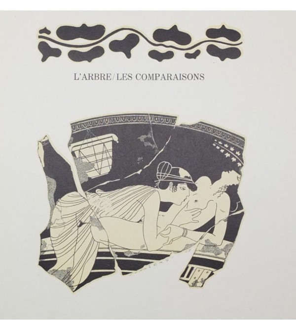
Besides citing classical authors, Louys borrowed themes from them just as he modelled parts of his plot on the Bible. Hence, we find traces of Leda, Pasiphae and Europa in some of the incidents described.

René Ranson’s title page

The book is also ‘metatextual’ before that term was invented. It is repeatedly aware that it is a story, pretending to be a memoire. For example, the student narrator addresses us, as readers, explaining “I would have taken much more pleasure in inventing a story where I could give myself (so easily) a more sympathetic role” or “That’s the trouble with memoires: they get monotonous. In a novel, this kind of repetition can never be excused, but in life it has to be accepted.” When a play is acted out in the final chapters of the book, the artificiality of that make-believe within the wider pretence of the story-telling is continually highlighted, the use of dramatic jargon constantly reminding us that it is all invented and staged: for example “Teresa probably did not know that she had introduced a prosopopoeia into her speech, but there is no need to know the figures of rhetoric to put them… at the service of persuasion. Was it the apostrophe, the hypothesis, the exhortation or the prosopopoeia that won? I do not know…” Very evidently, this sort of passage is not part of standard work of pornography.

The text can be understood at several levels simultaneously, I would argue. The basic plot concerns a student who moves into a new flat next door to Teresa and her three daughters and discovers that all four are sex workers. A few weeks of uninhibited sensual indulgence with the entire family follows, before they suddenly disappear. The novel may be interpreted as a condemnation of the sex trade and its malign impact upon the women trapped within it. At the same time, though, there are elements of the narrative which celebrate female sexual autonomy and women’s right to control over their bodies and their pleasures. Teresa is proud of her physical prowess; she comes over as a powerful and determined woman- except that the downside of her assertiveness is the fact that she dominates her family and is involved in damaging incestuous relationships with all of them. Then again- as he often did- Louys seems to suggest that self-sufficient lesbian households may represent some sort of social utopia– an ideal of independence and happiness. Yet he also interrogates lesbian or bisexual identity, perhaps ultimately tending towards a position that sexual fluidity is a more accurate way of understanding individuals.

On its face, Trois Filles may appear outrageously, shockingly pornographic, but I think it’s plain that any text that casually mentions Jesuit preacher Louis Bourdaloue, Roman poet Tibullus, the Greek playwright Aeschylus, Alexander the Great, Melisandre, and the painter Ingres, has depths and intentions that are not instantly obvious. The complex and multi-faceted nature of Trois Filles means that we are constantly left unbalanced by it, not quite sure of Louys’ meaning, uncertain whether he is playing a game and always returning to the text to uncover new layers of significance.

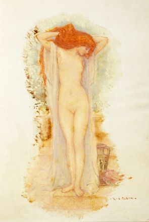
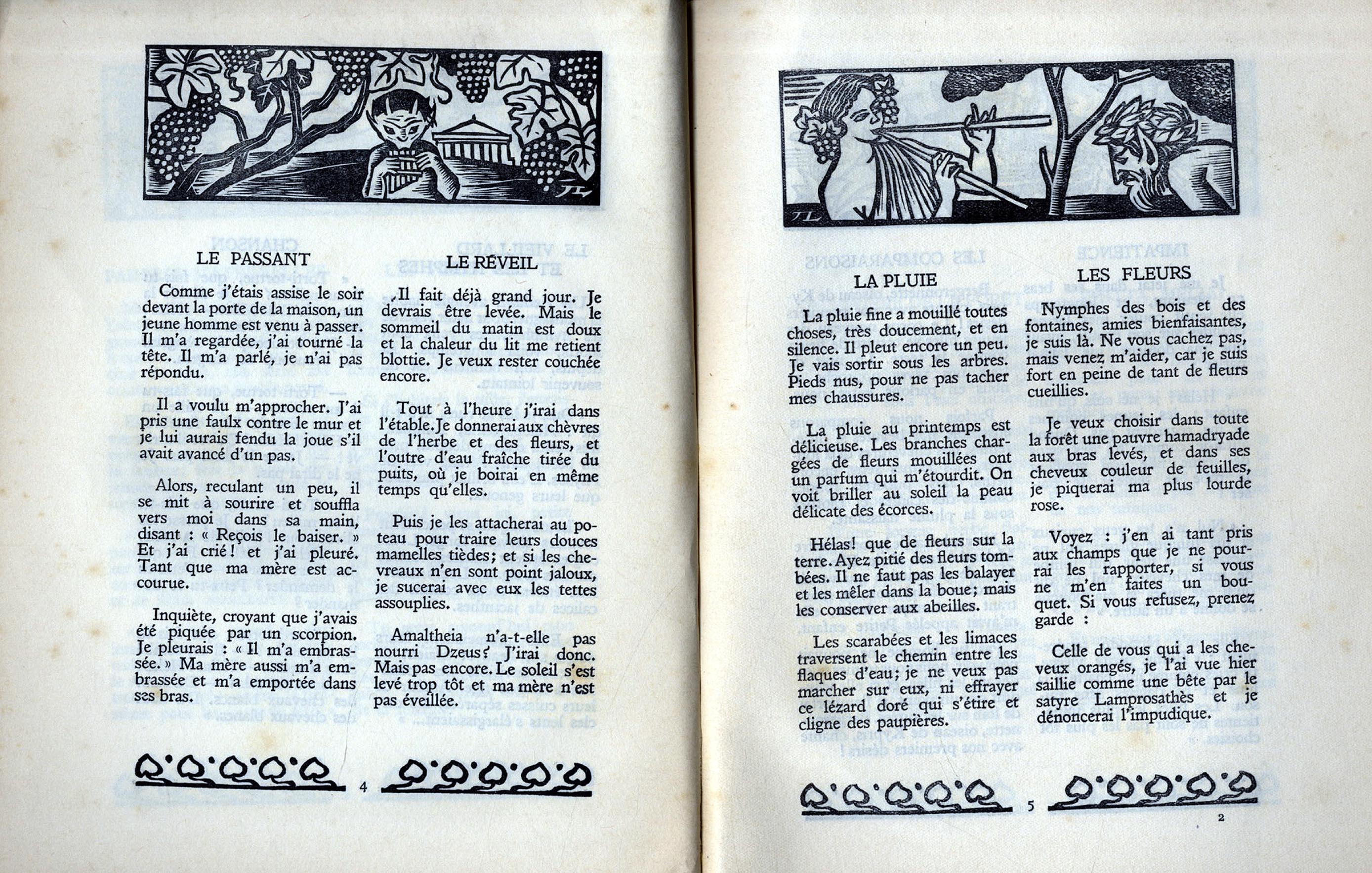
As ever, I find the novel’s bibliology as fascinating as the book itself. Illustrated editions proved extremely popular with publishers and several artists whom we’ve already encountered before, because of their work on texts by Louys, were commissioned to provide imagery. The first edition of Trois Filles was released by Pascal Pia in 1926, with twenty plates by Louis Berthomme Saint-Andre. Further illustrated editions followed in due course: in 1930, with plates by Andre Collot; in 1935, illustrated with sixteen etchings by Marcel Vertes and in 1936, with 34 watercolours by René Ranson (1891-1977). Ranson was one of the most important designers at work during the interwar heyday of the Parisian music hall, working for the Folies Bergère between 1924 and 1932. Renowned for his draughtsmanship, he was a painter, illustrator and costume designer as well. Ranson also supplied designs to the Paris Opera, and for several film studios, including Fox, Pathé and Paramount. Over and above his theatrical work, Ranson painted glamour or pin-up nudes and provided plates for works such as Baudelaire’s Fleur du mal. In past posts I’ve remarked on the frequency with which cartoonists and caricaturists found work as illustrators- and, for that matter, how often the skills acquired in illustrating children’s books might be transferred to the distinctly adult content of the works of Pierre Louys. René Ranson demonstrates how theatrical and costume designers might find additional work in book illustration; other examples I’ve noted previously include George Barbier, Louis Touchagues and Andre Dignimont. All of them surely deserve our respect for their multi-talented ability to turn their hands to almost any artistic commission offered to them.

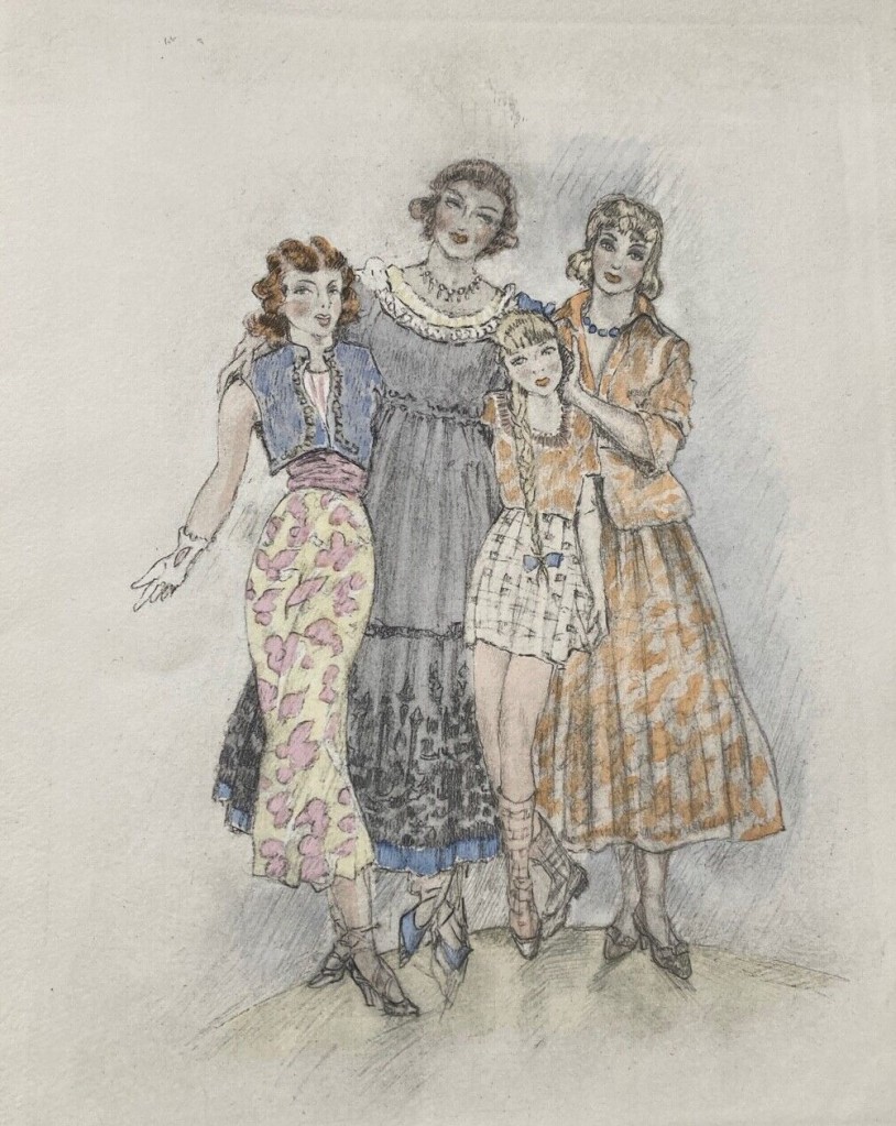
After the end of the Second World War, further editions of Trois Filles followed: Jean Berque provided sixteen plates for an issue in 1955 and, late that same year, Edouard Chimot also illustrated an edition with a dozen plates (see head of page for the family in their best ‘New Look’ dresses). Then, in 1960, an edition illustrated by Rojan was published. Finally, as I have mentioned several times, a version illustrated by graphic novel artist Georges Pichard appeared in 1980. In all these cases, the illustrators were faithful after their own style to the text they were commissioned to work upon, meaning that in most cases the plates are not really suitable for publication on WordPress. This explicitness can- as I’ve suggested- have its own implications for the text that the images accompany. Pichard, used to multiple frames in cartoon strips, designed an impressive fifty-three plates to go with Louys’ book. The sheer number of these, coupled with his graphic style of strongly drawn images, has the effect of underlining the more bleak and depraved aspects of the book. His monochrome plates emphasise the elements of tragedy and desperation in the narrative- something that Chimot’s and Ranson’s very pretty coloured illustrations definitely do not do.

This post is a simplified version of a longer, fully annotated essay on the novel that can be downloaded from my Academia page. I have also written there in detail on Louys’ attitudes towards religion. For readers who are interested, several translations of the book are readily available, the most recent being Her Three Daughters, available from Black Scat books (published December 2022). See as well my Louys bibliography and details of my other writing on the author.

The cover of Pichard’s edition

Hans Makart- nymphs & centaurs

Abundantia, 1870

In the past I’ve discussed quite a few British neo-classical painters such as Alma-Tadema and John Collier. Here I wish to draw attention to an Austrian artist in the same tradition, the hugely influential Hans Makart (1840-84). Makart was a prolific history painter, designer, and decorator in the ‘academic’ tradition and his work had considerable influence on the development of art in Austria-Hungary, Germany and beyond. The image below is a fairly standard example of late nineteenth century classicism- the school of women in togas on marble terraces, but Makart developed beyond this into something more imaginative and interesting. There was also an orientalist strand to his work, as demonstrated by several portrayals of Cleopatra and other ancient Egyptian women- see the image below; this too very typical of the period. Both ancient Rome and Pharaonic Egypt will have appealed to the artist because, as we shall see, they enabled him to indulge his taste for lavish colours, opulent ornamentation- and naked women.

Summer
Cleopatra’s Nile Hunt

Makart was born in Salzburg, the son of a failed painter, and began his artistic training at a remarkably young age at the Vienna Academy (1850-51). Classicism was the predominant style, with the emphasis on clear and precise drawing and the modelling of the human form in obedience to the principles of Greek sculpture. The young Makart, sadly, was a poor draughtsman and didn’t enjoy the continual drawing from statuary and from life- nor did his instinct for colour and flamboyance fit well with his teachers’ rather austere view of classical art. His teachers considered him to be lacking any talent or promise and he was dismissed from the Academy. Undeterred, the youth travelled to Munich for further training and thence to London, Paris and Rome. He developed a painting style that emphasised colour and drama; his work attracted attention when he began to exhibit and in 1868, when the Austrian emperor bought his version of the Romeo and Juliet balcony scene, his future was secured. Makart was encouraged to settle in Vienna and was provided with a studio. He’d asked for a suite of rooms but was given an abandoned foundry. This unpromising location had the advantage of size (to accommodate his vast paintings) but it was not initially appealing. Undeterred, Makart furnished and decorated it with artifacts and ornaments in the showy and lavish manner that became synonymous with his work. Those who liked to snipe at this upstart’s success labelled it a Trödelbude (junk room) or Möbel-Magazin (furniture warehouse), but it became a key destination for anyone visiting the imperial capital. The salon was regarded as such a “wonder of decorative beauty” that it became the model for the most tasteful reception rooms in private homes in Vienna. Makart thereby managed to make himself the foremost figure in cultured life in the capital and to develop the old factory into the vibrant social rendezvous for writers, the rich and the nobility- the venue for the best parties in the city.

Triumph of Ariadne, 1874

In the Austrian imperial capital Makart painted portraits but also practiced as a costume, furniture and interior designer (a practitioner of the idea of the gesamtkunstwerk I’ve mentioned before). As well as private clients, his work was commissioned by the royal family and to hang in public buildings and in 1879, doubtless with an irony he relished, he was made a professor at the Vienna Academy. Sadly, though, Makart died just five years later, aged only 44, still at the peak of his celebrity and influence.

Allegory with Sea Nymphs

Hans Makart’s work gave rise to a so-called ‘Makartstil’ (Makart-style) which shaped Viennese culture. He was known popularly as the ‘magician of colours,’ for it was the design and look of his work that was important above all. His paintings tended to be very big and his themes were typically dramatic and allegorical, their subjects being drawn from European history and mythology. As such, he was considered to be the Austrian rival to the French William-Adolphe Bouguereau– and their pictures have much in common in both subject and flamboyant style. In fact, many of Makart’s contemporaries objected to precisely what links him with Bouguereau- his excess of nudes, introduced in historical scenes where they were unjustified. The theatrical scale of his canvasses was another target for professional contempt- although this actually reflects those ‘old masters’ whom he admired, such as Rubens.

Faun & Nymph
Nymph & her Children

It is Makart’s often over-the-top mythological paintings that I prefer. The society portraits and the murals for grand buildings are generally far less inspired or interesting- but his nymphs and goddesses can have a natural energy I enjoy. The artist’s instinct for sensuality, which many contemporary artists liked to sneer at, were ideally suited to this subject matter. I first came across Makart’s work when I was writing my book on The Great God Pan- and I prefer his vision of Arcadia to Bouguereau’s. On the whole, Makart’s renditions of nymphs and satyrs are a good deal less frenetic and a lot more pastoral than the Frenchman’s.

Faun & Nymph (Pan & Flora)

The painting that really launched Makart’s career in 1868 was Modern Cupids, which was exhibited in Munich and attracted considerable attention. This triptych is painted against a striking a gold background that transports the viewer to a mythical twilight.  The central, vertical, panel of the three depicts a triumphal procession of nymphs and young satyrs. The main, probably female, figure in this group has a noticeably and disturbingly mature face on a youthful body.  In the two side panels, nymphs are shown dancing in flowing gowns.  Some of these girls are distinctly juvenile, although in the left-hand panel two of the nymphs are passionately kissing; a third nymph beside this couple wears a looser chiton or toga which reveals to us her bare back and a glimpse of bosom and another in the background cradles a baby.  All these details mean that we are left slightly unbalanced by the youthful looks, adult clothes and hair styles, pierced ears and mature behaviour.  All the figures, meanwhile, are surrounded by abundant nature, so that the main idea Makart seems to be conveying is that these beings are manifestations of the natural world, vigorous, fertile and ever-renewing.  The ambiguity of the nymph as either girl or woman is a traditional aspect of these minor divinities; from a distinctly British perspective, too, the old head on a young body puts me in mind of the changeling child, an elderly faery swapped for a human infant. Due to these elements, the triptych as a whole feels unsettling: nature is depicted, but it is not fully natural.

Hans Makart, Modern Cupids, 1868, left hand panel
Centaurs in the Forest

That said, Makart also captured the violent vigour of the centaurs. As I have described in my book, The Woods are Filled with Gods, they share with the satyrs an irresistible desire for nymphs, but this is combined with huge strength and speed, as well as an irascible temperament, which can make them dangerous adversaries. The Renaissance and old master influences on Makart are often apparent- the battle between the lapiths and centaurs, for example, has a fine pedigree, stretching from the Parthenon’s marble friezes through Piero di Cosimo, Jacob Jordaens and Luca Giordano to the late nineteenth century (and, in fact, beyond- for instance proto-surrealist Giorgio de Chirico in 1909).

Battle of the Centaurs & Lapiths
Nessus Abducts Deianira, c.1880

In addition to the direct impact that Makart had on art and culture in Vienna, his position at the Academy and the ubiquity of his work inevitably meant that he influenced younger painters and designers. Many of those, just as inevitably, rejected what he stood for. Gustav Klimt is a prominent example of such an artist; nevertheless, he always maintained his respect for Makart, whose influence is clear in Klimt’s early work. More generally, the decorative and sexual aspects of Austrian Art Nouveau have been traced back to ‘Makartstil.’ This impact notwithstanding, Makart’s reputation faded swiftly, so that an artist who was, in his lifetime, more famous and prestigious than many of the leading figures of French art, is now scarcely known.

For more information on Victorian era art, see details of my book Cherry Ripe on my publications page.

The Nixies (Water Sprites) & the Tiger, c.1870

George Barbier- art deco designer & illustrator

Barbier, Cleopatra, 1912

Georges Barbier (1882-1932) was one of the great French illustrators of the early twentieth century. His style marked the transition from art nouveau to art deco. Barbier was born in Nantes and studied art at the city’s Ecole Regionale du Dessin et des Beaux-Arts. In 1908, he moved to Paris to study at the École des Beaux-Arts; his principal teacher was Jean-Paul Laurens, an academic history painter who was also father of Paul-Albert Laurens, another illustrator of Pierre Louys.

During the early years of his career, after his graduation in 1908, Barbier worked under the pseudonym of Edward William Larry, but in 1911, as his career became more established following the first solo exhibition of his work, he reverted to his real name, albeit Anglicised to George.

illustration for Baudelaire’s Poesies, 1926

After Barbier mounted his first exhibition in 1911, his work became very fashionable and was much in demand. He received commissions to design costumes for the cinema, theatre and ballet- such as the Ballets Russes and, with Erté, for the Folies Bergère– to illustrate books, for the design of jewellery, glass and wallpaper patterns and to produce haute couture fashion illustrations for companies such as Cartier and Arden, being especially noted for his head-dress designs. In addition, Barbier wrote essays and articles for the prestigious Gazette du Bon Ton and supplied illustrations to magazines such as Vogue and its predecessor Le Journal des Dames et Des Modes, L’Illustration, La Vie Parisienne and Gazette du Bon Ton– the latter along with other notable artists such as Charles Martin and Umberto Brunelleschi.

Laclos, Les Liaisons dangereuses

For the next two decades, Barbier led a group of fellow students from the Ecole des Beaux Arts which was known by Vogue as ‘The Knights of the Bracelet,’ a tribute to their fashionable and flamboyant manners and style of dress. The Knights included Charles Martin, whose design of the stage performance of Bilitis has been reproduced on another page.

Barbier’s quite early death, at the age of just 50, seems to have meant that his work fell into obscurity for some decades. Perhaps this neglect was compounded by the fact that he ‘only’ worked on fashion and set designs, more transitory and less elevated forms of art. He has, however, in more recent years been recognised for the skilled artist that he was.

Les Dames Seules, 1910

Barbier’s book illustrations are in a distinctive art deco style, often with a hint of Greek classicism- which he greatly admired (alongside the work of more traditional French artists such as Watteau and Ingres). He made use of ‘pochoir,’ a technique which he championed and which was inspired by Japanese wood-block printing . It involved single layers of vivid colour being added by hand to a lithograph using a stencil (a precursor of the silk screening) and its use provided his illustrations with a vibrancy and depth which could not be equalled by printed colour alone. The artist’s interest in the arts of Japan may also be seen in his fashion designs (for example, for a Blouse Japonais, 1913) and in some of his plates for Pierre Louys’ Chansons de Bilitis– as we see from the parasol and cherry blossom below.

Les Chansons de Bilitis, 1922

Between 1916 and 1921 Barbier produced a series of ‘Almanacs’ entitled La Guirlande des Mois (The Garland of the Months). These proved so popular that they were followed up by larger format portfolios of fashion plates entitled Falbalas et Fanfreluches (Ruffles and Frills)- see cover illustrated above.

Les Chansons de Bilitis, 1922

Amongst Barbier’s illustrative work were several books about ballet, as well as literary works by Gautier, Alfred de Musset, Paul Verlaine’s Fetes Galantes and Baudelaire’s Poesies. His work on Laclos’ Liaisons dangereuses (1929 & 1934) indicate the artist’s happiness to engage with erotica. His designs for the 1922 edition of Pierre Louys’ Chansons de Bilitis have been noted previously, but deserve further attention for their confident style and rich colouring. Bilitis is, of course, a further work of erotica with a strong lesbian element- just like Laclos. It has been suggested that Barbier was gay and, certainly, his designs indicate an awareness of the thriving lesbian culture with Paris during this period- examples being images such as Dames Seules (1910, above) and an ‘Amazone’ illustrated as part of a series of Costumes Parisiens in 1913.

A major attraction of Bilitis, no doubt, was that it gave Barbier an opportunity to indulge his interest in classical art, which he is said to have deepened by studying the collection held by the Louvre. I have noted already the presence of Japanese motifs, but his love of Greek and Etruscan red and black vases must surely be reflected in the last two designs illustrated here.

At the time of his death, Barbier was working on an edition of Louys’ Aphrodite. The 52 planned plates were completed by Georges Lepape, but it was only in 1959 that Pierre Bouchet engraved these and the new edition was finally published. The results are just as luscious and colourful as the version of Bilitis.

Barbier, Aphrodite

Other illustrators of Pierre Louys have been discussed in postings on his various major books, as well as posts dedicated to particular artists. For more information on his work, see my bibliography for the author; see too my essays on his writing on my books page.

La Lune aux yeux bleus (The moon with blue eyes); from Les Chansons de Bilitis, Part 1

Illustrators of ‘Bilitis’- in the ‘Classical’ style

Raphael Collin

I have described before how Pierre Louys first found success as an author with his Chanson de Bilitis (Songs of Bilitis) in 1894. It was not his first book, as he had preceded it with Mines des Courtesans, a translation of Roman author Lucian, but it was his first work of creative fiction. The book claims to be ‘translated from the Greek’ on its title page, but it’s not- some of it is certainly stolen or adapted from the Greek (especially Sappho) but it is largely the author’s own work. Over the ensuing 130 years, Bilitis has proved persistently popular, as is reflected in the astonishing number of editions that have been published- which works out (very roughly) at one every three or four years. This remarkable popular demand has affected the way I decided to deal with my discussion of the illustrators of the book. There are so many that a single post was not feasible: instead, I divided them fairly arbitrarily into ‘styles’ to share them out.

Raphael Collin

Here, I consider those illustrators who chose to go for a ‘classical’ or ‘Greek’ style, authentic to the subject matter. Just as Bilitis is a pastiche of ancient Greek verse, these artists, in pursuit of a sort of authenticity (or to reinforce the author’s own subterfuge) elected to imitate historical precedents, such as the decorations of Greek vases and cups. Some scholars were actually taken in by the Songs when they first appeared (even sniping at Louys for poor translation!) but with these images we can simply admire the artists’ skills.

Frontispiece by Laurens, 1898

An early edition from 1898 was illustrated by Paul-Albert Laurens, who also worked on an edition of Louys’ Leda. As the frontispiece shows, his contributions bolstered the impression the author wanted to give that this was an authentic rediscovered Greek work.

Raphael Collin
Raphael Collin

One of the earliest illustrators of the text was Louis-Joseph-Raphaël Collin (1850-1916), who worked on an edition of 1906 for Pierre Zucker. Collin was a fairly conventional academic painter and ceramicist (although he was influenced by the new styles of Impressionism and by Japanese art, which was being discovered during the late nineteenth century). He studied in Paris with Bouguereau and Cabanel and began to exhibit his own work from 1873, soon gaining major commissions for murals in public buildings (such as the Sorbonne and the Odeon). All the same, much of Collin’s work features nudes in landscapes and classically inspired scenes such as Nymph and Faun, Nude Lying with Swan (i.e. Leda), Daphnis and Chloe, Four Nymphs and various ‘mythological scenes.’ He also illustrated an edition of Longus’ Daphnis and Chloe in 1906, so these interests all made him an obvious choice to tackle Bilitis. Collin’s engraved plates are mostly rather staid and conventional very similar to those of James Fagan, who illustrated an English edition of 1904) and the strongly lesbian theme of the book only subtly suggested- although, even in his delicate way, Collin certainly does not avoid it in his 33 plates. He obviously drew heavily upon classical and Renaissance sculptures and paintings of Aphrodite and the like (and more recent imitations of these) for their poses. The image that heads this post, though, is more inspired: it seems to mimic a faded and damaged mural, or perhaps a fragment of painted material or papyrus, as if it too is a relic of the time of Bilitis (about 600 BC). It might be thought of as a copy of a manuscript of her poems or- better still- as part of the decoration of her tomb, for the entire book by Louys purports to have been copied from the inscriptions in Bilitis rediscovered burial chamber. 

Two other remarks: the two dancing girls shown above are Glottis and Kyse from the book (songs 47-49), whom Collin has made rather older than Louys suggests. Secondly, Collin also worked on an edition of Louys’ Aphrodite in 1909, and his colour plate of the dead Chrysis is one of the few illustrations of the book that so honestly confronts the tragedy of its conclusion.

Here too I’ll note the illustrations prepared by the Italian Aldo Pagliacci (1913-90) for a 1960 edition of the book. Generally Pagliacci’s oil paintings might be characterised as a combination of Daliesque surrealism with a quattrocento Italian Renaissance style. However, the frontispiece for the Louys book seems to me to imitate a faded wall painting, with its apparent stains in the plaster, rather like Collin’s. The image may be presumed to represent Bilitis and her partner, Mnasidika, meeting some other women. Pagliacci has taken care to indicate the age disparity between the pair, which not all artists do- although he’s exaggerated it at the same time.

In 1906 the artist called ‘Notor’ worked on another new edition of the Songs. His actual name was Vicomte Gabriel de Roton (1865-1964); son of a postmaster, he came to manage a vineyard on behalf of his wife’s family whilst developing his own interests as an author, illustrator, archaeologist, traveller, journalist and Hellenist: his published works included Woman in Greek Antiquity (1901), Dance in Greek Antiquity (1911) and translations of Homer’s Iliad and Odyssey. Roton illustrated these last two books himself, basing his designs on painted Greek vases, and he also provided illustrations for other ‘classical’ texts such Fénelon’s Adventures of Aristonoüs, Charles Marie Zévort’s translation of Lysistrata in 1898 and, of course, Bilitis. His work is highly authentic, but also very respectable, so that his plates for neither Lysistrata nor Bilitis reflect the sexual nature of the texts.

In 1928 a small selection of only 16 songs from the original book were translated into Latvian as Bilitis Dziesmas by Janis Sudrabkalns. This selection was published in limited fine art edition with 16 full-page plates and a frontispiece designed by Sigismunds Vidbergs.

Sigismunds Vidbergs (1890-1970) the most notable Latvian representative of Art Deco graphic art, one of his country’s most original artists of the twentieth century. He was a painter, decorated ceramics, designed posters and illustrated books and magazines. His subject matter included historical and religious scenes, urban and rural life, portraits and studies of architecture and nature. However, Vidbergs is best known for his erotic and risqué themes. For Bilitis, he reproduced Greek motifs in Art Nouveau style drawings pen and ink.

In 1930 Jean Lebedeff provided wood cuts for a new edition of Bilitis. His strong, simple designs certainly bring out the antique and pagan nature of the setting of the book, as the Pan and fauns below demonstrate, but- once again- there is no real reflection of the true nature of Louys’ text itself.

The otherwise obscure artist Gilles Marie in 1960 designed a series of etchings for Bilitis. With their decorative borders, the two-page end papers are both striking, classical looking and (in the case of the rear papers) suitably erotic.

I close with two artists who I can’t quite fit anywhere else. Jean Jules Dufour (1889-1973) was just beginning his career when he was commissioned to illustrate a 1934 edition of the book. He worked in a variety of styles and media, producing etchings, woodcuts, pencil drawings and oil paintings. Dufour focussed on landscapes, street scenes, architectural images and illustrated books. His black and white images are vaguely Greek inspired, notably the cover, whilst the other plates showing figures have a kind of stillness and monumentality that remind me of statues.

Lastly, I include the Argentinian Raul Soldi whose illustrations for a 1945 edition of Bilitis are presented in a variety of styles: there are simple line drawings, black and white etchings and colourful plates based on bright watercolours that are loosely impressionistic. Some of the images are quite surreal, with bodies covered with eyes or mouths, but he is frank about the lesbian content and the attractive cover, framed by its column and pediment, is a lovely depiction of Bilitis and her wife.

In summary, what especially strikes me is how all of the illustrators featured here adopted a style imitative of ancient Greek ceramic decoration- and yet managed to produce such different interpretations. Each individual artist is, of course, different and their output is uniquely theirs, but the broad spectrum of difference in their responses once again highlights how their visions may impact upon those of readers. They all choose to emphasise varying elements in stories (or even within the same scenes) and their editing of their work (frequently unconscious, no doubt) accentuates this. As I have observed several times before, their departures from the text will inevitably shape the reader’s perceptions of it.

Leon Bazile Perrault- cats, cupids & cloying cuteness?

The Wood Gatherer

Léon-Jean-Bazile Perrault (1832-1908 ) was French artist who catered to affluent bourgeois taste by producing beautiful pictures to decorate their homes. Inspired by his teachers, François-Édouard Picot and William-Adolphe Bouguereau, who were both master painters in the Academic style of the nineteenth-century, Perrault perpetuated their emphasis upon mythology and idealisation. Like them, too, Perrault drew upon the eighteenth century artistic tradition of painters such as Jean-Antoine Watteau and François Boucher, who both painted idealised subjects as well.

The flower seller (1887)

Léon-Bazille Perrault was born to a poor family in Poitiers. At the age of fourteen he began drawing lessons as a way of earning extra income for the household; he displayed considerable talent and was soon helping to renovate local churches. Winning a drawing competition when he was 19 enabled Perrault to afford to travel to Paris to begin his formal artistic training, which began under Picot and was continued with studies under his friend Bouguereau at the Ecole des Beaux Arts. Like Munier before him, Perrault was deeply inspired by his teacher and the latter painter’s influence certainly shows in their shared style and subjects.

Narcissa

Perrault’s career began during the Second Empire of Napoleon III. This was a period marked by a middle class taste for works of art that were superficially beautiful rather than intellectually demanding or avantgarde. Painters such as Perrault, Bouguereau, Cabanel and Munier all supplied that market. Like his contemporaries, Perrault met this commercial demand with mythological figures, pictures of children, nudes and some genre scenes. What proved popular at exhibitions and sold best as either paintings or as engraved reproductions were pictures that offered an idealised version of contemporary life. Nonetheless, these paintings were also awarded prizes at exhibitions; Perrault received a number of awards and professional honours for his work.

The Lumberjack’s Daughter

Just like Bouguereau and Munier, a very important element in Perrault’s output were his pictures of children. A contemporary article in the magazine The Century described how:

“…it is not extravagant to add that no painter of children, from the time of Albano to the present day, has more perfectly rendered the inner structure and subtle modelling of surface, the peculiar quality and graceful action of a child, in perfect physical beauty and health; and all artists know that children are the most difficult of subjects.”

‘The Child in Art: Perrault’s Le Reveil d’Amour,’ The Century, vol. 46, 1893.
En penitence (In disgrace)

Whether Perrault’s young subjects were depicted playing a game, working in the countryside or were located within some mythological story and setting, they were all highly sentimental images which played upon the Romantic stereotype of childhood: its innocence and vulnerability, prettiness, endearing naughtiness and charming imitations of adult occupations. This can be seen particularly in Perrault’s numerous paintings of sleeping babies, angels, putti and cupids (pursuing a theme already profitably exploited by Bouguereau) or in his images of maternal or sisterly tenderness, which again feature sleeping babies or dependent toddlers and appealed to the same market. Also, like Munier, Perrault played upon his buyers’ parental emotions, as with En penitence (In disgrace) seen above; we as viewers are involved and appealed to by the image: the girl in her pure white shift seeks our comfort for some misdeed. There was, too, shameless sentimentality and schmaltz in the manner of Munier. Perrault painted a number of pictures of girls with cats and kittens, which surely meant to delight and charm in a very cynical way.

Girl with Kittens (1886)
Tenderness

Perrault’s images fitted into the ‘Romantic’ view of the child as pure and innocent, yet he added another layer to this. Just like Bouguereau and Munier, Perrault allowed a hint of adult awareness to creep into his images. Girl with Dove (seen below) is very much in the Greuze style in which the soft vulnerability of the bird is knowingly juxtaposed beside the exposed flesh. The dove is white and pure; her shed shift is white and pure and yet there is an undeniable subtext in the plump bird pressed to the chest. Boucher (mentioned earlier) also did the same in the eighteenth century as in his rather more blatant Venus with Two Doves. Audiences were expected to spot these resonances- which they must have done too in the painting The Education of a Sparrow (1894)- for which, see below. Doubtless, too, Perrault’s At the Fountain was an almost obligatory nod to Greuze’s Broken Pitcher, though sanitised and harmless. We might note as well how similar his girls look to those of his mentor and peer Bouguereau and how- again like his master- the girls are often found perched on convenient blocks of stone.

Girl with Dove
At the fountain
After the Swim

As with Bouguereau, Perrault’s countryside could be idealised- witness the classical fountain where the girl is filling her jug (above)- but, despite the risk of putting off buyers, he seemed readier to acknowledge the life of toil that poor rural children faced: The Wood Gatherer and The Lumberjack’s Daughter both have heavy burdens to carry. Away from Home (1879) shows a girl with a violin- a street musician- standing outside in the snow; Out in the Cold (1890) depicts a brother and sister shivering on a frosty step in the street (see too Les Jeunes Mendiants). Bouguereau painted very similar subjects, but made them sunny and hopeful. Perrault could be more honest- yet then again, The Apple Picker (1879) and The Snack (1880) make basic country fare look simple and wholesome- rather than indicative of poverty- which the girls’ lack of shoes implies.

Equally, despite the occasional hints that a living has to be earned, there is also plentiful time for picturesque and endearing play, by the sea or by pools, as we see in After the Swim (above), in which the little girl has gathered a bouquet and crosses her feet in an endearingly awkward manner. Like Bouguereau, Perrault often painted gypsy girls, and they are rendered as exotic and colourful creatures, wearing distinctive costumes and introducing an orientalist element into his work. Unlike Bouguereau, though, his subjects far less often engage with the viewer in a knowing two way exchange (although see Girl with Kittens). His master would have exploited far more the opportunities for suggestiveness presented by the hints of bared flesh in The Mirror of Nature, Crossing the Stream or The Wood Gatherer. Instead, for Perrault white dresses or blouses and flowers stress the Romantic notions of natural and pure innocence (Spring or A Crown of Flowers).

For more information on Victorian era art, see details of my book Cherry Ripe on my publications page.

The Mirror of Nature
Crossing the Stream
Spring
Education of a Sparrow

To summarise, Perrault was described in the 1893 article in The Century as “a polished French gentleman… suave and affable in his manner, tall and vigorous, a serious worker… his studio is richly and picturesquely furnished, after the usual luxurious manner of successful Parisian artists. It is, however, not a place of leisure, for Perrault is one of those modern painters who do their ten hours a day of hard work. He was the air of a well-to-do, practical man of the world.” He had learned the work ethic of his mentor Bouguereau and had realised that long days at the easel, giving the public what the public wanted, meant commercial success.

See too my book on nineteenth century painting on the books page.

William-Adolphe Bouguereau: glossy nymphs and peasant girls

Nymphs & Satyr (1873)

William-Adolphe Bouguereau (1825-1905) was a French academic painter. In his realistic-looking paintings, he often used mythological themes, giving modern interpretations to classical subjects, with an notable emphasis on the female human body. As one of the principal Salon painters of his generation, he was reviled by the Impressionist avant-garde so that, by the early twentieth century, Bouguereau and his art had fallen out of favour with the public, although he has been rediscovered since the 1980s.

The Birth of Venus (1879)

Bouguereau was born in La Rochelle to a family of wine and olive oil merchants. In 1839, he was sent to study for the priesthood at a Catholic college in Pons, where he learned to draw and paint from Louis Sage, who had studied under Ingres. Bouguereau then reluctantly left his studies to return to live with his family in Bordeaux, where he met a local artist, Charles Marionneau, and commenced formal training at the Municipal School of Drawing and Painting in November 1841. He was the best pupil in his class and decided to become an artist in Paris. To fund the move, he sold portraits, finishing 33 in three months- early evidence of his formidable commitment and work rate.

Before the Bath (1900)

Bouguereau became a student at the École des Beaux-Arts in 1846. To supplement his formal training in drawing, he attended anatomical dissections and studied historical costumes and archaeology. He was admitted to the studio of François-Édouard Picot, where he studied painting in the academic style, an approach that placed the highest status on historical and mythological subjects. Absorbing these attitudes, Bouguereau determined to win the Prix de Rome, which would gain him a three-year residence in Rome, where, in addition taking formal lessons, he could study Renaissance art at first hand, as well as Greek, Etruscan, and Roman antiquities.

Sewing (1898)

After three attempts, the young student won the Prix in 1850 and was able to move to Rome in January the following year. Over the next three years, Bouguereau explored the city and country, making sketches and watercolours as he went. He also studied classical literature, which influenced his subject choices for the rest of his career. He particularly revered Greek sculpture, Leonardo da Vinci, Raphael, Michelangelo and Titian. He also admired Rubens and Delacroix. An early reviewer observed how the artist had absorbed the lessons of the Italian masters: “Bouguereau has a natural instinct and knowledge of contour. The rhythms of the human body preoccupy him, and in recalling the happy results which, in this genre, the ancients and the artists of the sixteenth century arrived at, one can only congratulate [him] in attempting to follow in their footsteps … Raphael was inspired by the ancients … and no one accused him of not being original.” Raphael was a favourite of Bouguereau and he took this review as a high compliment. One of the requirements of the Prix de Rome was to complete a copy of Raphael’s The Triumph of Galatea. In many of his own works, he was to follow the same classical approach to composition, form, and subject matter whilst most of his religious paintings, crucifixions and Madonnas, are high sheen imitations of Renaissance originals.

The Little Marauder (1900)

Bouguereau’s career flourished after his trip to Rome. He received contracts to paint murals and other decorations in expensive homes, was commissioned to paint Emperor Napoleon III in 1856 and undertook decorations for the chapel of the newly constructed Saint-Clotilde in Paris. He was awarded the Legion of Honour in July 1859- the first of several honours. After this recognition, Bouguereau continued to receive prestigious commissions for portraits, decorations to private homes, public buildings, churches and from European royalty and his work was held in high regard (twelve of his paintings featured in the Paris Universal Exhibition of 1878 for example).

The Broken Pitcher (1891)

Bouguereau was a staunch traditionalist in both technique, style and content. His genre paintings and mythological themes were modern interpretations of Classical subjects, both pagan and Christian, with a focus on nude females. The idealised world of his paintings brought to life goddesses, nymphs, bathers, shepherdesses, and Madonnas in a way that appealed to wealthy art patrons of the era. He also used some of the religious and erotic symbolism of the ‘old masters,’ such as Greuze‘s symbol of the “broken pitcher” connoting lost innocence (see above).

Au bord de la mere

I first came across Bouguereau through his extravagant paintings of cupids, nymphs and satyrs, fantasies that are full of swarms of luscious flesh, but I then discovered that he also worked on more personal paintings, with realistic and rustic themes. There is a huge contrast between the vast, classical canvases with their writhing naked nymphs, and his more intimate studies of peasant girls working or at play in the countryside. These are clearly firmly positioned within the ‘Romantic’ child genre of image, symbolising the prevailing idea of childhood innocence to such an extent that the realist elements in the pictures- the need for children from poor families to labour alongside their parents- are very much diluted or glossed over (on the formulation and meanings of the ‘Romantic’ view of childhood, see Anne Higonnet, Pictures of Innocence, 1998). The result of Bouguereau’s approach was that representations of leisure time (especially swimming) superseded the harsh realities of essential economic activity. The same activities are repeated endlessly, too: sewing, fetching water, even -in La tricoteuse (The Knitter) of 1884, working with thread at the same time as being by a well…

Girl by Stream (1888)

Bouguereau’s country maids can look winsome whatever they’re doing: whether that’s stealing fruit from neighbours’ orchards or looking guilty having been caught in the act (see The Marauder earlier, Petites Maraudeuses, The Mischievous One or En penitence). Their poverty is always picturesque, so that girls eating frugal meals in the fields, comprising just a hunk of bread, can be viewed affectionately. Bouguereau manages to render everything sweet and sentimental. His beggars (La Mendicante or Loin de pays ‘Far from Home’) aren’t in rags or dirty, for instance. The same is true of his gypsy girls, such as Gypsy Girl with a Basque Drum (i.e. a tambourine) of 1867, Gypsy Girls (1879) or The Bohemian (1890) who introduce an exotic, orientalist element to his catalogue of young females. These figures are barefoot and/ or carry musical instruments; their way of earning a living is precarious but they are again picturesquely poor.

Charming as Bouguereau’s country girls are, it has to be recognised that they all start to look the same. This may be because he made use of just a handful of models and because of the rapidity with which he turned out canvases, but there is also an impression of a clear, preferred ‘type’ comparable to John Waterhouse’s ‘ideal’ girl that you see time and again in his paintings- and even replicated side by side in the picture Hylas and the Nymphs. The work (such as it is) that these girls do is often contrived simply to make them look better. Gathering in harvest sheaves, gleaning, collecting berries, nuts or grapes, churning milk, picking flowers- these all locate the subjects in a natural setting and suggest purity, simplicity and freshness on the part of the model. This is frequently reinforced by their white blouses and dresses, which are always clean, despite their outdoor, labouring lifestyles. This highlights the true nature of Bouguereau’s naturalism and realism: it is frequently quite artificial- as demonstrated by the frequency with which there is a large cube of stone perfectly positioned for his subject to sit or lean upon…

La Gue (The Ford)

Bouguereau also perpetuated the ‘girl on a rock by water’ trope that Thomas Couture seems to have invented. In his hands, the Edenic elements are very clear, although he varies between reflective self-absorption and his preferred pose for most of his models- a direct awareness of our gaze as viewers. This can have the effect of making the observer feel like an intruder upon a private moment (understandably- the subject wished to bathe alone and we have trespassed upon her solitude). Then again, the artist partook of a common trend in art of the period, in that he sometimes made the young country women pictured a little too aware of the viewer. Overall, though, his figures are very saccharine and feel as if they may have been contrived to appeal to as broad an audience as possible.

La priere (The Prayer)
La Frillleuse (The Chilly Girl)
Enfant tenant des fleurs
Child Holding Flowers

From the mid-1870s, Bouguereau taught at the Académie Julian. Many of his pupils followed his academic style, but others went on to reject it- for instance Henri Matisse. We shall discuss other artists who faithfully perpetuated the look and themes of Bouguereau’s work in later posts. This made sense, certainly, for during his lifetime, he was considered to be one of the greatest painters in the world by the academic art community (and the buying public)- yet he was simultaneously loathed and condemned by the avant-garde, who viewed him as a competent technician who was hopelessly stuck in the past in terms of both style and content. Degas invented the term “Bouguereauté” to describe the “slick and artificial surfaces” that characterised his work. It is undeniably glossy and highly finished and even at the time some critics attacked his “feeble mawkishness” as being representative of the terminal decline of the old style of painting. convention.” Bouguereau himself that his work was driven by the demands of the marketplace: “What do you expect? You have to follow public taste, and the public only buys what it likes.”

Historians are divided as to whether Bouguereau simply pandered to the market with his genre paintings, or whether it was his aim to elevate the status of the French peasantry because of his admiration for their nobility and humility. The art historian John House has described Bouguereau’s genre scenes as “broadly idealist… treating his peasant women as if they were Raphael Madonnas.” As I mentioned before, there is rarely any suggestion of tiredness, want or ill-health. Generally his approach to the Naturalist style was highly commercial and there is no suggestion from the pictures that Bouguereau had strong moral or sociological opinions about the position of the rural poor.

For more information on Victorian era art, see details of my book Cherry Ripe on my publications page.

At the Foot of the Cliffs (1886)

Bouguereau was a dedicated painter, often completing twenty or more easel paintings in a single year. He claimed his time was worth one hundred francs a minute- and churned out the genre scenes at a rate that proved this. Even during the last years of his life, he would rise at dawn to paint six days a week and would continue in his studio until nightfall. Throughout the course of his lifetime, he is known to have painted at least 822 paintings, although many have been lost. This very productivity possibly didn’t assist the artist’s reputation, either during his life or after his death in 1905. It suggested mass-produced and uninspired works and with the rise of modernism he fell quickly out of fashion, although his work has been reappraised in more recent decades.

Girl with Bouquet (1896)

Thomas Couture- teacher & trendsetter

Portrait of a girl

Thomas Couture (1815-79) was a French history painter and teacher. Amongst his pupils were such distinguished later painters as Édouard Manet, Henri Fantin-Latour, John La Farge and leading Symbolist Pierre Puvis de Chavannes.

Couture was born at Senlis, but when he was 11 his family moved to Paris. In due course, this enabled him to study at the city’s industrial arts school (École des Arts et Métiers) and later at the prestigious École des Beaux-Arts, where he studied under Antoine Jean Gros and Paul Delaroche. Talented and ambitious, Couture was unhappy that he failed to win the prestigious Prix de Rome competition at the École six times, but he ascribed this not to his own shortcomings but to failings in the school. He was finally awarded second prize in the Prix de Rome in 1837 and this repeated overlooking of his work and his talent left him with a lifelong animosity towards the École des Beaux-Arts (as we shall see).

La courtisane moderne (or, The Thorny Path), 1873

Couture began to exhibit at the Paris Salon in 1838 with Young Venetian after an Orgy (a painting of a rather wan and hungover looking young man). While his early works were anecdotal genre scenes, his earliest true success came with The Love of Gold in 1845 (in which young women appear to be offering themselves to a miserly looking man who hoards a pile of coins), and then with the work often regarded as Couture’s masterpiece, Romans During the Decadence in 1847, for which he was awarded a first-class medal. This ostensibly historical work, inspired by some lines from the Roman poet Juvenal, shows an orgy in a colonnaded room with all the cliches of nudity, wild dancing and over-intoxication that we associate with Imperial Rome. The painting was widely regarded by contemporaries as an allegorical criticism of the contemporary French government. Surprisingly, therefore, it was the government that purchased the huge canvas (which took Couture three years to paint).

Soon after this recognition of his skills, Couture opened an independent atelier (teaching studio) with the intention of challenging the preeminent position of the École des Beaux-Arts for turning out the best new history painters. Like the academicians, though, Couture held the art of ancient Greece and Rome, as well as that of Renaissance Italy and Flanders, in the highest respect and considered them his stylistic predecessors. Beneath his outward iconoclasm, therefore, there were inescapable academic foundations that often makes his set-piece paintings rather formal and lifeless

Bust of a young girl

Couture’s innovative technique gained much attention, and from the late 1840s he received prestigious commissions from the new emperor Napoleon III as well as from the church, which paid for a mural in the chapel of the Virgin in the church of St. Eustache in Paris. The artist’s painting of the Baptism of the Prince Imperial (c. 1856–62), met with mixed reviews and two other public works were never completed. Discouraged by the unfavourable reception of his paintings, in 1859 Couture left the French capital, returning to Senlis, where he painted portraits and decorative paintings for private patrons. After 1871 he opened a new atelier and continued to teach young artists who sought him out. In 1867 Couture further snubbed the academic establishment by publishing a book on his own ideas and working methods called Méthode et entretiens d’atelier (Method and Workshop Interviews).

The Young Musician or Gypsy Girl
Jeune italienne (Young Italian)

In fact, it is Couture’s portraits, character studies and genre scenes that are far more lively and interesting than his great classical canvases. These include simple interior studies, such as the boy with his clay pipe in Soap Bubbles, another idle youth in Day Dreams and the snapshot of provincial life, A Lawyer (or Judge) Going to Court (1859), which shows him striding alone down a street that’s deserted except for a flock of chickens. Working children, such as in Return from the Fields or the Little Confectioner, were simple and honest realist images, but it was in studies of young females that Couture seemed to excel. The gypsy girl and young Italian illustrated above have a certain exoticism, but the painter evidently preferred simpler and more homely scenes.

Study of a young girl
Bust of young woman with bared shoulders

Couture occasionally painted nude women (for example, the poet Baudelaire with his lover, the courtesan Madame Sabatier)- and more often adult male life studies in the classical tradition of Michelangelo- but he seems to have preferred junior subjects. Couture initiated the fashion for a style of painting that I shall term ‘Girls on Rocks by Water.’ His Little Bather is the best example of this, a young girl seen with a demurely down-cast gaze as she sits pensively by a pool or stream. The presence of the apple, entwined as it is with the ribbon of the crucifix she was wearing, sends an interesting message about the girl. She is a young Eve, naked in the lush ‘garden’ of the woodland where she is bathing, but we can draw reassurance from the religious emblem (and, I suspect, her white dress) that she is symbol of purity and innocence and beyond any hint of temptation.

As we shall see, this juxtaposition of the innocent nude and a natural location was to be adopted by several subsequent painters, as it represented an ideal of childhood purity that came to dominate popular painting during the later nineteenth century. I shall return to discussion of this subject, and of the artists inspired by Couture, in subsequent posts. For more information on Victorian era art, see details of my book Cherry Ripe on my publications page.

The Little Bather (1849), The Hermitage, St Petersburg
Nude Study

William Sergeant Kendal- in search of Psyche

Psyche, 1909

William Sergeant Kendall (1869-1938) was an American painter, a man whose life and career took a very male trajectory, it might be argued. He became famous for painting his family, his wife and three young daughters frequently modelling for him (as in Psyche above, for which his oldest girl Elisabeth posed aged 13); then in the early 1920s he began a relationship with one of his students when he was in his fifties and quickly divorced his wife and married his younger lover, having to resign from his teaching position at Yale University at the same time. The late nude below may give some inkling of his passions.

Nude, 1932

From the age of just fourteen, Kendall trained as an artist at the Brooklyn Art Guild and the Art Students League, New York, and at the Pennsylvania Academy of the Fine Arts. After learning the basics of his craft, in 1888 he travelled to Europe to paint amongst the artist colonies of Brittany and study at the Academie Julian and the École des Beaux-Arts, Paris, where he also began to exhibit work. These experiences confirmed his classicist, academic style.

Girl in Blue with a Dog, 1909

In 1892 Kendal returned to New York to set up a professional studio and to begin teaching art. Considerable success and recognition followed so that, by 1913, he was professor and head of the Yale School of Fine Arts. Kendall undertook portrait work, like so many artists, but was especially known for his scenes of intimate domestic life, showing his wife caring for and playing with their children.

After the scandal of his affair with a student, who had also modelled for him, and his subsequent marital breakdown, Kendall retired to the country with his new wife, Christine Herter. He continued to paint for the remainder of his life, even though modernism had made his style of art highly unfashionable. Kendall was a keen rider but two serious falls during the 1930s seem to have hastened his death.

Crosslight, 1913

Besides the scandal of his love life, Kendall also attracted some controversy through his decision to repeatedly paint his daughters nude or partially dressed. He often combined these poses with mirrors, joking that it enabled him to paint two girls for the price of one. Writing in 1998 in the catalogue for a retrospective exhibition of Kendall’s work, critic Robert Austin said of this collection of paintings:

“Americans have never felt entirely comfortable with paintings of the nude. Perhaps Kendall’s nudes were so well liked because they often showed children and were therefore removed from sexual context. Many of the nude paintings are so precisely painted that they approach drawing as closely as painting can. This is certainly one of the reasons why Kendall liked painting the nude, for clothing, after all, creates an ambiguous outline.”

Nowadays we feel more ambivalent about such pictures, but there is no denying Kendall’s skill in using light and reflections to create a striking image. Furthermore, we must recall that, at the time, numerous artists painted mothers caring for naked children in the nursery (Mary Cassatt and Berthe Morisot are just two of a number of such French artists) whilst the use of children as the subject of life studies was entirely acceptable and conventional (see, for example, the Canadian Paul Peel). More of these paintings are reproduced on a separate page with comparisons from other contemporary artists.

Child & Mirror, 1913

As in the Psyche illustrated above, we see Kendall’s tendency (which was very much of its time) to feature classical or mythological themes or to give Latin or Greek titles to his paintings. Amongst his later nudes we’ll find Keheilet, Eidolon, Cypridedia, and Gloria– all of them, I’d suggest, intended to give a greater status and respectability to a picture of a naked young woman. The picture of Psyche (which allegedly was disliked by the daughter who posed for it) neatly combines Greek mythology with a faery theme (also still in vogue at that time) as well as benefitting from the resonance of the associations, current in that period, between ‘fairy’ things and all that was dainty, feminine, small and pretty. A Fairy Tale of 1900 makes similar use of these multiple meanings, showing a mother adoringly regarding his daughter, who sits pensively in a small tree.

A Fairy Tale
Cicada, 1910

Further Reading

See, for example, S. Conroy, Aphrodite’s Garden: Diversity & Perversity in Twentieth Century Art (2023).

Arthur Wardle- wild beasts and wilder women…

A Bacchante

Arthur Wardle (1864–1949) was a British painter- not a great or inspired one, but persistent and productive. He worked in different techniques (for example, designing posters for the Great War recruitment drive) and dabbled in a variety of styles and genres- whatever, I suspect, he thought might sell.

Waiting for Master

Wardle’s artistic career began with great promise; at the age of only sixteen, he had a picture accepted for the Royal Academy’s summer exhibition. The painting showed cattle grazing by the Thames, and it was animals that provided the key theme throughout his career, most notably dogs and big cats. Wardle was prolific and successful, exhibiting regularly.

Springtime

Wardle had no ‘style’ of his own, really- unless we count ‘furry.’ Some of his works resemble James Tissot’s fashionable society beauties- seen with their dogs, of course. He also dabbled in Victorian genre, showing country and family incidents, classical scenes like those of Lord Leighton and Laurence Alma-Tadema, and this proved an area which shaded into what we might call ‘fantasy’ art. The Bacchante illustrated at the top of the page typifies this: who knows why this woman is wandering around with her bunch of grapes, unmolested by the pack of leopards? Perhaps that maenad frenzy I’ve described before deters them; perhaps they’re scared of being attacked by her? Then again, the satyr seen below seems to get on with the leopards just like a pair of domestic pet cats. Doubtless this symbolises oneness with nature.

A Sylvan God
A Lady with Leopards

Wardle’s world certainly seems to be full of characters who are oblivious- or immune- to the terror of dangerous beasts. I wouldn’t, for example, suggest kicking a full grown swan- especially if you’re naked. If you do, the idyll won’t last for long.

Enchantress
Spring Idyll

There are peaceful encounters with beasts, as well. There’s the Spring Idyll with game birds and, even better, Wardle’s Fairy Tale, illustrating a line by Sir Walter Scott “All seem’d to sleep – the timid hare/ On form, the stag upon his lair/ The eagle in her eyrie fair/ Between the earth and sky.” (The Bridal of Triermain, 1813)

Fairy Tale

The prize probably has to go to Wardle’s 1912 picture, The Lure of the North. This is one of the maddest pictures I’ve had the pleasure of seeing. No commentary is required, really… It’s hard to imagine that exhibition visitors and potential purchasers were expected to take this seriously. Enjoy it all the same. For more information on Victorian art, see details of my book Cherry Ripe on my publications page.

For more information on late nineteenth and early twentieth century art history, see my books page.

Luis Falero- Febrile Faery Fantasies

Lily Fairy, 1888

Spanish painter Luis Ricardo Falero (1851-96) is today especially remembered for his faery paintings. He developed a signature style featuring slender young teenage girls equipped with large butterfly wings and labelled as fairies.  The Poppy and Lily Fairies– both of 1888, Butterfly, exhibited in 1891 and Sea Nymph (1892), all typify this facet of his work, which derives its continuing appeal from the pretty, harmless and tiny conception of faeries which first prevailed in Victorian times and which he exploited so effectively. 

These faeries, besides their rather sugary nudity, are pretty anodyne. The same probably can’t be said for the Nymph of 1878, who may have hazy butterfly wings but wears a much more serious, if not threatening, expression. As for Fairy Under Starry Skies (1885), this is remarkable for its leaping, flame haired girl, who is equipped with dove’s or angel’s pinions rather than the more conventional insect wings of the artist’s other fairy pictures.  Feathered wings notwithstanding, she doesn’t look very angelic. Of course, Falero had a double defence that he could mount to any challenge to the propriety of his art: his topless teens were not just unreal (as supernatural beings), they were also of diminutive dimensions, living amongst flowers that were larger than they were (witness the Lily Fairy, no bigger than a fern leaf, yet somehow holding a microscopic lily stem).

A Fairy Under Starry Skies

Falero was a nobleman who chose art as a career after failed ventures in the military, science and engineering.   He received his training in Paris from Gabriel Ferrier, a painter whose output was a curious mixture of portraits, orientalist and fantasy scenes and erotic or pornographic prints, amongst which topless young women and nymphs featured quite frequently. 

After studying in Paris, Falero moved to London.  In the year of his very early death, the painter was successfully sued for maintenance by his former housemaid and artistic model, Maud Harvey, for having seduced her at the age of seventeen and then made her pregnant.  She must therefore feature amongst the many fantastical nudes that Falero painted.   She could well be the red-head in The Artist’s Model, who also appears in numerous other of his pictures.  Maud seems to be the model in the Reclining Nudes of 1879 and 1893, the second being a sumptuous scene in which she stretches out languorously on rich fabrics.  The same young woman may be seen in Posing (1879), La Favourite (1880) and A Beauty (1885).

La Favourite
Witches going to their Sabbath (The departure of the witches): 1878

A substantial number of Falero’s canvases even more powerfully erotic than his nudes, depicting writhing naked females. Examples include Witches’ Sabbath (1878) and Faust’s (or Falero’s) Dream (1880), a picture that’s particularly notable for its jumble of entwined youthful flesh.  More so than faeries, witches were associated with an uninhibited and ecstatic sensuality, as the cavortings with broom sticks demonstrate.

The witch, painted on a tambourine 1882
Faust’s Dream

Whilst Falero’s witches tend to be full-breasted, energetic women, slim young nudes appear very regularly too- usually in static, solitary poses- such as La Coquette (1878), Moon Nymph and Dawn (1883), Allegory of Art (1892), An Oriental Beauty (1895) and La Favourite (1896).  All are full-length studies, focussing our gaze solely on the figure with no distracting narrative.  Similar are the twinned young nudes clinging together, amongst which are Balance of the Zodiac, Moonlit Beauties, Twin Stars, Double Star (1881) and Leo and Virgo (1886).

Balance of the Zodiac
Prayer to Isis, 1883 (also called Mystic Blessings)

Alongside these supernatural fantasies, Falero also indulged the Victorian taste for nudity that was presumed to be found amongst ancient and non-European cultures. A canvas like A Prayer to Isis (1883) must derive from his teacher Ferrier’s orientalist interests.  We see, in profile, a naked young woman playing the benet or Egyptian harp and, in front of her, a little nude girl holding aloft two sistra.  By silhouetting the pair against the twilit sky, Falero has cleverly emphasised their beautifully modelled outlines. The Enchantress of 1878 derives from this same orientalist school that we’ve seen before, in which the ‘east’ (generally Egypt and the Levant for Europeans of the period) was a realm of exotic, liberated sexuality and provocative if impractical clothes (compare Ernest Normand’s Playthings).

The Enchantress

The classical world provided a similar distance in time and space, that allowed artists to justify as much bare flesh as they dared to paint. A Beauty of 1885 is along the same lines as the Egyptian scenes, except that it places the nudity in a Roman bath- something we’ve examined before in several postings. Closely related is the Reclining Nude of 1879. She luxuriates on a some fabric, it seems in an opium dream, but the lined material (to my eyes anyway) is contrived to look rather like an oyster shell, which arguably takes her away from the orgasmic pleasures the boudoir and deposits her on a sandy shore, suggesting instead that we view her as some sort of siren, naiad or sea nymph, or even as Aphrodite, born from the waves. See Gioacchino Pagliei’s nearly contemporary Naiads (1881) in Nottingham City Art Gallery, the picture that for me is immediately evoked by Falero’s image, although we could probably point to Alexandre Cabanel’s Birth of Venus (1863) as a strong contender for inspiration, as well as plenty of late Renaissance images of Venus on a bed too as possible precedents.

Reclining Nude
Cabanel, Birth of Venus
Pagliei, Gioacchino; The Naiads; Nottingham City Museums and Galleries
Planet Venus

One could probably justly condemn Falero’s work as glamour photography in oils. The Planet Venus of 1889 isa good example of this. It is a very curious image: the central figure, standing before a crescent moon, is a naked young blonde who is, for some reason, pressing her forefinger into her left breast just below the nipple.  In the background four plump little naked girls gambol and pirouette amidst swirling draperies along the edge of the lunar sphere.  The picture has an unsettling atmosphere of disturbing eroticism.   In Falero’s picture Morning Star the nude female subject clasps and squeezes her left breast; exactly the same gesture is seen too in Leo and Virgo.  It is an attitude that’s very familiar to us now from soft pornography- the nipple being offered in a manner that is at once both maternal and sexual.

For more information on Victorian art, see details of my book Cherry Ripe on my publications page.

Leo & Virgo