In my recent post on the work of painter and illustrator Paul Albert Laurens, I mentioned his painting The Garden of Eros, which is imitative of the eighteenth century galante style of art made popular and fashionable by Watteau, Fragonard, Greuze, Boucher and others.
Having just completed my book on this period, Voyage to the Isle of Venus, and being in the process of completing the editing and expansion of my book on early twentieth century art, I decided to borrow and adapt the title of the painting as the title of the book (which, in any case, features a discussion of the work of Laurens). Now published, In the Garden of Eros is my updated survey of the interactions and interconnections between book illustration and fine art during the first half of the last century. It focusses upon the art of Franz von Bayros, the many illustrators of the numerous editions of works by Pierre Louys and key figures in early twentieth century art, such as the German expressionist group Die Brucke, Paula Modersohn-Becker, Balthus, Egon Schiele, Hans Bellmer, surrealists Dorothea Tanning and Leonor Fini, Marc Gertler and many, many others. In its second part, the text examines the persistent ‘orientalist’ trend in twentieth century painting and literature, identifying how one influenced the other and how many illustrators were also orientalist painters.
The book clearly ties in with my many posts on the illustrated editions of Pierre Louys’ novels and poetry collections; in a very real sense, this blog provides the illustrations to the text of the new book. In addition it is complemented by my numerous essays about the writing of Louys that may be found on my Academia page. See, as well, my Louys bibliography and my books page for additional information.
The image of decadent Rome is constantly present in the works of Lorenz Alma-Tadema. In an 1883 lecture on the current styles of art in Britain, the art-critic John Ruskin criticised Alma-Tadema for making it his “heavenly mission to portray” Rome in its “last corruption […] and its Bacchanalian frenzy” (The Art of England: Lectures Given in Oxford, 1884, 103). Ruskin was not mistaken in his analysis of the time frame of much of the painter’s work: the vast majority of Alma-Tadema’s historical scenes focus on the late-Imperial period of Rome. For example, in 1871 he painted A Roman Emperor, depicting a member of the praetorian guard bowing to a terrified Claudius, with the murdered body of the assassinated Caligula, his nephew and predecessor, sprawled close by. The Roses of Heliogabalus from 1888 shows the emperor Heliogabalus showering his dinner guests with rose petals, resulting in many being smothered to death- or so legend claims; his reign was brief as a result of his alleged excesses. The artist’s Unconscious Rivals (1893) began as a painting of the ceiling of Nero’s Domus Aurea (Golden House) in Rome. Alma Tadema’s 1907 canvas Caracalla and Geta depicts the two sons of the emperor Septimius Severus in a magnificently decorated box in the Colosseum; the brooding Caracalla stares at his triumphant younger, but favoured, brother, Geta, foreshadowing the latter’s murder and Caracalla’s coming reign. According to Edward Gibbon, Caracalla would surpass even Nero and Domitian in tyranny to become the “common enemy of mankind.”
Alma Tadema, A Roman Emperor, 1871
Gibbon’s famous history of The Decline and Fall of the Roman Empire– in which he argued that successive emperors’ hedonism and cruelty brought about the decadence and decline of the once-great Rome- is clearly echoed in Alma-Tadema’s canvases. He seldom chose to depict incidents or scenes from the positively-viewed Republican or Augustan eras; rather, it was Rome’s worst rulers, and the dissolution and cruelty of their reigns, which characterised Alma-Tadema’s Roman world. This was a deliberate turn against the idea of exempla virtutis, the moralistic view of earlier history painting which called for inspiring examples to be presented to the public.
Caracalla & Geta, 1909
I have mentioned before that French artist Thomas Couture first came to public attention with a painting of Rome during the Decadence (1847). The Polish-born painter, Henryk Siemiradzki (1843-1902) had close connections to Ukraine but spent a large part of his life studying and painting in Rome. He too painted classical scenes, both mythology and incidents in everyday life, but he also specialised in incidents from Polish and Russian history and from the Bible. Nero’s Torches (1876) combines Biblical history with neo-classicism by showing the Imperial court assembled to watch some Christian martyrs being incinerated; Christian Dirce (1897) shows a scene in the Colosseum, in which an opulent looking but thuggish emperor inspects the corpse of a Christian woman who was lashed to a bull before it was pitted against gladiators. Both have perished, it seems; the original Dirce was the Greek queen of Thebes who, according to myth, mistreated her niece, Antiope, and in revenge was killed by the latter’s sons by means of tying the queen to the horns of a bull.
Thomas Couture, Rome during the Decadence (1847)
An Orgy in the Time of the Caesars (1872) and Orgy on Capri capture the mood of the Rome of Edward Gibbons. We have the same nudity and inebriation that we see in Couture’s canvas, but with added menace. The brooding lighting of the palace in the 1872 painting suggests an obliviousness to the outside world; on Capri the bacchanal has brought cavorting revellers to the seashore, where they appear oblivious in their delirium to the corpses that have fallen down from the imperial villa above.
Siemiradzki, A Roman Orgy in the Time of Caesars, 1872
Siemiradzki, An Orgy of the Times of Tiberius on Capri, 1881
Rather like Siemiradzki, fellow Pole Wilhelm Kotarbiński (1848-1921) trained in Rome and worked for many years in Kyiv. He painted many scenes set in imperial Rome and Egypt, many exuding a sense of luxurious and indulgent lassitude; his orientalist images of courtesans in the seraglio are saturated with a comparable mood of bored carnality. Most striking, perhaps, is Kotarbiński’s orgy scene, a canvas that depicted some of the stereotypes of decadent Rome. From the 1890s, the painting is replete with the signifiers of doomed extravagance, the nudes, the wine, the flowers, the hints of sex.
For readers of a certain age, there may of course be a certain staid familiarity to some of these images- especially that of Claudius and the murdered Caligula- because they are all highly reminiscent of the BBC version of Robert Graves’ I, Claudius, which was first broadcast in 1976. The series’ orgies were all very respectable affairs, with the dissolution of participants mainly marked by eating grapes straight off the bunches held above their heads (it seemed). Pretty tame stuff, especially when compared to the HBO’s Rome…
Kotarbiński, A Roman Orgy
Orgies are good fun to paint, of course; the artist can indulge himself in nudes and rich fabrics whilst showing off his skills in convincingly depicting candle and torch light. Nonetheless, I wonder if there are political undertones in some of these paintings as well. Certainly, Couture’s critique of Roman decadence was painted just a year before the 1848 revolution that toppled the Bourbon monarchy of Louis Philippe and the picture was understood by contemporaries to be a veiled attack on the crown. The Pole Kotarbiński could well have felt little affection for the Russian empire, partly as a result of native nationalism and partly because of the time he spent living in Ukraine- most notably when the Red Army invaded in 1919. He might well have welcomed the fall of the Romanovs in 1917. I am less convinced of this thesis in respect of Siemiradski, given that he spent many time studying in St Petersburg and the fact that many of his canvases hang in Russian galleries.
Part of the unspoken context of the artistic (and literary) orgies I have been discussing is the understanding that they were an indulgence of an elite. Only the rich and powerful can afford to stage them; only the rulers of society can command the slaves, servants and courtesans needed to entertain guests; only the privileged and connected can overcome any problems arising from participants getting overexcited and carried away- or, for that matter, can conduct themselves like this without serious reputational damage. Immunity from prosecution is ensured by status and wealth. It was in just such settings that the Marquis de Sade situated works such as Justine, Juliette, Philosophie dans le Boudoir and 120 Days of Sodom. Nobles and high-ranking churchmen are depicted kidnapping, tormenting, raping and murdering the young, the poor and the vulnerable, indulging their perverted tastes without consequence. Editions of his books issued during the Marquis’ lifetime were illustrated by Claude Bornet; his etchings show mixed groups of up to fifteen people copulating, beating and torturing each other- illustrations far more orgiastic than anything we’ll find in oils on canvas.
However, in the aftermath of the First World War, it may be argued that orgies and decadence became democratised. The horrors inflicted on the ordinary population in the first major war of mechanised destruction and slaughter appear to have led to a reaction- a wish to celebrate survival and to indulge the senses. The hedonistic Paris and Berlin of the 1920s are examples of this new mood- a rejection of politics and an embrace of personal liberation and pleasure. Arguably, this is reflected in the art of the period as well.
The very obscure and pseudonymous French illustrator ‘Fameni Leporini’ produced portfolios that depicted large and feverish group sex scenes. Next to nothing is known about the identity or biography of this artist; it is assumed he was born in the late 1880s or early 1890s, as he became active as a designer in the ’20s and ’30s. Some of his work seems very clearly to have been designed to illustrate de Sade’s books (the best fit would be the second part of The One Hundred and Twenty days of Sodom)– or at least was composed in response to the marquis’ writings: monks feature amongst the figures in a number of scenes. Other designs may well be the products of Leporini’s imagination, elaborating on some of the themes I have discussed; one of his series of prints was even titled La grande orgie (The Big Orgy). As other commentators on his work have observed, determining with certainty whether Leporini always depicted consensual activities, perhaps mixed with a little mutual S&M, or was portraying something more violent, is not always easy to say- especially in the mass scenes of writhing flesh that characterise his output. Given Leporini’s probable age, he is very likely to have seen service during the First World War. I speculate whether the damage inflicted upon many men’s psyches by these experiences may be part of the explanation as to why there was the marked boom in novels and illustrations depicting spanking and flogging that occurred in Paris after 1919 (see, for example, the work of Carlo featured previously).
The German illustrator Otto Schoff was able to undertake work similar to Leporini’s in Berlin during the 1920s, such as his Orgien (‘Orgies’) of 1924, a collection of ten lithographs in which every sexual combination seems to feature (even including pets). Die Liebesspiele der Venus (The Love Games of Venus) appeared in the same year, in which Schoff once again explored identical themes: one orgy even seems to be taking place in a nursery. Comparable family orgies may be found in Jules Pascin’s Erotikon of 1933. In these artists’ imaginations, all restrictions and boundaries seem to have broken down. Far worse, for sure, can be read in accounts of Emperor Tiberius and others, but space and time distanced those events and transformed them into curiosities about which audiences felt safe. Bringing identical behaviours into contemporary settings seems to have been more challenging to viewers, the artists thereby raising provocative questions about violence, pleasure, state power, personal liberty and the illogical mismatch between what’s lawful and permissible (mass killing) and what’s prohibited (mass copulation)…
Further reading might include Burgo Partridge’s History of Orgies (2017) or, perhaps, A Photographic History of Orgies (2020) by Alexandre Dupouy, whose study of Paris- City of Pleasure, I have previously reviewed. For more information on Victorian era art, see details of my bookCherry Ripe on my publications page.
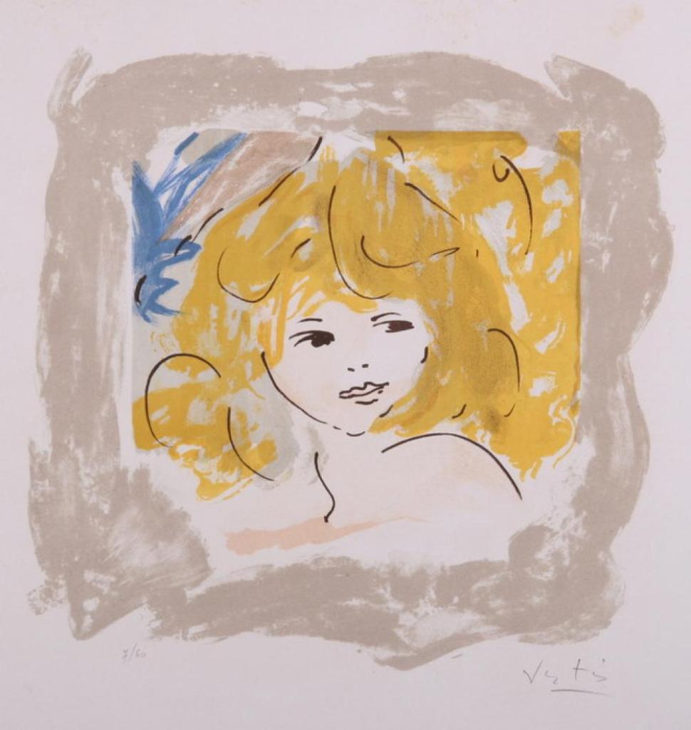
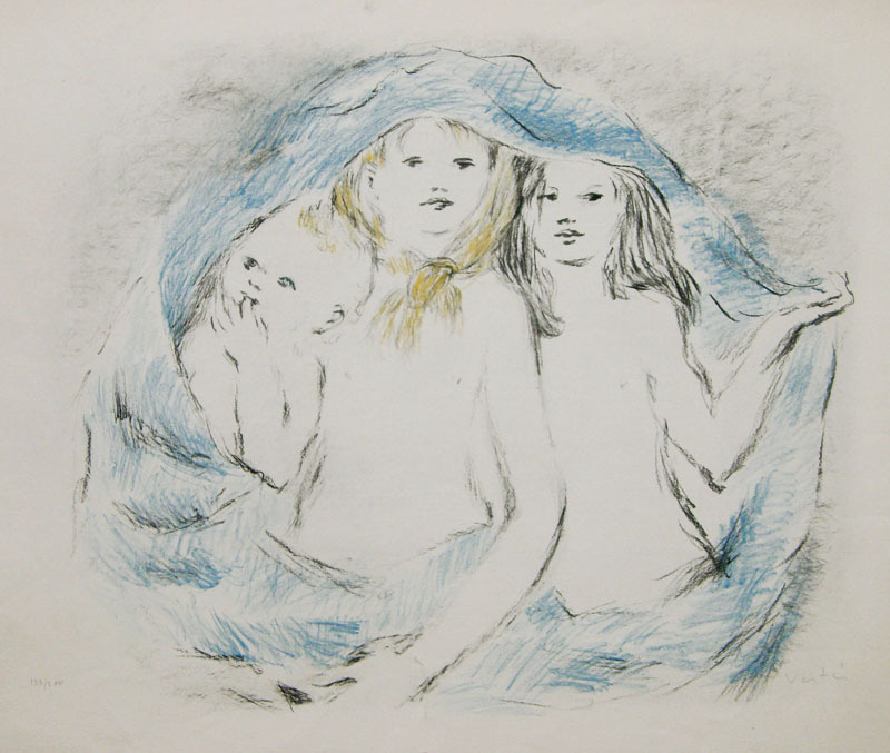
Marcel Vertès (1895-1961) was a costume designer and illustrator of Hungarian-Jewish origins. He was born in Budapest and his first commercially successful works of art were sketches of corpses, criminals and prostitutes he made for a sensationalist magazine in Budapest (he subsequently published a portfolio of this work as Prostitution in 1925). Vertès later provided illustrations for many of the clandestinely printed publications opposed the continuation of the Hapsburg monarchy and the Austro-Hungarian Empire in the aftermath of the First World War.
After the Great War, Vertès moved first to Vienna and thence, in 1925, to Paris, where he became a student of fine art at the prestigious Academie Julian. He quickly established himself on the Paris art scene, concentrating on illustration, painting and printmaking, especially lithography. He became a close friend and disciple of fellow émigré Jules Pascin, with whom he shared many tastes and interests.
Amongst the work Vertès undertook were forgeries of Toulouse-Lautrec’s works, which helped him earn his art tuition fees. His illustration commissions included working on various erotic books, which included several works by Pierre Louys. Amongst the titles Vertès illustrated were La Semaine Secrete de Venus, 1926, which was written by Pierre Mac Orlan, a leading author of erotic and spanking fiction during the interwar period in Paris (and another friend of Pascin’s); also Collette’s Cheri in 1929 and the collection of Guillaume Apollinaire’s poems, Ombre de mon Amour, in 1956. These may all have led to his commissions to work on several books by Louys, but it may also have helped that Vertès (like Toulouse Lautrec and Jules Pascin before him) seemed to have a good knowledge of the world of Parisian brothels, as demonstrated by his album of colour lithographs, Dancings (Dancing Halls) which he produced soon after his arrival in Paris in 1925. This showed gay as well as straight bars and clubs. It was followed up, in 1932, by a portfolio titled Dames seules (Women Alone), which comprised fifteen lithographs by Vertès illustrating aspects of lesbian life in the capital: couples together in their homes, women’s bars, women cruising for sex in the Bois de Boulogne and, in one case, a woman catching her girlfriend with some else.
Harper’s Bazaar, October 1940
The artist first tackled Pierre Louys’ novelTrois Fillesde leur mere in 1927. His seventeen dry-point prints were graphically faithful to the text; Vertès depicted all the perversities of the family at the heart of the novella. Next, Vertès illustrated Pybracin 1928, unflinchingly recording the highly varied sex and sexuality that features in the hundreds of short poems that make up the collection. The artist also contributed plates to an edition of Les Aventures du Roi Pausole in 1932, which faithfully detailed the incidents of the story in thirty-eight pen and ink drawings. Six years later, he tackled Pierre Louys’ Poésies érotiques. Much like Rojan’s version of the previous year, Vertès provided thirty-two pencil and watercolour plates that fully portrayed all the lesbian and other incidents narrated in the verses.
Vertès, Three Girls
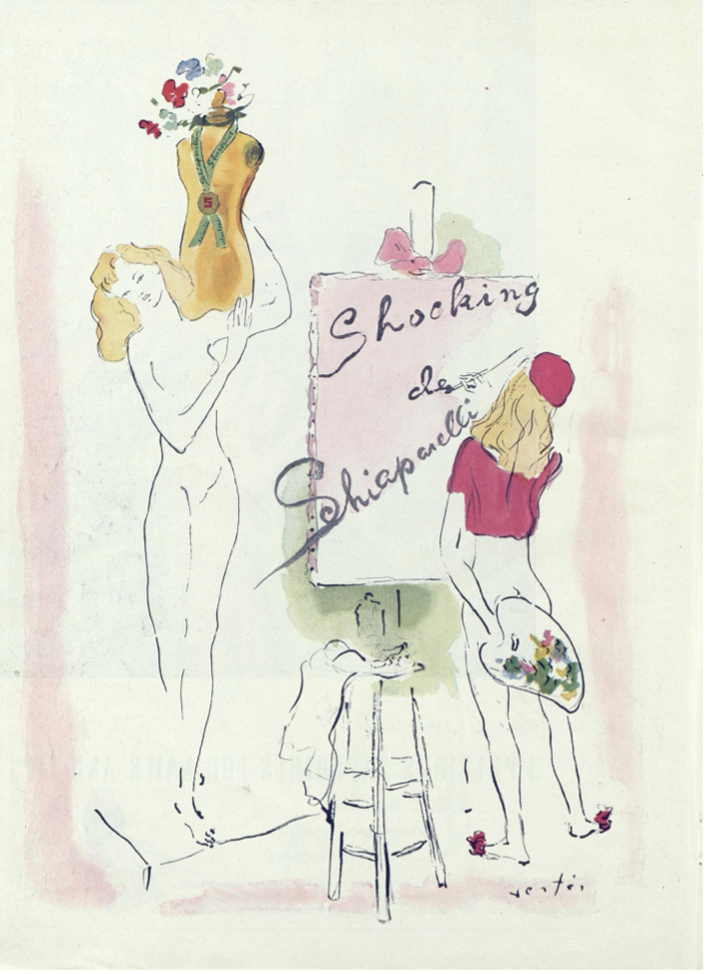
In 1935 Vertès made his first trip to New York in search of business contacts. Two years later he staged his first one-man exhibition in New York. That same year, in Paris, he provided the fashion designer, Elsa Schiaparelli, with advertisements for her new perfume called Shocking, work that was considered rather suggestive and a little shocking by some in the industry, with their hints of dryads and discrete nakedness. Schiaparelli herself obviously liked the artist’s work, for the campaign ran for seven years.
Harper’s Bazaar, October 1944
At the start of Second World War, Vertès returned to New York with his wife, escaping the Nazi invasion of France by just two days. Ten years later, he returned to live in Paris but still maintained his lucrative professional contacts in the USA. These led his work on the 1952 film Moulin Rouge about the life and times of artist Henri De Toulouse-Lautrec, for which Vertès won two Academy Awards; in addition, he painted the murals in the Café Carlyle in the Carlyle Hotel and in the Peacock Alley at the Waldorf Astoria Hotel in New York. Furthermore, he designed the sets for Ringling Brothers’ Barnum and Bailey Circus in 1956, contributed illustrations to Vogue and Harper’s Bazaar and was a jury member at the 1961 Cannes Film Festival. In France, his work was recognised when he was made an officer of the Legion d’Honneur in 1955, after designing sets for ballets at the Paris Opera. Vertès also published a number of books himself, including The Stronger Sex, Art & Fashion in collaboration with Bryan Holme, It’s All Mental, a satire on psychoanalysis, and Amandes Vert, an illustrated biography.
As his enormously eclectic output will indicate, Vertès was able to work in a variety of styles and media, turning his hand to almost any commission he received. In this, he resembled many of the illustrators I have described in my postings: whilst they may have regard themselves as painters or engravers, earning an income demanded that they were constantly flexible over subject matter and materials.
Reynard the Fox
Kris de Roover (born 1946) was an artist from Antwerp, Belgium. He studied architecture before becoming an illustrator and, during his career, worked on illustrating a wide range of subjects, including erotica, with his designs being published across Europe and in the USA. De Roover employs revived the ligne claire style of comic art, which was pioneered in Belgium by Herge and other artists at Tintin magazine.
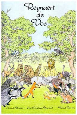
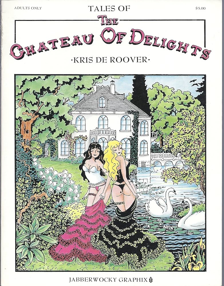
De Roover illustrated a comic strip version of Marcel Russen’s retelling of the medieval tale of Rynaert de Vos (Reynard the Fox, 1999), Die verhalen uit het kasteel der lusten- het verboden boek (1984- which was translated later as ‘The Chateau of Delights,’ 1990) and Pierre Louys’ L’Histoire du Roi Gonzalve et des douze princesses (1990). He also created the children’s comic De Tocht der Petieterkees (The Tour of the Petieterkees, 1989).
My interest here is de Roover’s work on Roi Gonzalve. His previous work on Het kasteel der lusten, had indicated a talent for erotica, but the uncompleted novel by Louys represented a challenge to his representational skills. The origins of the story itself are unclear; the king seems to be an invention of Louys, taking his name from the eleventh century king Gonsalvo of the counties of Sobrabe and Ribagorza in the Pyrenees (and, as such, being a neighbouring realm to the imaginary kingdom of Trypheme in Louys’ Les Aventures du Roi Pausole). The twelve princesses of the full title, and their unnatural relationship with their father, may be an echo of the twelve children that the god Uranus had with his sister Gaia in the Greek myth of the Titans. Moreover, one of these offspring, Cronus, had six children with his sister Rhea and two of these, Zeus and Hera, became husband and wife, although Zeus previously was married to his aunt, Themis, sister of Cronus and Rhea. Rather like cartoonist Georges Pichard in his earlier work illustrating Louys’ Trois filles de leur mere, it seems that the Spanish publisher of Roi Gonzalve considered that a graphic novel style would be the best way of tackling the adult content of the story, thereby creating some distance and unreality. De Roover accordingly seems to have depicted the king as a louche, Lothario-like figure in a dinner jacket with a large seventies moustache, a slightly dodgy looking monarch whose character was well suited to the plot of the unfinished text, such as it is.
De Roover’s choice of style for the book involved emphasising elements in his previous work: his plates feature strong outlines and very brightly coloured designs, using blocks of colour for each figure or item and depicted in a very simple manner (a style that might be very suitable for a children’s book- although primary tones are distinctly stronger than those he used for Reynaert de Vos in 1999). De Roover surrounded these with a pen and ink border design of female nudes which closely resemble his delicate work in the Kasteel der lusten. These elements further help to reduce the challenging nature of the content and to lighten the mood, by making the novella seem more like an action comic. It’s notable too that de Roover, like Paul-Emile Becat before him, chose to depart from the text of the book and overall raised the ages of the princesses he drew, lessening some of the potentially controversial impact of Louys’ narrative, although his plates are still explicit and are clearly tied to the text with quotations of the passages depicted.
We may well wish to reflect upon the fact that the two most recent illustrators to work upon the posthumously published works of Pierre Louys felt that such a style was more suitable or acceptable. For more discussion of these issues, see my Pierre Louys bibliography. For more discussion of work of Vertes and de Roover and of the illustrated editions of the works of Pierre Louys in their wider context, see my book In the Garden of Eros, available as a paperback and Kindle e-book from Amazon.
Auguste Brouet (1872-1941) was born and raised in a poor family in Paris and its suburbs. As a youth, he became a lithographer’s apprentice, whilst also developing his talent for drawing by attending evening drawing classes at the École des Beaux-Arts– also including a short stint at the studio of Symbolist painter Gustave Moreau. From about 1895 he began to earn a living in an etching workshop, making engravings of famous paintings ranging from Rembrandt to Whistler. He supplemented this by producing painted copies of popular contemporary paintings as well as by working as an assistant in the studios of successful and well-known artists, such as Degas and Whistler.
Brouet, La Parade, 1900
From about 1902, Brouet began to produce his own engravings. His favoured subjects were street scenes in the poor areas of Paris- something he knew well and for which he felt great sympathy. He also depicted dancers, nudes and life in working class bars and theatres, as well as cityscapes and some landscapes. After a period of hardship during the First World War, Brouet’s fortunes began to revive. His work became fashionable through exhibitions, public awards and published articles.
Resting dancers
By the 1920s, Brouet’s had established a reputation and his etchings were in demand. As the market entered a golden age, he also attracted increasing commissions from Parisian publishers for book illustrations, especially from Devambez which was then under the artistic direction of artist Edouard Chimot. Like Chimot himself, Brouet suffered severely from the impact of the market crash and depression of the late ’20s, and he spent most of the rest of his life in poverty.
Salon
Brouet illustrated a considerable number of volumes, including Virgil’s Georgics, several books by Joris-Karl Huysmans. Brouet’s interest in the life of poor working females, especially actresses and dancers, well suited him to working on the work of Pierre Louys. Brouet first began to receive commissions to undertake erotic illustrations in the mid-1920s. The first to be published, in 1926, was Un été à la campagne– a notorious epistolary novel by Gustave Droz which describes two girls’ sexual adventures with a range of partners over one summer in the country.
Brouet’s work in 1933 on Pierre Louys’ Le Histoire du Roi Gonzalve et des Douzes Princesses is probably his most daring. The manuscript for this book was unfinished at the author’s death; it was sold by his widow and first published in 1927, illustrated by Paul-Emile Becat. The story concerns a king with incestuous desires for his twelve daughters; in its unfinished state it is little more than a succession of explicit erotic scenes. Becat’s response to the text was sexually frank, but with aspects of the relationship between king and princesses elided. Brouet created a dozen line drawings to accompany the text which much more faithfully followed the details of the text. Brouet’s associations with less common aspects of sexuality may be judged by two of his nude studies from 1924- one, Small Nude, shows a reclining girl of ten or eleven from behind; far more interesting, though, is Les Etheromanes (The Etheromaniacs)- two naked young women side by side on a bed, one of whom is holding a small glass. We are to understand that the couple are drinking ether, a late-nineteenth and early twentieth century drug habit practised to induce euphoria. It’s not clear whether they may be using ether to enhance physical sensations or whether the implication is that they are prostitutes who are numbing themselves to their work.
Benezit’s Dictionnaire des Peintres describes Brouet as “a sensitive interpreter of the authors of his choice.” His work is constantly attractive, partly for his skilled technique but also for his subject matter, which gives a real insight into everyday metropolitan life for ordinary Parisians. The website auguste-brouet.org is devoted entirely to his work. For more discussion of subjects covered here, see my bookIn the Garden of Aphrodite and also refer to my Pierre Louys bibliography.
Reclining dancer
For a complete discussion of Brouet and of the illustrated editions of the works of Pierre Louys in their wider context, see my book In the Garden of Eros, available as a paperback and Kindle e-book from Amazon.
Édouard Chimot (1880-1959) was a French prolific artist who worked as an editor, painter, watercolourist, engraver and draughtsman/ illustrator, editor and even an early film-maker. His career reached its peak during the 1920s in Paris, when he was involved with the publication of fine quality art-printed books.
Maurice Magre, Les Belles de nuit, 1927
Chimot was born in Lille, but studied at the École des Arts décoratifs in Nice, before returning north for further study at the École des Beaux-Arts in his home city. It appears that he began exhibiting only in his early thirties (perhaps after a spell as an architect) and then had his career disrupted by military service during the Great War.
During the period just before the outbreak of war, Chimot had a studio in Montmartre in Paris and often sketched in the lesbian bars of the quarter. His first exhibition in 1912 secured a commission to illustrate René Baudu’s text Les Après-midi de Montmartre with etchings of “petites filles perdues“- the little lost girls of the red light district, which was finally published in 1919. This association with bohemian culture was going to remain with him. As he was later to say, “I chose women as my favourite subject- and then as my only one.”
La femme et le pantin, Louys
Further commissions followed, for example illustrating the grimly real war novel L’Enfer by Henri Barbusse and Baudelaire‘s Spleen. This in turn led to work with the publisher Les Éditions d’Art Devambez, for whom he was artistic director between 1923 and 1931. Besides arranging artists to illustrate texts, he still worked on some himself, He reserved some choice texts for himself, for example choosing Pierre Louys’ works Les Chansons de Bilitis (1925), Poesies de Meleagre (1926), La Femme et le Pantin (1928), Aphrodite (1929) and, lastly, Parallèlement by Paul Verlaine (1931)- these reflect his continued interest in representing scenes of sex and sexuality. Chimot was also involved in making two films during this vibrant period.
However, the Wall Street Crash of 1929 destroyed the market for costly luxury books in limited editions. Chimot’s work and income was never as assured again. Hence, his work increasingly comprised erotica: in 1931, for example, he issued Maurice Magre’s Les Belles de nuit, lithographs of prostitutes, Baudelaire‘s Fleurs du mal in 1941, Prosper Merimee’s Carmen in 1951 and a collection simply entitled Chats (Pussies) in 1936. He was also asked to provide plates for editions of Louys’ Poems inedits (1887-1924) in 1938 and Trois filles de leur mere in 1950. He described his technique for designing illustrations in an interview in 1926: “I make a lot of drawings in the atmosphere of the text, then I choose among them. The engraving becomes a free translation of my drawing. It then takes me two to four weeks for an engraving; I only make etchings.”
Louys, Les poemes antiques, 1949
Chimot’s description of his interaction with the text, his search for the ‘mood’ or ‘atmosphere’ (l’ambiance) is fascinating. It indicates the interaction between artist and author: the former must first choose key or representative incidents in a story, and then seeks to get to the emotion and dynamics underlying that particular scene so as to be able to depict them most authentically and effectively. S/he has to identify with the artist’s motivations and reactions and to be able to find an expression of these and of his/her own responses. As I have suggested before, when this is done perceptively and well, the result lifts the entire artwork. It’s worthwhile observing in relation to this that Chimot’s illustrations are often notably faithful to the text: for example, his Mnasidika in Bilitis is as young as Louys indicates and his plates for Trois filles are as explicit as the text demands.
Despite these financial pressures, Chimot still produced some striking art, such as his 1958 portfolio of sixteen female nudes, Les Belles que voilà: mes modèles de Montmartre à Séville (‘Here are the Beauties: my models from Montmartre to Seville’). As the collection’s title indicates, Chimot moved to Spain during the Second World War. It’s fascinating to note that he had a connection with Seville, a city much haunted by Louys late in the last century- especially because of the working girls he encountered there.
Chimot, Study of a Girl
For more information on the writings of Louys, please see my bibliography page and details of my own books. For more discussion of the work of Chimot and of illustrated editions of the works of Pierre Louys in their wider context, see my book In the Garden of Eros, available as a paperback and Kindle e-book from Amazon.
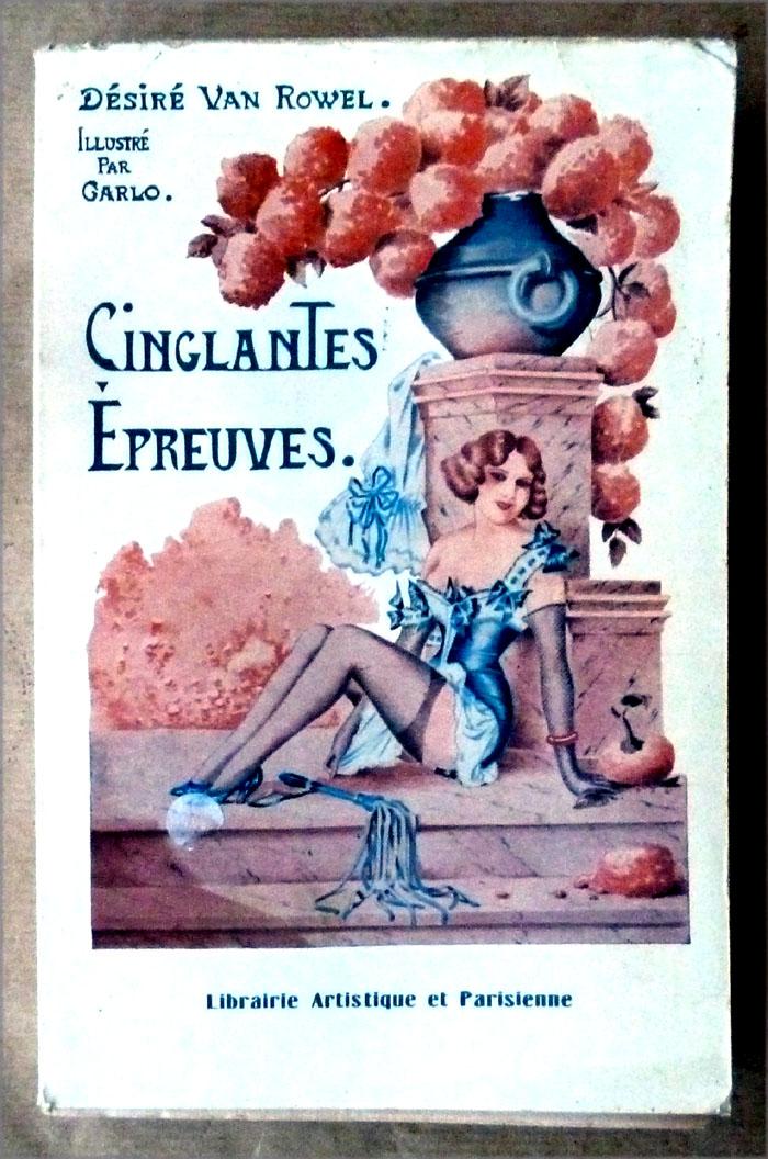
My recent research has led me onto the track of the illustrator called ‘Carlo.’ He is regarded as one of the two or three most talented and striking artists who provided illustrations to the French erotic book trade in Paris during the 1920s and 1930s. His work is held in the highest esteem along with that of Cheri Herouard and another more mysterious illustrator called ‘Wighead.’ Carlo is celebrated for his strong lines and forms, which are nonetheless coupled with the most delicate treatment of fabrics such as lace and satin and, most importantly, a unique and bold imaginative vision.
Surprisingly, though, despite his popularity with the book buying public at the time, and the subsequent collectability of his illustrations, very little is known about Carlo; all that can be stated with any confidence is the dates when he was active: between about 1910 and the mid-1930s. Readers may sometimes see these given as birth and death dates of 1900 to 1930; this can be disregarded. Whoever our artist was, he must have been born around 1890, if not earlier, to become old enough and skilled enough to find employment by the second decade of the twentieth century. We simply don’t know why his output ceased in 1936.
Based upon the close similarities of style, as well as of name, it is almost certain that a number of cartoons that were signed by ‘Charléno,’ and which appeared in satirical and humorous magazines such as Le Rire and Sans-Gêne from around 1912 until the late 1920s, are by the same individual. They are drawn in the same clear manner and the female bodies and hair are handled in the same manner. Charleno’s cartoons were often mildly risqué or sexual, as in Admiring Her Legs or Ou est le feu? of 1917, in which a girl in her apartment, wearing only her stockings, is confronted with a fireman brandishing the nozzle of his hose…. etc etc etc.
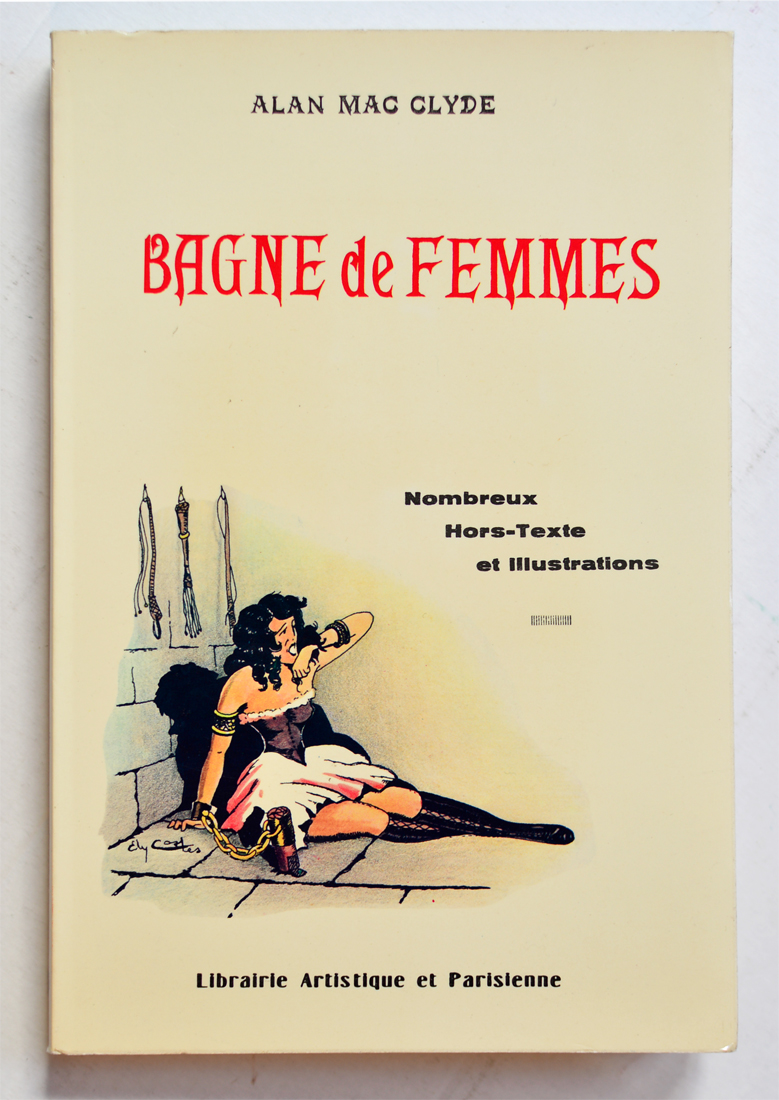
The artist who had traded as Charleno seems to have started calling himself ‘Carlo,’ or even just ‘C,’ in 1931, when he began providing illustrations for the erotic publishers Librairie Générale. By the end of 1936, when the last ‘Carlo’-illustrated title appeared, he had produced an astonishing total of some three hundred drawings for at least thirty different books. The output of books is also notable: given their nature- S&M and fetish fiction for an adult market- they tended to be quickly produced, quite repetitive and, inevitably, rarely great works of literature. Some have suggested that teams of authors worked on them to keep up with demand, something that may have produced the word counts required but probably didn’t do very much for sophisticated characterisation or complexity of plots.
Most of Carlo’s work illustrated texts by ‘Alan Mac Clyde;’ as you’ll see, he was also writing under a pseudonym to protect his identity from the police. One of these titles, Bagne de femmes (The Women’s Penal Colony, 1931) was described by the publisher as benefitting from “engravings of incredible realism” by Carlo that enhanced the account of “a rich and authoritarian woman [who] had the audacity to create a veritable prison for women. There, under the rule of fierce guardians, splendid creatures are delivered to horrible and voluptuous suffering.” Carlo’s plates show leather-clad dominatrices binding their submissive victims or enjoying the pleasure of dressing up in elbow length gloves, corsets, stockings and stiletto heels. This sort of content and illustration is pretty typical of the entire genre throughout its interwar heyday.
Carlo’s skill- and what keeps his work collectable nearly one hundred years later- was to be able to devise the most baroque and ingenious torments for the slaves of the dominatrices he drew, combining these with utterly baroque outfits of leather and other materials. It can be surprising to see items that you would anticipate only to find in a modern fetish shop appearing in a fully-equipped 1920s dungeon. A woman has to go round on all fours dressed as a leather dog in Mac Clyde’s Despotisme féminin or as a be-feathered horse pulling a carriage in Servitude. Carlo’s women are always perfect: their perms are glossy, without a hair out of place (despite all that whipping); they wear extreme corsets, elaborate headwear with antennae or rabbit ears, ruffs, masks or hoods, long boots and gloves. His mastery of fabrics and textures, and his ability to depict the light reflected on shiny materials and hair is impressive, especially given the fact that his illustrations were very seldom coloured and were usually only created with pen and ink.
I’ve written a great deal about those artists working at the more literary and respectable end of the business of publishing erotica. Illustrators like Becat and Saint-Andre were able to maintain careers in painting and church mural design whilst still being able to work on erotic texts without it damaging their reputations too much. It helped, of course, that they received commissions to design plates for established figures in the literary canon, Laclos, Ronsard, Baudelaire and the like, or that more contemporary authors were writing poetry and ‘modern classics’ (Apollinaire or Pierre Louys for example). Individuals like Carlo, who provided illustrations for spanking novels, don’t seem to have come from the same kind of background at all. These different groups of artists may have intersected in their willingness to make money designing magazine covers or commercial posters, or drawing comic strips, but virtually none of the named artists I’ve featured seem to have been commissioned by the more clandestine publishing houses nor do any of their habitual illustrators seem to have made the break into more conventional book illustration; the only exception to this is Luc Lafnet, whose career I have outlined. Of course, we know Lafnet’s real name; with the other artists it’s hard to say for sure given the prevalence of disguising identities with jokey pseudonyms. Nevertheless, I wonder if there may have been something of a ‘class’ divide between those who attended an art school like the Ecole des Beaux Arts and those who went to a technical school specifically to learn to draw for commercial purposes- adverts, posters, catalogues and such like.
The preceding speculations don’t detract in the least from Carlo’s draughtsmanship and his unique sense of the exotic and exciting. If you’d like to know more about this enigmatic figure, there are several websites dedicated to or featuring Carlo’s work, as well as a now rather rare and expensive book from 1984 by Robert Merodack that celebrates his skills. His books are still available- either as originals or reprints- through Amazon, Abe and other vendors.
Thomas Couture (1815-79) was a French history painter and teacher. Amongst his pupils were such distinguished later painters as Édouard Manet, Henri Fantin-Latour, John La Farge and leading Symbolist Pierre Puvis de Chavannes.
Couture was born at Senlis, but when he was 11 his family moved to Paris. In due course, this enabled him to study at the city’s industrial arts school (École des Arts et Métiers) and later at the prestigious École des Beaux-Arts, where he studied under Antoine Jean Gros and Paul Delaroche. Talented and ambitious, Couture was unhappy that he failed to win the prestigious Prix de Rome competition at the École six times, but he ascribed this not to his own shortcomings but to failings in the school. He was finally awarded second prize in the Prix de Rome in 1837 and this repeated overlooking of his work and his talent left him with a lifelong animosity towards the École des Beaux-Arts (as we shall see).
La courtisane moderne (or, The Thorny Path), 1873
Couture began to exhibit at the Paris Salon in 1838 with Young Venetian after an Orgy (a painting of a rather wan and hungover looking young man). While his early works were anecdotal genre scenes, his earliest true success came with The Love of Gold in 1845 (in which young women appear to be offering themselves to a miserly looking man who hoards a pile of coins), and then with the work often regarded as Couture’s masterpiece, Romans During the Decadence in 1847, for which he was awarded a first-class medal. This ostensibly historical work, inspired by some lines from the Roman poet Juvenal, shows an orgy in a colonnaded room with all the cliches of nudity, wild dancing and over-intoxication that we associate with Imperial Rome. The painting was widely regarded by contemporaries as an allegorical criticism of the contemporary French government. Surprisingly, therefore, it was the government that purchased the huge canvas (which took Couture three years to paint).
Soon after this recognition of his skills, Couture opened an independent atelier (teaching studio) with the intention of challenging the preeminent position of the École des Beaux-Arts for turning out the best new history painters. Like the academicians, though, Couture held the art of ancient Greece and Rome, as well as that of Renaissance Italy and Flanders, in the highest respect and considered them his stylistic predecessors. Beneath his outward iconoclasm, therefore, there were inescapable academic foundations that often makes his set-piece paintings rather formal and lifeless
Bust of a young girl
Couture’s innovative technique gained much attention, and from the late 1840s he received prestigious commissions from the new emperor Napoleon III as well as from the church, which paid for a mural in the chapel of the Virgin in the church of St. Eustache in Paris. The artist’s painting of the Baptism of the Prince Imperial (c. 1856–62), met with mixed reviews and two other public works were never completed. Discouraged by the unfavourable reception of his paintings, in 1859 Couture left the French capital, returning to Senlis, where he painted portraits and decorative paintings for private patrons. After 1871 he opened a new atelier and continued to teach young artists who sought him out. In 1867 Couture further snubbed the academic establishment by publishing a book on his own ideas and working methods called Méthode et entretiens d’atelier (Method and Workshop Interviews).
The Young Musician or Gypsy Girl
Jeune italienne (Young Italian)
In fact, it is Couture’s portraits, character studies and genre scenes that are far more lively and interesting than his great classical canvases. These include simple interior studies, such as the boy with his clay pipe in Soap Bubbles, another idle youth in Day Dreams and the snapshot of provincial life, A Lawyer (or Judge) Going to Court (1859), which shows him striding alone down a street that’s deserted except for a flock of chickens. Working children, such as in Return from the Fields or the Little Confectioner, were simple and honest realist images, but it was in studies of young females that Couture seemed to excel. The gypsy girl and young Italian illustrated above have a certain exoticism, but the painter evidently preferred simpler and more homely scenes.
Study of a young girl
Bust of young woman with bared shoulders
Couture occasionally painted nude women (for example, the poet Baudelaire with his lover, the courtesan Madame Sabatier)- and more often adult male life studies in the classical tradition of Michelangelo- but he seems to have preferred junior subjects. Couture initiated the fashion for a style of painting that I shall term ‘Girls on Rocks by Water.’ His Little Bather is the best example of this, a young girl seen with a demurely down-cast gaze as she sits pensively by a pool or stream. The presence of the apple, entwined as it is with the ribbon of the crucifix she was wearing, sends an interesting message about the girl. She is a young Eve, naked in the lush ‘garden’ of the woodland where she is bathing, but we can draw reassurance from the religious emblem (and, I suspect, her white dress) that she is symbol of purity and innocence and beyond any hint of temptation.
As we shall see, this juxtaposition of the innocent nude and a natural location was to be adopted by several subsequent painters, as it represented an ideal of childhood purity that came to dominate popular painting during the later nineteenth century. I shall return to discussion of this subject, and of the artists inspired by Couture, in subsequent posts. For more information on Victorian era art, see details of my bookCherry Ripe on my publications page.
The Little Bather (1849), The Hermitage, St Petersburg
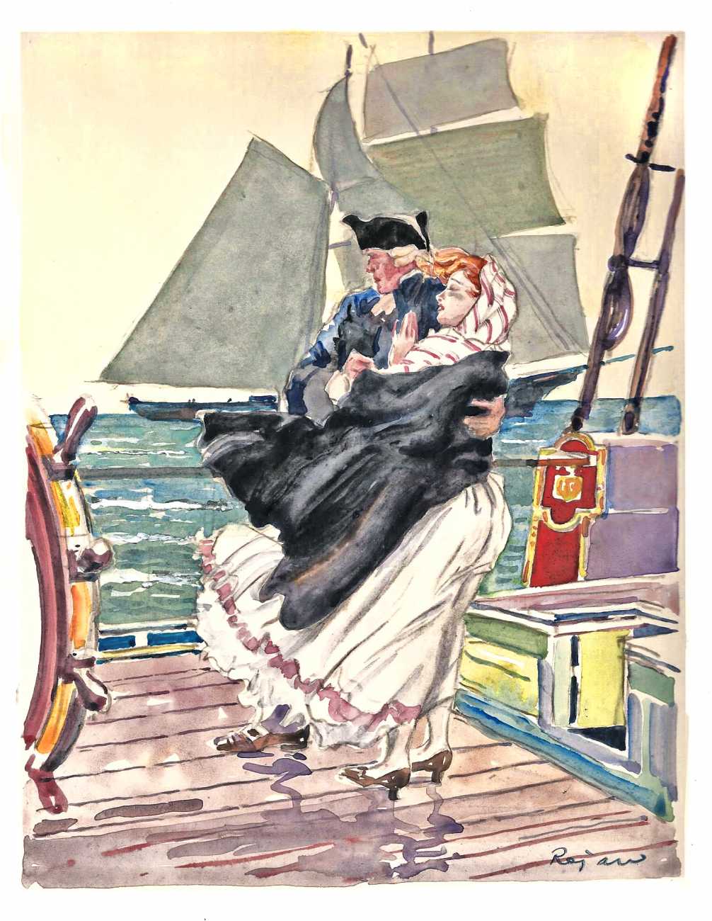
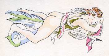
Feodor Stepanovich Rojankovsky (1891-1970), also known as Rojan, was a Russian émigré illustrator. He is best known both for his children’s book illustration but also for his erotic art from the 1930s. Rojan was born in Mitava, in the Kurland Governorate of the Russian Empire (now Latvia) in 1891. After his father’s death in 1897, the family moved to St. Petersburg to be closer to an older married sister. The artist later recalled how he once was taken to the zoo and that then, his imagination excited, he was given a set of coloured crayons with which he immediately began to draw the animals he’d seen. As a result, the boy’s interest in natural history picture books and illustrated classics developed whilst he honed his artistic skills by copying his elder brothers’ school drawings and paintings. These interests led to him to enrol for two years at the Moscow School of Painting, Sculpture and Architecture. However, these studies were interrupted by military service during the First World War, but his first works (patriotic battle scenes) were published in a magazine in May 1915.
After the war, Rojan joined siblings in Ukraine where he worked as an artist for the local council, illustrating school books. Further military service followed during the Russian Civil War and he became a prisoner of war in Poland. After the war, the artist stayed in Poland designing book covers and illustrations for the bookseller and publisher Rudolf Wegner. Unable to return to USSR after his service with the anti-communist White Army, Rojan moved to France in 1925, where he found work again as an illustrator of children’s books.
from Frog Went a Courting, 1956
In Paris, Rojan supplemented his income by designing plates for a considerable amount of erotica. Allen and Polly Irving’s biography of the artist describes these “naughty books [as] a minor but noteworthy aspect of the illustrator’s long and varied career [which] round out the picture of a man in and of his time and place. The drawings are best viewed in the cultural setting of Paris in the 1930s and, in the much harsher world of today, appreciated for their gentle period style and what they reveal of our social and cultural history…. This small and generally amusing body of work has long been known, valued, and collected; Rojankovsky lavished his best draughtsmanship and colour work on these illustrations and they are among his most accomplished work” (from Feodor Rojankovsky: The Children’s Books and Other Illustration Art, 2013). Rojan was an incredibly productive designer and his illustrations are “distinctive, brightly-coloured, spirited and stylish,” generally painted in watercolours.
Rojan is noted for the portfolio Idylle Printaniere of 1936 which consists of 30 lithographs wordlessly telling the story of the chance meeting of a man and a woman on a train and thence to a hotel room. His work on titles by Pierre Lous included 105 plates for the Manuel de civilité pour les petites filles (The Young Girl’s Handbook of Good Manners, 1926), Pybrac (1927), 75 illustrations for the Poèsies erotiques (1937) and, lastly, Trois filles de leur mère (1940). He also worked on titles including Jeux d’Enfants (1930), Memoires of Casanova (1931), Théophile Gautier’s Poésies libertines (1935), Raymond Radiguet’s Vers libre (1937), Vicomtesse de Saint Luc’s Liqueurs féminines, parfums sexuels (1940) and Jean Spaddy, Dévergondages (Wantonness, 1948). Rojan also designed illustrations for Le petit chaperon rouge (Little Red Riding Hood) and for Guillaume Apollinaire’s Cortège priapique, which were unpublished. His attractive and light-hearted style was plainly well-suited to children’s books, so it can be quite strange to see it applied to very explicit adult scenes, which frequently involve a wide diversity of couples engaged in a range of practices.
from Casanova
In 1941, Rojan moved to the US to work there with his former French publisher. He was able to continue his career illustrating large number of children’s’ books featuring either history or animals and the natural world. He wrote and illustrated seventeen books of his own and provided plates for four dozen books by authors including Rudyard Kipling, Rose Fyleman and Algernon Blackwood.
from Radiguet’s Vers Libres
After leaving Paris, Rojan produced no more erotic work- perhaps understandably given that his name was now associated by the public with titles such as Our Puppy, by Elsa Ruth Nast (1948), Baby Wild Animals, John Wallace Purcell (1958) and The White Bunny and His Magic Nose, Lily Duplaix (1957). For more information on Pierre Louys see my bibliography for the author and for details of interwar book illustrations, see my books page.
From Le théâtre érotique de la Rue de la Santé, 1932
For more discussion of the work of Rojan and of illustrated editions of the works of Pierre Louys in their wider context, see my book In the Garden of Eros, available as a paperback and Kindle e-book from Amazon.
I have posted before on the painting genre known as Orientalism. I return to it now to examine more closely its roots in sexism and racism. As an artistic genre, Orientalism arose initially out of the encounter between Europe and the Near East- Turkey and the Levant. At that time, from the early nineteenth century onwards, this area was in the control of the Ottoman Empire and white Christian visitors were very much tourists and explorers in unfamiliar lands. The art created at this stage conveyed these exotic new worlds to eager audiences. The British artists John Frederick Lewis (1804-76) and Charles Robertson (1844-91) are typical of this kind of reportage or travelogue painting, depicting street scenes and unfamiliar environments such as mosques and bazaars. There is excitement and fascination about these citizens of a major empire and members of a major faith.
However, as the century passed, the European presence and interest changed. Conquest and colonisation took over, placing the white male painters in a different relationship to their artistic subjects. We might contrast Robinson’s charming scenes of souks and street vendors to Jean-Louis Gerome’s studies of street prostitutes in Cairo. The male artists were now members of a new ruling class and their interactions with the populace shifted quite radically. There was a new balance of power and the painters, like all their compatriots, viewed the peoples of North Africa and the Middle East as more of a subject population. This wasn’t universally the case of course; some visitors found the local culture more attractive than their own, such as Frenchman Alphonse Etienne Dinet (1861-1929), who converted to Islam and changed his name to Nasredine.
Adam Styka, Amorous Couple
Nonetheless, a lot of Orientalist art has a distinct sexist and racist tone. The Pole Adam Styka (1850-1959) seems to typify this attitude: his canvases feature smiling Moroccan couples and single confident females, the women generally being endowed with remarkably large, firm and thrusting breasts (for instance, Zohra, A Moroccan Dancer or A Scene in Marrakesh- In the Moroccan Sun). Dinet’s pictures from around Bou Sa’ad in Northern Algeria also regularly depicted naked young women, their healthy natural beauty further adorned with heavy jewellery and tattoos- for instance, Bather by Moonlight (1901), Femme Kabyle (1916) or Raoucha (1901). They are often seen in pairs, bathing or doing their washing, sometimes lying in repose side by side and holding hands (Bathers Under the Pink Laurels, 1910) or, even, wrestling together naked (Bathers Wrestling, 1909)- both of which activities are clearly charged with suggestions of same-sex intimacy, especially in the latter painting, in which the girls’ hands interlinked and their glossy bodies clasped together.
Giovanni della Rocca, A Wealth of Treasure
The themes of racism and sexism unite powerfully in harem and slave market scenes, both enormously popular clichés of the Orientalist style. Della Rocca’s Wealth of Treasure (above) frankly indicates the cold, calculating equation between enslaved bodies and bullion: they were all assets to be acquired, stored and enjoyed. Depicting harems provided painters with ample chauvinist opportunities to display white women being controlled and sexually exploited- and this by non-European males. This sheds a deeply unflattering light on the artists’ views of both women and non-white men. Even more excitingly for the buyers of these works, the closeted nature of the harem meant the women were enclosed together in intimate proximity, so that titillating hints of same-sex attachment could be offered as well. Pierre Louys did just this in his Adventures of King Pausole, and painters regularly took the opportunity to show women bathing, resting or relaxing together.
Otto Pilny, The Hostage
The Swiss artist Otto Pilny (1866-1936) specialised in catering for an art market that wanted to see white women bound, oppressed and on sale, producing seemingly endless scenes of shrinking, partially naked women displayed as wares, as in The Slave Market (1910) and The Slave Dealer (1919), amongst many others. A few of his images will serve to illustrate his style as well as different aspects of these pervasive tastes. In Slave Trade in the Desert, the buyer seems to have a choice of the girl or a carpet; Un choix difficile obliges the buyer to decide between a white horse and a woman. Another painter just as prolific as Pilny was the Italian Fabio Fabbi (1861-1946), who painted several very similar pictures, amongst them The Slave Market, An Eastern Slave Market, Slave Trade Negotiations and The Slave Auction. The auction house Christies has summarised his output as comprising “flirtatious depictions of odalisques on show in slave markets, orientalist bazaars or dancing on white-washed terraces… [works which] found an eager market during his lifetime.”
Rather like the novels of Pierre Louys which were located in the ancient Mediterranean and Egypt, or in imaginary European kingdoms, Orientalist painting allowed artists to depict, for public consumption, subjects that would have been deemed unsuitable if set in their own times and homelands. Nonetheless, within the more discrete and concealed market for erotic illustration that existed in France from the late nineteenth century onwards, more blatant and direct examples of comparable themes may be found: a few artists produced portfolios featuring scenes in which African men might be depicted molesting French women or African maids would be shown having to provide sexual favours to their employers- female and male. These regrettable images are arguably less varnished manifestations of undercurrents of fantasy, prejudice and exploitation that have yet to be fully escaped.
For more discussion of orientalism in early twentieth century art, see my book In the Garden of Eros, available as a paperback and Kindle e-book from Amazon.
Jean Traynier was a French illustrator who flourished during the 1940s and ’50s. Almost nothing is known about him, other than through his surviving published work. He was evidently one of a pool of illustrators working in Paris from the 1930s, drawn there by the employment opportunities offered by the booming luxury book trade, especially- as I’ve described previously- the thriving market for erotica, such as much of the material by Pierre Louys that was discovered and published after his death. As we’ll see shortly, this business continued throughout the Second World War- perhaps surprisingly.
Traynier’s work included illustrations for Albert Samain’s collection of poetry Au Jardin de l’enfant and Prosper Merimee’s Carmen (both 1943), The Song of Songs (1945), Robert Gilsoul’s Quinze Joies de mariage ‘The Fifteen Pleasures of Marriage,’ L’Idylle Venitienne (‘Venetian Idyll) by Gabriel Soulages and Henri de Montherlant’s La vie amoureuse de Monsieur de Guiscart ‘The love Life of Monsieur de Guiscart’ (all three in 1946), Flaubert’s Sentimental Education and Beroul’s Romance of Tristan & Isolde (both 1947), Rousseau’s Social Contract (1953) and Point de Lendemain, ou la nuit merveilleuse (No Tomorrow, Or the Wonderful Night) by Dominique-Vivant Denon (1957).
The illustrations for the biblical Song of Songs are as proper as we would anticipate, but as the titles of some of these books may suggest, their content was racy and the plates mirrored the text- from the slightly saucy (Carmen) through images of topless women in silk knickers (Guiscart), to the predictably erotic Fifteen Pleasures of Marriage.
Traynier was especially daring with Denon’s No Tomorrow, which is illustrated with twenty highly explicit plates, showing couples in eighteenth century wigs engaged in some highly acrobatic intercourse, including one passionate couple with a strap-on. In fact, the style of these illustrations is familiar, for Traynier had already employed it eight years earlier when designing the plates for Pierre Louys‘ collection of erotic verse, Cydalise (1949). The title is simply a female name, although Louys’ inspiration may have come from the ballet, Cydalise et le chèvre-pied (‘Cydalise and the goat-foot’ or, preferably, ‘Cydalise and the satyr’). Composed by Léo Staats to a score by Gabriel Pierné, it was written in 1914-15 but, because of the First World War, was not performed until January 1923 at the Paris Opera. Louys is very likely to have been aware of the production and its premier and may have considered the name suitable for his book, given his heroine’s profession and the priapic propensities of satyrs.
from Les Quinzes joies
The manuscript of the poetry collection was (like many) undiscovered until after poet’s death in 1925. Many of these texts were rushed into print over the next couple of years. This was not the case with Cydalise, which may indicate that the original buyer purchased the document out of personal interest alone and that it was only later, perhaps because of changed circumstances or inheritance by an heir, that the decision was made to publish the work. It’s interesting to note that the preface is at pains to stress the authenticity of the text, given the tendency of imitators to cash in upon Louys’ name; at the same time, it compares the book’s rather belated appearance to a forgotten bottle of vintage wine being discovered in a cellar behind a bundle of sticks.
The book has only ever been issued in this one limited edition run of 265 copies, issued in a case and with sixteen plates by the artist. It is therefore very rare: for example, there is no copy in a library in the UK; I would have to go to Bibilotheque nationale de France in Paris to be able to consult the nearest accessible volume. The book is, consequently, the highly collectible, although copies seem to appear often enough on auction house websites.
Cydalise (so far as I can judge from the verses I have seen on page images displayed online by auction rooms and book dealers) concerns the training and work of a young prostitute by an older woman in the business. As Louys described in another of his books, L’Île aux dames (The Island of Women), it was typical for a sex worker to employ a maid, a younger female who was possibly her daughter, to assist her. This gosse (kid) would solicit business, deal with clients and gradually get more involved in the provision of sexual services before setting up on her own. The author seems to have been pretty familiar with these arrangements, but then his own journals and letters reveal that he was a regular visitor to brothels, at least early in his life.
The book is written in a style familiar with Louys, a sort of working class/ street slang, coarse and direct, which certainly appears to be authentic to the subject. Traynier’s plates are the same style of pen and ink design that he was to use again for No Tomorrow, except that in the case of Cydalise he has chosen a fin-de-siecle setting for the pictures, rather than pre-Revolutionary France. The plates are both realistic- depicting sexual activity- and fantastic, for instance showing a woman surrounded by gigantic phalli. Because of this content, I don’t think it’s suitable to feature images from either book here, but you can easily find them online if you wish. Nevertheless, I hope it may be clear that Traynier must have seemed like a very suitable artist to commission for the Louys title, having a track record in this kind of book, a readiness to produce images that matched the content and tone of the text they would sit beside and, as well, a clear and simple style with strong lines and bold designs.
In the same year, 1949, Traynier also supplied illustrations for an edition of Louys’ La Femme et le pantin (The Woman & the Puppet). This was one of a five volume set of the author’s works issued by Albin Michel. The story tells of a middle aged man who falls for a girl in her teens and is tormented by her, giving her money and gifts and never having his love requited. It is set in Spain, as Traynier’s illustrations make clear.
For more on the many works of Pierre Louys, see my bibliography of his available books. For details of my essays on the French interwar illustrators, and other areas of art history, see my books page. For more discussion of the work of Traynier and of illustrated editions of the works of Pierre Louys in their wider context, see my book In the Garden of Eros, available as a paperback and Kindle e-book from Amazon.


.jpg)

.jpg)