In 1975, the artist, lecturer and art historian Peter Webb wrote about the work of the Austrian illustrator Franz von Bayros, describing his illustrations of erotic literature and his “skilful drawings that reflected fin-de-siecle extravagance and showed a great debt to Aubrey Beardsley. He conjured up a world of guiltless sex, a carefree world of sexual pleasure only occasionally marred by harsher realities.” Von Bayros’ inspiration by Beardsley (as well- to a lesser extent- by Felicien Rops) is clear, but it struck me recently, when working on my studyIn the Garden of Eros, how their influences might also be traced to Jean Traynier, illustrator of Cydalise by Pierre Louys.
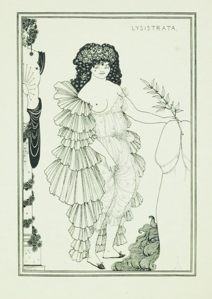
Beardsley, engraving for Lysistrata
Aubrey Beardsley was a self-taught artist who had learned his craft from studying illustrated books and ancient Greek painted vases. He was inspired and encouraged by Edward Burne-Jones, but (as Edward Lucie-Smith wrote in Symbolist Art) the young man emphasised what was perverse in the older painter’s work. Beardsley is known for his sharp penwork, his “linear arabesque,” which he balanced against bold contrasts of black and white. Lucie Smith described how Beardsley was a natural illustrator, able to “think of the design as something written on a surface, whose essential flatness must be preserved in order to balance the type which appear either on the same page or on a facing page.” He was a founder of the Art Nouveau style, hugely influential across Europe, and, through his work, book illustration came to be dominated by the new Symbolist and Art Nouveau ideas: “Partly art and partly craft, illustration rapidly assimilated itself” to the new decorative movement- as we have seen, for example, with Henri Caruchet.
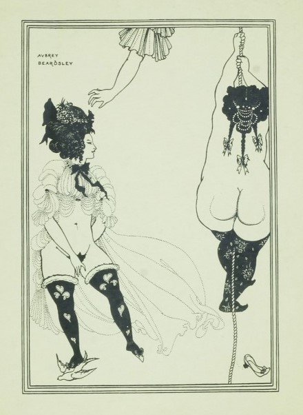
Beardsley is renowned for the highly erotic nature of much of his illustration. His work on Aristophanes’ play Lysistrata (1905) is characterised, in particular, by men caricatured with enormous phalluses and, quite commonly, large, mature women with big bosoms and bottoms. He depicted sexuality and bodily functions with a startling honesty that offended many at the time. Webb was perfectly correct to spot the lineal influence, for the work of von Bayros bears many close parallels with that of Beardsley: not only is his sharp graphic work comparable (both artists depicted fabrics in a masterly fashion), but there are the exaggerated phalli (which may also be found in Rops), the obese and lascivious women, the preternatural and precocious children, and (even) in one plate, from his collection Im Garten der Aphrodite, a scene in which woman ecstatically rubs herself along a taut rope (something which instantly reminded me of the engraving of ‘Two Athenian women in distress’ from Lysistrata reproduced above). Odd forms of excitement like this are typical of the illustrator’s images: compare as well ‘Le Collier‘ (The Necklace) from von Bayros’ portfolio of 16 prints produced under the pseudonym of Chevalier de Bouval in about 1925.
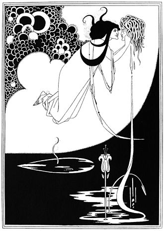
Beardsley, The Climax, 1893
Both Beardsley and von Bayros illustrated Salome and John the Baptist- in the case of Beardsley, for Oscar Wilde’s play Salome (1896). Each artist also detected and portrayed something unwholesomely sexual in the relationship between the princess and the executed prophet- in one plate by von Bayros he showed Salome breast-feeding the severed head of the Baptist, which lies on a plate. Decapitated heads and skulls were, in fact, common in the Austrian’s’ work, another part of the cloying atmosphere of macabre perversity that he constructed.
print by von Bayros
These two earlier artists seem to have provided clear models for Jean Traynier when he came to taking on erotic works such as Louys’ Cydalise in 1949 and a 1957 edition of Point de Lendemain, ou la nuit merveilleuse (No Tomorrow, or the Wonderful Night) by Dominique-Vivant Denon (1747-1825). In the case of the latter, the eighteenth century setting reminds me of many works by von Bayros, such as his 1905 portfolio Fleurettens Purpurschnecke- Erotische Lieder und Gedichte (Fleurette’s Purple Snail- Erotic Songs and Poems from the Eighteenth Century) and John Cleland’s novel, Die Memoiren der Fanny Hill (1906). In part, these images simply mirror the era of the works being illustrated, but their erotic nature (and that of other writers such as Laclos and de Sade) generally imparted an aura of licentiousness to the entire period- so that wigs and beauty spots came to act as visual symbols for a certain liberated sexuality: Beardsley’s plates for The Rape of the Lock, as well as the general mood of his Lysistrata, are cases in point; in addition, see my book, Voyage to the Isle of Venus.
von Bayros, illustration for John Cleland’s Fanny Hill
As for Traynier’s monochrome engravings for Cydalise, two of the plates feature exaggerated, ‘fantasy’ phalli directly comparable to those seen in Lysistrata, and surely inspired by them, possibly by way of either von Bayros or Rops- or just as likely directly. Comparable ‘erotic dream’ images, albeit in very different styles, may be found in the 1932 edition of Pybracby the Czech surrealist Toyen and in recent work by the British graphic artist Trevor Brown. In addition, the black and white style adopted for both works by Traynier repeats that of von Bayros and Beardsley, suggesting that, for him, it seemed suitable for depicting powerfully erotic scenes. Another small detail which may indicate a derivation from Beardsley’s Lysistrata are the many bows the decorate the hair of Traynier’s female figures- an elaborate and distinctive touch.
The influence of von Bayros might also be traced in similar details. I have discussed previously the pseudonymous erotic illustrator Fameni Leporini. The impact of Claude Bornet’s 1790s illustrations to de Sade seems clear, as both opt for naked bodies stacked up improbably in their renderings of orgies, but the morbid mood of von Bayros may also be detected. Leporini, too, preferred pen and ink for his designs and we may identify in them various traits and details that appear to have been borrowed from the Austrian: the mood of perverse cruelty and of lesbian passion that suffuses a good deal of his work and certain specific scenes which could be derived more directly from examples by von Bayros.
I have written a good deal about the books of Pierre Louys and about the numerous illustrated editions of those works that have been published. I now want to consider how the work of the Marquis de Sade has been treated by the publishing trade. As many readers will appreciate, de Sade bears many striking resemblances to Louys- the Marquis was doubtless an inspiration to the latter and they both dealt with similar themes of transgressive sexuality in manners that were sometimes shocking and provocative. Sade was, though, much more of a philosopher than Louys, far more concerned with wider social and political questions. Very narrowly, the content of their books guaranteed stimulating material for artists to work with, so that publishers knew that illustrated editions would be likely to sell well within a certain market.
Guido Crepax, Justine, 1979
It’s interesting, therefore, to find that there are maybe twenty illustrated versions of de Sade’s key works (Justine, Juliette, Philosophy in the Bedroom and 120 Days of Sodom), not an insignificant number, perhaps, but dwarfed by the total of illustrated editions of Louys, which exceed one hundred and twenty on my latest reckoning. In the case of Sade’s most notorious title, 120 Days of Sodom, this may partially be explained by the fact that the manuscript of the text was only rediscovered and published by the poet Apollinaire and then by the surrealist Maurice Heine in the late 1920s. In point of fact, though, most of the editions of de Sade post-date the 1960s, suggesting that it was only in more recent decades that publishers felt that it would be acceptable to issue his works without the risk of public complaints and criminal proceedings.
Philippe Cavell, 1983
I suspect that one of the first artists to respond to the works of Sade, since Bornet had illustrated the original editions of La Nouvelle Justine and Juliette in 1797, was the rather obscure French artist Fameni Leporini, probably in the 1930s. As others have observed, it seems very clear that the artist was working to a text (or texts), for otherwise some scenes make little sense to the viewer- their context is obviously lacking, as if they were meant to illustrate a narrative that is now absent. Personally, I regard his portfolios not as illustrations of specific titles, but rather as interpretations of the themes and scenes also addressed by de Sade (most obviously, I would suggest, Part Two of The One Hundred & Twenty Days of Sodom); this would seem to be confirmed by the inclusion of monks in a few prints as well as some images that show eighteenth century dress. Leporini was very capable of representing intense mutual passion between lovers, but he also reflected the violence and abuse of power that could be present in Sade’s works, meaning that he depicted not shared pleasure but dominance, distress and shame- an acknowledgment that male control and exploitation have often had the potential to distort interpersonal relationships.
In rather the same way, in the 1960s the German born surrealist Hans Bellmer produced a series of darkly erotic drawings and etchings inspired by the writer. These were interpretations of Juliette, Justine and 120 Days, but the works were unconnected to any edition of those books. The first was the drawing Life & Death (For de Sade) of 1946, A Sade from 1961 and culminating with the Petit traité de morale (A Little Moral Treatise) in 1968. Bellmer’s baroque images elaborate his figures’ anatomy in unreal ways that tend to dehumanise the subjects and distance the viewers. The results can be violent and disturbing, resembling dissection drawings, stressing that corporeality is close to decay and that lust verges on cruelty.
Blaine, Justine
New illustrated editions of Sade began to be published during the 1930s. In 1931 Heine’s transcription of 120 Days, with 16 lithographs by Andre Collot, appeared. In the manner typical of Collot, the images were as explicit as this violent and pornographic text demanded. They recognised, nonetheless, that the pain and humiliation is shared in de Sade’s book, with seducers as likely to be whipped or degraded as their victims.
One of Sade’s most popular books has always been Justine- or the Misfortunes of Virtue. There was a German edition in 1900, with colour illustrations in eighteenth century style by an unknown author. These imitate Bornet’s plates from 1797, notably his tendency to pile up figures in improbable pyramids, and like their models the plates they are highly explicit. The book- probably consequentially- appeared in a very small print run. However, in 1931, the same year as Collot’s 120 Days, an English translation of Justine was published in New York, with 27 “spirited illustrations by Mahlon Blaine.” Blaine was a colourful character who liked to claim that he had been born on Easter Island. One dealer has described his work as walking “the razor’s edge between the grotesque and beautiful.” He was a self-taught illustrator notable for his darkly erotic images, which are to be found in books which also include Flaubert’s Salammbo (1927) and William Beckford’s Vathek (1928). As will be seen, there’s considerable vigour in his designs, as in the representation of Justine’s death seen below.
In 1932, the Czech surrealist Toyen (whom we have encountered before in discussing her illustrations for Pierre Louys’ Pybrac) provided plates for an edition of Justine. These match the rather abstract style of her work on Pybrac that same year. Toyen’s husband, Jindřich Štyrský (1899-1942) who was a surrealist painter, poet, editor, photographer and graphic artist, also designed a photographic cover for an edition of de Sade’s Philosophy in the Bedroom, as well as writing a study of the Marquis’ work.
Jindřich Štyrský’s cover image for de Sade
A pause in publications followed until near the end of the war, when in 1944 a new edition of Juliette, illustrated by another Surrealist artist, the Argentinian Leonor Fini, appeared. The curator of a 2018 exhibition in New York on ‘Fini and the Theatre of Desire’ described how, for the artist, life was to be lived as an “investigation in the human psyche and, for her, gender and sexuality were the greatest ways to perform those kind of experiments, both on the canvas and in real time.” Fini illustrated about fifty books during her career, choosing authors and titles that coincided with her own interests. These included the Satyricon and works by Verlaine, Jean Genet and Charles Baudelaire. Fini’s twenty-two plates for Sade’s book responded in particular to the macabre elements in the text, emphasising skeletons and decay as much as erotica. This emphasis on mortality, I think, was her way of representing those aspects of de Sade’s work where carnal desire slips into cruelty and the reader/ viewer becomes uncomfortable and alienated.
Fini, Juliette, 1944
Two years later another female illustrator, Lilian Gourari, provided twenty one plates for a new edition of Justine, ou Les Infortunes de la Vertu. I’ve been unable to find out much about Gourari (or Gourary), other than she illustrated only a few books- amongst them children’s books such as Les Neufs Lutins de la Montaigne (The Nine Gnomes of the Mountain). Her work on de Sade appears to be the most significant. She didn’t flinch from depicting the various misfortunes inflicted upon the hapless Justine.
Gourari, 1947
A slowly accelerating flow of editions of de Sade had begun. In 1948 an edition of Eugenie de Franval (a story of incest and its punishment) appeared, with eight plates by Valentine Hugo (1887-1968). She was a writer and painter, best known for her work with Jean Cocteau and the Ballet Russes and her close association with the Surrealists (including an affair with Andre Breton). Her illustrations included editions of the Surrealist’s favourite, the Comte de Lautréamont’s Les Chants de Maldoror (1933) as well as the surrealist Paul Éluard’s Les Animaux et leurs hommes (1937) and Symbolist poet Arthur Rimbaud’s Les Poètes de sept ans (1938).
Eugenie de Franval, Valentine Hugo
Another version of Justine, this time illustrated by Schem, appeared in 1949. His twenty three coloured lithographs are typical of the sweet delicacy of his attractive illustrative work, featuring a good deal of nudity but nothing really shocking.
Schem
Eberhard Schlotter
A hiatus followed during the 1950s, perhaps because the market seemed well supplied, but interest in de Sade revived in the ’60s with three new illustrated editions of his work. Curiously, all of these featured the work of young German artists. The eldest was Eberhard Schlotter (1921-2014) who worked as a painter in Spain and Germany. In 1967 he designed a set of sixteen etchings depicting episodes from Sade’s Philosophy in the Bedroom. The following year, the Polish-German Arwed Gorella (1937-2002) created 13 etchings for the second volume of Sade’s collected works (in German). The images- mostly portrait busts- remind me of those faces constructed from vegetables and fruit created in by Giuseppe Arcimboldo (1526-93)- except that Gorella (naturally) used naked bodies. Uwe Bremer worked on volume three of the same edition, using a radically different style but yet- like Gorella- capturing the same anatomical aspect of Sade’s work that so many other illustrators had identified.
Gorella
Bremer
In 1972 Johannes Vennekamp (b. 1935), the German artist and colleague of Uwe Bremer, produced a portfolio of thirteen etchings based on 120 Days. He too opted for a kind of diagrammatic graphic approach, in contrast to which was the refreshingly cartoonish work of caricaturist and illustrator Albert Dubout (1905-76), who illustrated Justine in 1976 with some exuberant and exaggerated images. Dubout (who was married to illustrator of Pierre Louys Suzanne Ballivet) worked on satirical magazines such as Le Rire and illustrated numerous books, including Rabelais Gargantua and Pantagruel; perhaps this background helped him to locate the humour in de Sade, finding his extreme situations so over the top as to be laughable rather than shocking. In 1979 Guido Crepax took the next logical step and rewrote Justine as an exquisitely illustrated graphic novel (see image earlier). A graphic novel version of Juliette, by Philippe Cavell, followed in 1983 (see cover image earlier). His other illustrated work includes an edition of Fanny Hill and various erotic novels such as Petites alliees by Clary F and Nini Tapioca by Beatrice Tessica.
Johannes Vennekamp
Further illustrated editions have followed in the last few decades: these include (amongst others) Justine and Juliette by Martina Kugler (1945-2017) in 1991 and by Lisa Zirner in 2014. The former opted for simple pen drawings in an unusual ‘tribal’ or ‘primitive’ style, the latter for fifteen cheerful, bright, almost cartoonish illustrations which are notable for the joy and pleasure that she depicted amongst the participants. Interestingly, perhaps, in 1985 and 2006 respectively, both women had previously illustrated Histoire de l’œil by Georges Bataille, intellectual, philosopher and early associate of the Surrealists. The History is a 1928 novella that details the increasingly bizarre sexual perversions of a pair of teenage lovers. Bataille was heavily influenced by de Sade, making the separate publications quite closely linked.
Javier Gil (born 1961) created a series highly explicit pastels based on Philosophy in the Bedroom in 1996 whilst Alexander Pavlenko, who was born in Russian in 1963 but who now lives in Germany, has produced another portfolio of Sadean inspired works entitled A Sade- rather like several earlier German artists. Pavlenko’s approach was to produce rather exaggerated erotic images. Most recently, in 2014, the French illustrator Yves Milet-Desfougeres (1934-2022) created a series of quite crude-looking pen sketches to go with another edition of Philosophy; he too had also worked on Bataille’s Histoire de l’œil, in 2010.
Lastly, in 2000 a lavishly produced edition of Justine, with twenty designs by Cyriaque de Saint-Aignan, was published. These are impressive female nude studies, although not perhaps fully reflective of the book; the ‘glamour’ style of the pictures, most notably the frontispiece, which renders the virtuous and innocent Justine as a Carmen-like figure, seem at odds with the story.
What many of the illustrators of de Sade have confronted in the author’s texts is the risk that carnality can tip over into depersonalising cruelty, that a sense of the individual, consent and volition can be lost. This sets this body of work apart from many of the books I have previously discussed. Nevertheless, as I’ve proposed before, we see how the provision of illustrations with text can amplify the written word, reinforcing its impact as well as making the reader focus more closely upon what is being described or discussed. This can have an especially powerful effect with work such as de Sade’s.
The image of decadent Rome is constantly present in the works of Lorenz Alma-Tadema. In an 1883 lecture on the current styles of art in Britain, the art-critic John Ruskin criticised Alma-Tadema for making it his “heavenly mission to portray” Rome in its “last corruption […] and its Bacchanalian frenzy” (The Art of England: Lectures Given in Oxford, 1884, 103). Ruskin was not mistaken in his analysis of the time frame of much of the painter’s work: the vast majority of Alma-Tadema’s historical scenes focus on the late-Imperial period of Rome. For example, in 1871 he painted A Roman Emperor, depicting a member of the praetorian guard bowing to a terrified Claudius, with the murdered body of the assassinated Caligula, his nephew and predecessor, sprawled close by. The Roses of Heliogabalus from 1888 shows the emperor Heliogabalus showering his dinner guests with rose petals, resulting in many being smothered to death- or so legend claims; his reign was brief as a result of his alleged excesses. The artist’s Unconscious Rivals (1893) began as a painting of the ceiling of Nero’s Domus Aurea (Golden House) in Rome. Alma Tadema’s 1907 canvas Caracalla and Geta depicts the two sons of the emperor Septimius Severus in a magnificently decorated box in the Colosseum; the brooding Caracalla stares at his triumphant younger, but favoured, brother, Geta, foreshadowing the latter’s murder and Caracalla’s coming reign. According to Edward Gibbon, Caracalla would surpass even Nero and Domitian in tyranny to become the “common enemy of mankind.”
Alma Tadema, A Roman Emperor, 1871
Gibbon’s famous history of The Decline and Fall of the Roman Empire– in which he argued that successive emperors’ hedonism and cruelty brought about the decadence and decline of the once-great Rome- is clearly echoed in Alma-Tadema’s canvases. He seldom chose to depict incidents or scenes from the positively-viewed Republican or Augustan eras; rather, it was Rome’s worst rulers, and the dissolution and cruelty of their reigns, which characterised Alma-Tadema’s Roman world. This was a deliberate turn against the idea of exempla virtutis, the moralistic view of earlier history painting which called for inspiring examples to be presented to the public.
Caracalla & Geta, 1909
I have mentioned before that French artist Thomas Couture first came to public attention with a painting of Rome during the Decadence (1847). The Polish-born painter, Henryk Siemiradzki (1843-1902) had close connections to Ukraine but spent a large part of his life studying and painting in Rome. He too painted classical scenes, both mythology and incidents in everyday life, but he also specialised in incidents from Polish and Russian history and from the Bible. Nero’s Torches (1876) combines Biblical history with neo-classicism by showing the Imperial court assembled to watch some Christian martyrs being incinerated; Christian Dirce (1897) shows a scene in the Colosseum, in which an opulent looking but thuggish emperor inspects the corpse of a Christian woman who was lashed to a bull before it was pitted against gladiators. Both have perished, it seems; the original Dirce was the Greek queen of Thebes who, according to myth, mistreated her niece, Antiope, and in revenge was killed by the latter’s sons by means of tying the queen to the horns of a bull.
Thomas Couture, Rome during the Decadence (1847)
An Orgy in the Time of the Caesars (1872) and Orgy on Capri capture the mood of the Rome of Edward Gibbons. We have the same nudity and inebriation that we see in Couture’s canvas, but with added menace. The brooding lighting of the palace in the 1872 painting suggests an obliviousness to the outside world; on Capri the bacchanal has brought cavorting revellers to the seashore, where they appear oblivious in their delirium to the corpses that have fallen down from the imperial villa above.
Siemiradzki, A Roman Orgy in the Time of Caesars, 1872
Siemiradzki, An Orgy of the Times of Tiberius on Capri, 1881
Rather like Siemiradzki, fellow Pole Wilhelm Kotarbiński (1848-1921) trained in Rome and worked for many years in Kyiv. He painted many scenes set in imperial Rome and Egypt, many exuding a sense of luxurious and indulgent lassitude; his orientalist images of courtesans in the seraglio are saturated with a comparable mood of bored carnality. Most striking, perhaps, is Kotarbiński’s orgy scene, a canvas that depicted some of the stereotypes of decadent Rome. From the 1890s, the painting is replete with the signifiers of doomed extravagance, the nudes, the wine, the flowers, the hints of sex.
For readers of a certain age, there may of course be a certain staid familiarity to some of these images- especially that of Claudius and the murdered Caligula- because they are all highly reminiscent of the BBC version of Robert Graves’ I, Claudius, which was first broadcast in 1976. The series’ orgies were all very respectable affairs, with the dissolution of participants mainly marked by eating grapes straight off the bunches held above their heads (it seemed). Pretty tame stuff, especially when compared to the HBO’s Rome…
Kotarbiński, A Roman Orgy
Orgies are good fun to paint, of course; the artist can indulge himself in nudes and rich fabrics whilst showing off his skills in convincingly depicting candle and torch light. Nonetheless, I wonder if there are political undertones in some of these paintings as well. Certainly, Couture’s critique of Roman decadence was painted just a year before the 1848 revolution that toppled the Bourbon monarchy of Louis Philippe and the picture was understood by contemporaries to be a veiled attack on the crown. The Pole Kotarbiński could well have felt little affection for the Russian empire, partly as a result of native nationalism and partly because of the time he spent living in Ukraine- most notably when the Red Army invaded in 1919. He might well have welcomed the fall of the Romanovs in 1917. I am less convinced of this thesis in respect of Siemiradski, given that he spent many time studying in St Petersburg and the fact that many of his canvases hang in Russian galleries.
Part of the unspoken context of the artistic (and literary) orgies I have been discussing is the understanding that they were an indulgence of an elite. Only the rich and powerful can afford to stage them; only the rulers of society can command the slaves, servants and courtesans needed to entertain guests; only the privileged and connected can overcome any problems arising from participants getting overexcited and carried away- or, for that matter, can conduct themselves like this without serious reputational damage. Immunity from prosecution is ensured by status and wealth. It was in just such settings that the Marquis de Sade situated works such as Justine, Juliette, Philosophie dans le Boudoir and 120 Days of Sodom. Nobles and high-ranking churchmen are depicted kidnapping, tormenting, raping and murdering the young, the poor and the vulnerable, indulging their perverted tastes without consequence. Editions of his books issued during the Marquis’ lifetime were illustrated by Claude Bornet; his etchings show mixed groups of up to fifteen people copulating, beating and torturing each other- illustrations far more orgiastic than anything we’ll find in oils on canvas.
However, in the aftermath of the First World War, it may be argued that orgies and decadence became democratised. The horrors inflicted on the ordinary population in the first major war of mechanised destruction and slaughter appear to have led to a reaction- a wish to celebrate survival and to indulge the senses. The hedonistic Paris and Berlin of the 1920s are examples of this new mood- a rejection of politics and an embrace of personal liberation and pleasure. Arguably, this is reflected in the art of the period as well.
The very obscure and pseudonymous French illustrator ‘Fameni Leporini’ produced portfolios that depicted large and feverish group sex scenes. Next to nothing is known about the identity or biography of this artist; it is assumed he was born in the late 1880s or early 1890s, as he became active as a designer in the ’20s and ’30s. Some of his work seems very clearly to have been designed to illustrate de Sade’s books (the best fit would be the second part of The One Hundred and Twenty days of Sodom)– or at least was composed in response to the marquis’ writings: monks feature amongst the figures in a number of scenes. Other designs may well be the products of Leporini’s imagination, elaborating on some of the themes I have discussed; one of his series of prints was even titled La grande orgie (The Big Orgy). As other commentators on his work have observed, determining with certainty whether Leporini always depicted consensual activities, perhaps mixed with a little mutual S&M, or was portraying something more violent, is not always easy to say- especially in the mass scenes of writhing flesh that characterise his output. Given Leporini’s probable age, he is very likely to have seen service during the First World War. I speculate whether the damage inflicted upon many men’s psyches by these experiences may be part of the explanation as to why there was the marked boom in novels and illustrations depicting spanking and flogging that occurred in Paris after 1919 (see, for example, the work of Carlo featured previously).
The German illustrator Otto Schoff was able to undertake work similar to Leporini’s in Berlin during the 1920s, such as his Orgien (‘Orgies’) of 1924, a collection of ten lithographs in which every sexual combination seems to feature (even including pets). Die Liebesspiele der Venus (The Love Games of Venus) appeared in the same year, in which Schoff once again explored identical themes: one orgy even seems to be taking place in a nursery. Comparable family orgies may be found in Jules Pascin’s Erotikon of 1933. In these artists’ imaginations, all restrictions and boundaries seem to have broken down. Far worse, for sure, can be read in accounts of Emperor Tiberius and others, but space and time distanced those events and transformed them into curiosities about which audiences felt safe. Bringing identical behaviours into contemporary settings seems to have been more challenging to viewers, the artists thereby raising provocative questions about violence, pleasure, state power, personal liberty and the illogical mismatch between what’s lawful and permissible (mass killing) and what’s prohibited (mass copulation)…
Further reading might include Burgo Partridge’s History of Orgies (2017) or, perhaps, A Photographic History of Orgies (2020) by Alexandre Dupouy, whose study of Paris- City of Pleasure, I have previously reviewed. For more information on Victorian era art, see details of my bookCherry Ripe on my publications page.